
HerbPork
Branding Identity Design & Packaging Design
Executive Creative Director
Ying-Fa Wang
Executive Project Director
Hsiu-Ju Hsu
Art Director + Designer
Cih-Wan Wang |
Szu-Ying Lu |
Shiang-Yin Su
Project Planning
Chih-Chia Chang
Published on 04. 01. 2025
HerbPork
Branding Identity Design & Packaging Design
#香草科學・極致鮮甜
HerbPork香草豬以香草飼養,能有效去除腥味並同步增加肉品的甘甜度、而在飼養過程中,也定期為動物們做健檢,產品製程上全程低溫保鮮;在把關上從源頭到餐桌以「安心健康的美味」為主張!
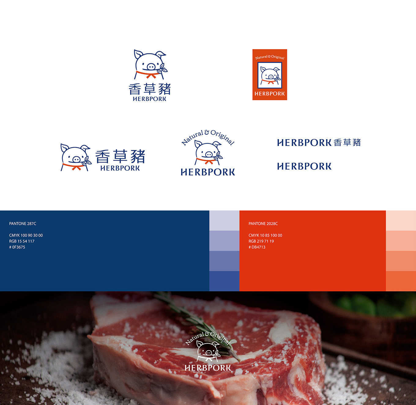
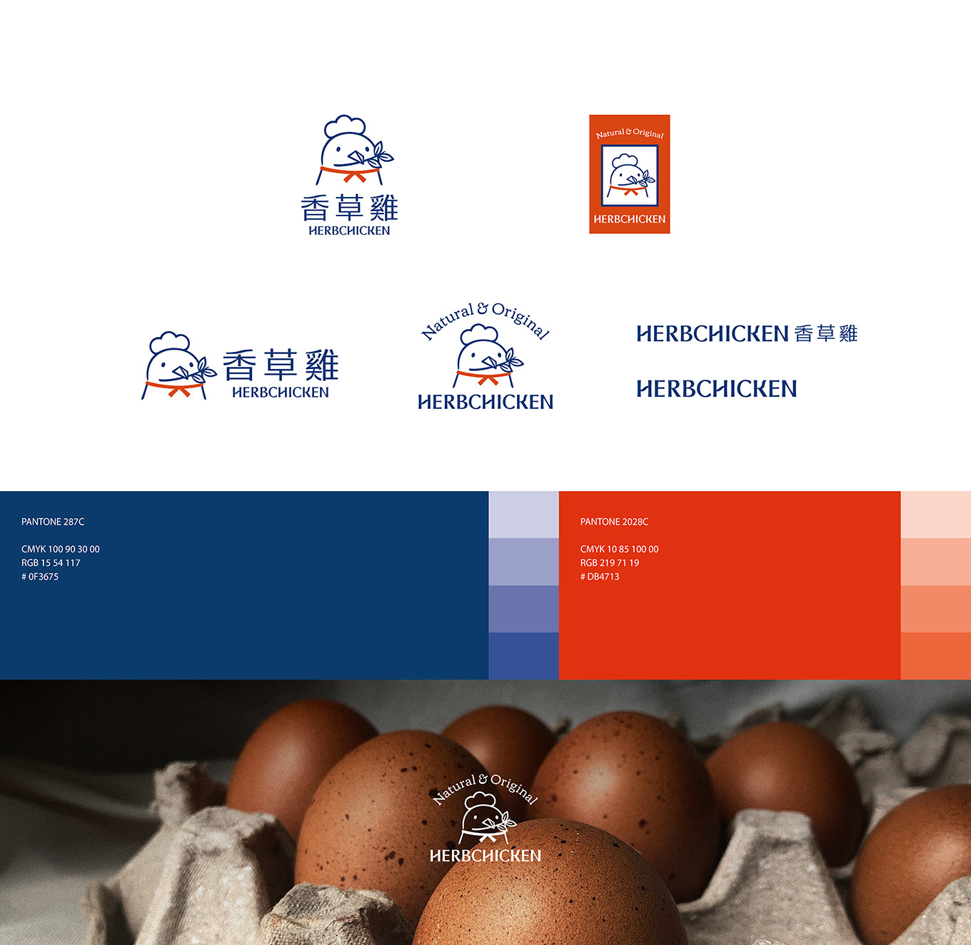
LOGO設計上結合品牌核心— 將品牌主販售肉品「豬肉」結合品牌獨特飼養方式「香草飼養」的精神來轉化舊款LOGO,改以風格簡約並帶有陽光親切感,以拉近與消費者的距離;而產品系列支線 #香草雞 也同樣以此風格意象來設計圖像。
品牌標準字—整體走端正意象,傳達產品嚴謹、專業的層層把關精神。同時在部分撇、捺筆畫中融入柔和的曲線,巧妙呼應香草植物的自然意象,展現獨特的細節與品牌特色。
品牌色彩系統— 以溫暖的紅色為主,象徵美味與熱情;搭配沉穩的品牌藍,強調科學養殖的嚴謹與專業,兩者融合傳遞「美味 × 科學培育」的品牌概念。
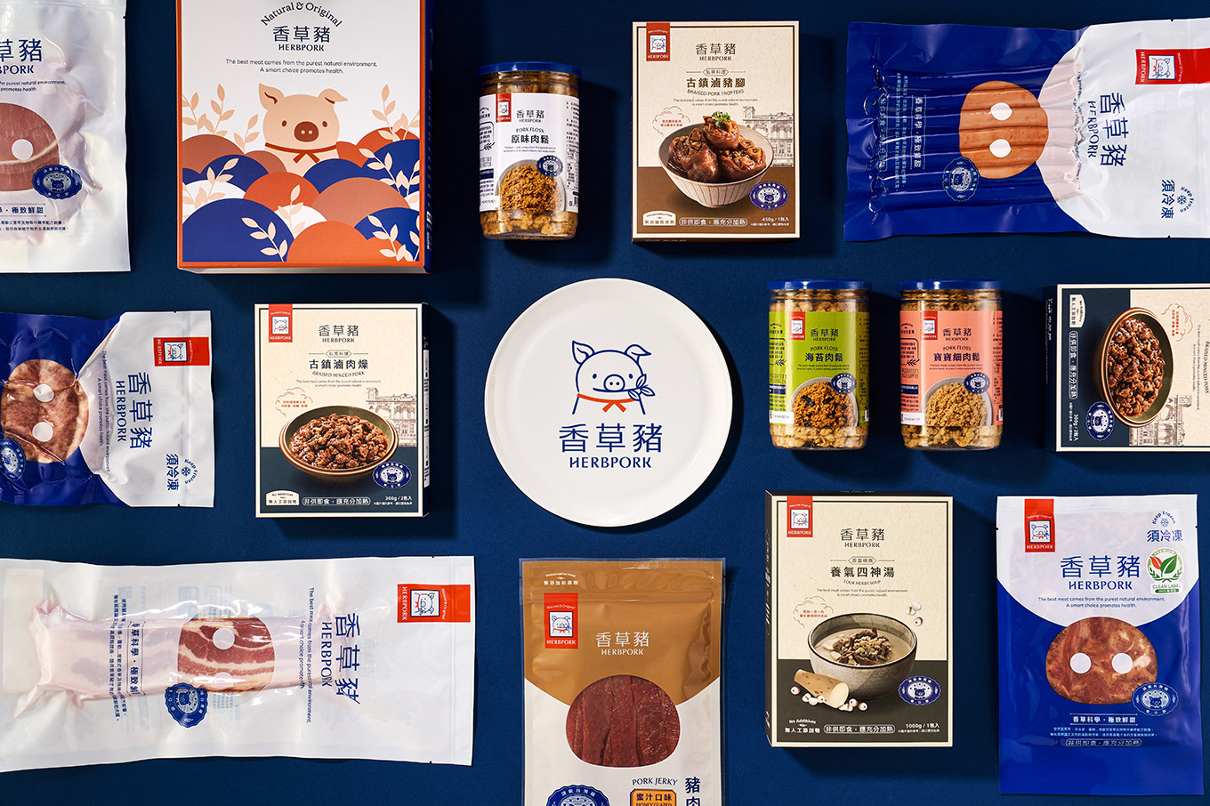
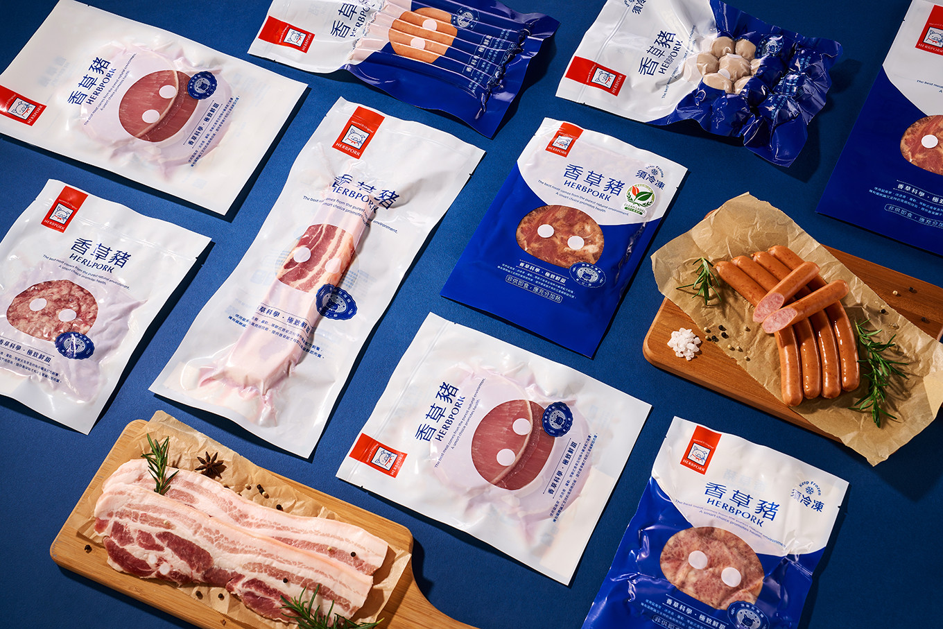
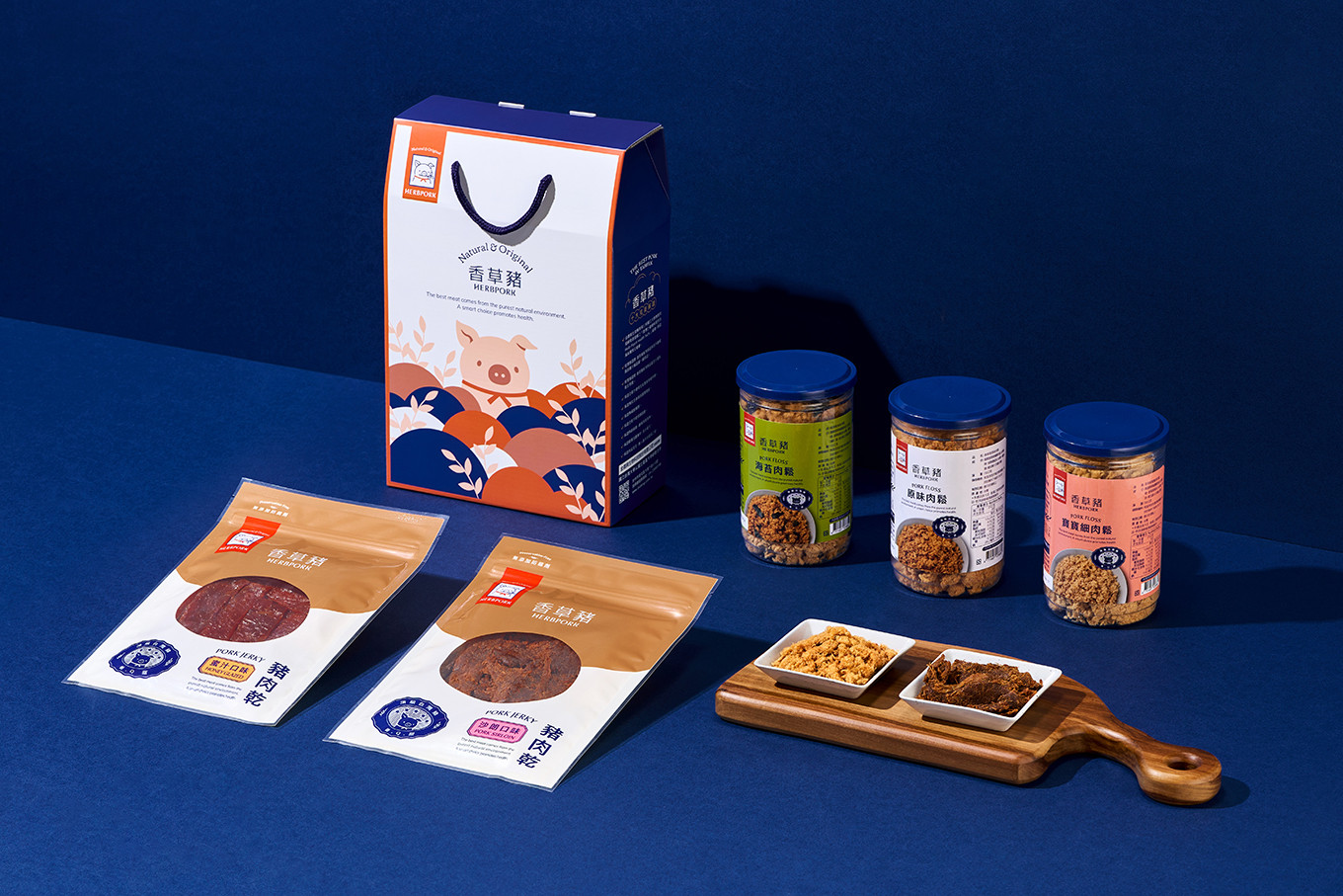
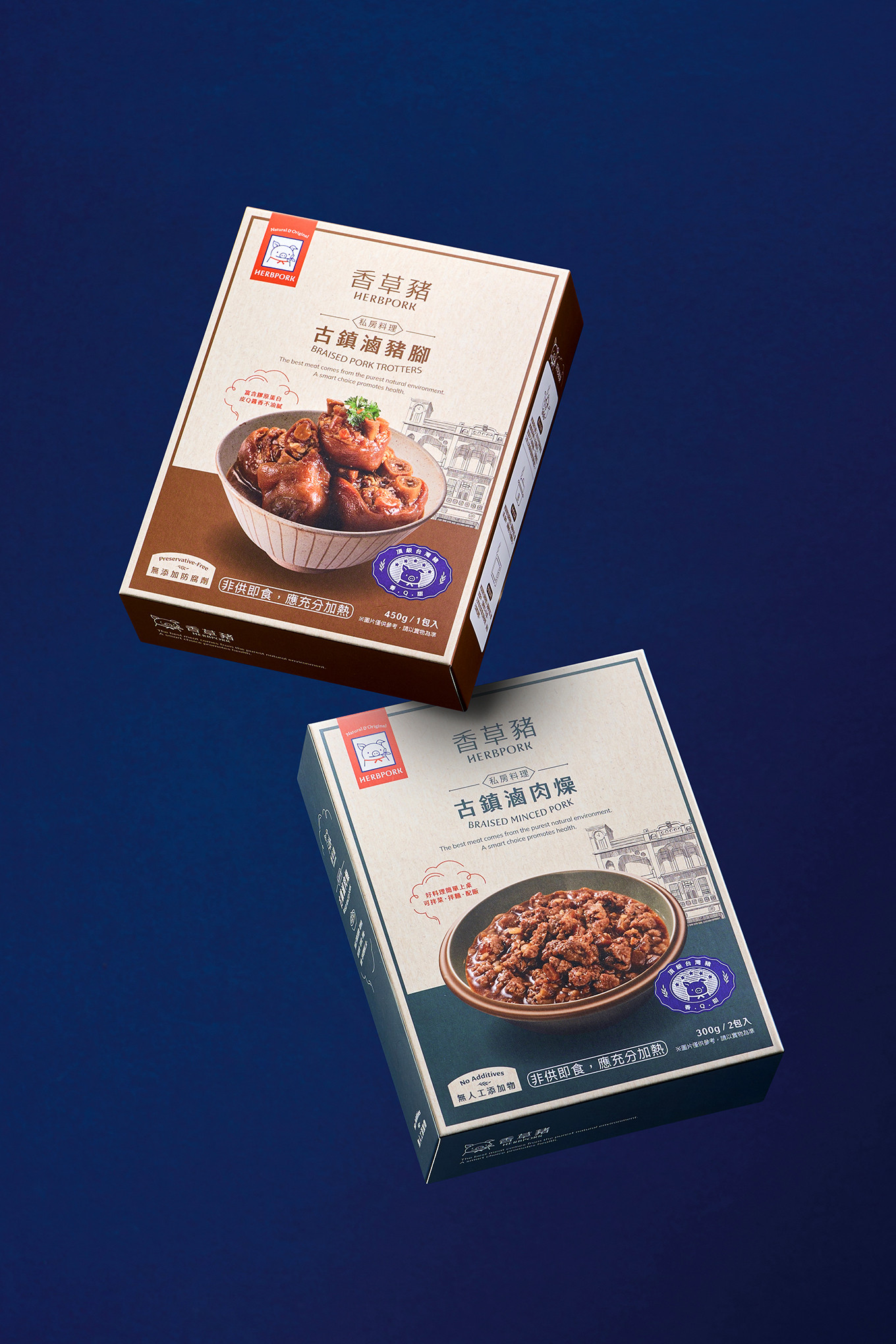
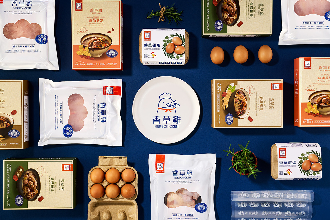
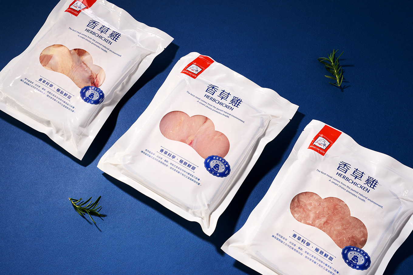
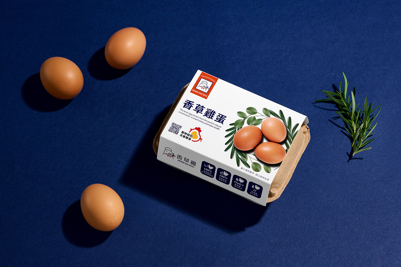
包裝系統規劃—以強調產品嚴格品控與純淨安全的承諾,運用 #純淨留白 的視覺語言,營造清新、專業的印象。搭配品牌專屬 icon 與識別圖像,進一步強化「專業、安心、科學」的品牌意象。
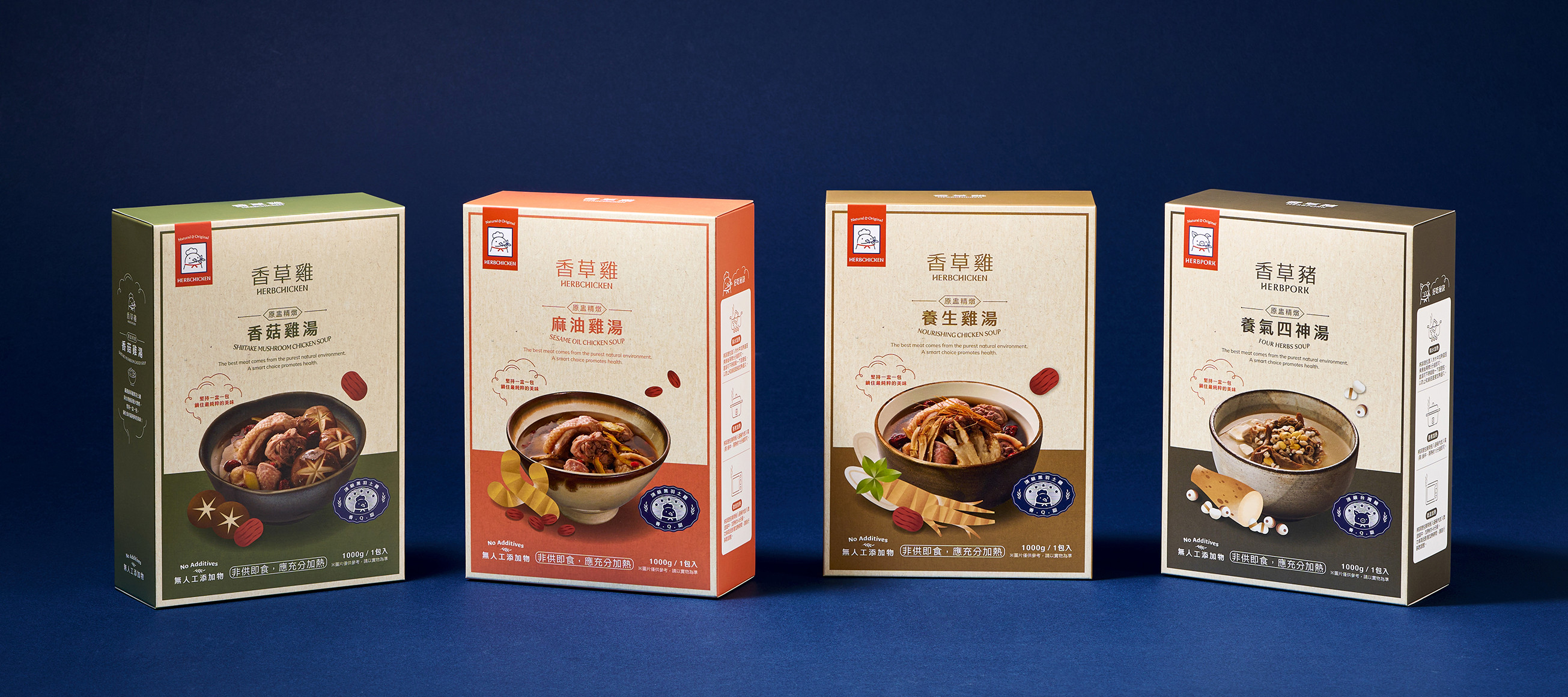
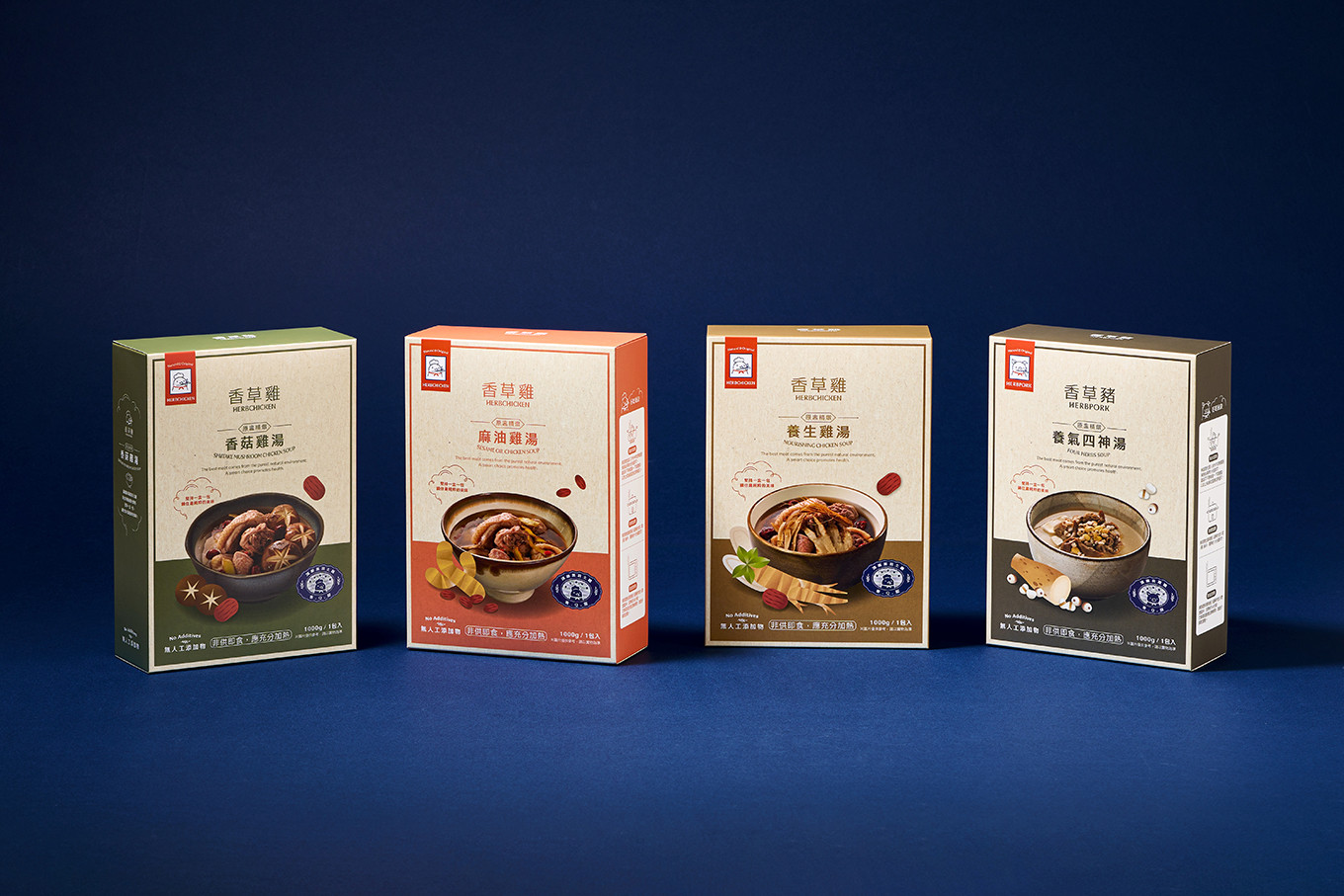
不同產品系列採用獨立色系,除了讓消費者能夠一目了然辨識品項,並同步提升內部包裝與出貨流程的效率。
吃香草長大的豬 #香草豬 在每一個細節都以最高標準執行,只為提供頂級、安心、無負擔的美味選擇。
#Herbal Science, Extremely Fresh
HerbPork raised pigs on a specialized herb-based diet, could effectively remove the gamey odor and enhance the sweetness flavor of pork. During the rearing process, regular health check-ups are conducted for the animals to ensure their well-being. Throughout the production phase, a strictly controlled low-temperature environment is maintained to preserve maximum freshness and quality.From source to table, our commitment is rooted in the promise of 'Safe, Healthy, and Delicious Excellence.The logo combines its core value of unique rearing method herb-fed, and its main product pork to transform into brand logo, the style is simple and welcoming, to be more accessible to the customers. The product series #herb chicken is also follow up this image to design.
Logotype design —The brand logotype is conceptualized with a structured and upright silhouette, conveying the brand's rigorous and professional spirit of meticulous quality control. Simultaneously, soft, flowing curves are integrated into specific brushstrokes subtly echoing the organic forms of herbal botanicals. This interplay between precision and fluidity showcases unique attention to detail while defining the brand's distinctive character.
Color System — Vibrant and warm red as main color symbolizing deliciousness and passion, with sophisticated blue as classic color of the brand, which emphasize the rigor and professionalism of scientific cultivation. These two hues translates the core brand philosophy of “Culinary Excellence × Scientific Breeding" into a cohesive visual language.
Packaging Design — to emphasize the brand’s commitment to rigorous quality and purity, a visual language of ‘Pure White’ to create clarity and professional impression, and with exclusive icon and identity image to further enhance brand core value #professional #safety #science.
Distinct color palettes are applied to each product sub-line, enabling consumers to identify specific items at a glance. This systematic approach simultaneously optimizes internal packaging and fulfillment workflows, significantly enhancing overall operational efficiency.
Raised on a specialized herbal diet, Herb Pork executes every detail to the highest standards, dedicated solely to providing a premium, safe, and burden-free culinary choice.
 View more projects
 Next post


