Bluuoo
Identity & Web Design
品嘉生技有限公司
Pin Jia Biotechnology ,Ltd.
Brand Bluuoo
_
Executive Creative Director
Ying-Fa Wang
Executive Project Director
Hsiu-Ju Hsu
Art Director + Designer
Cih-Wan Wang|
Shiang-Yin Su&Ya-Chi Hu
Project Planning
Chih-Chia Chang
_
Published on 09. 01. 2023
Bluuoo
Identity & Web Design
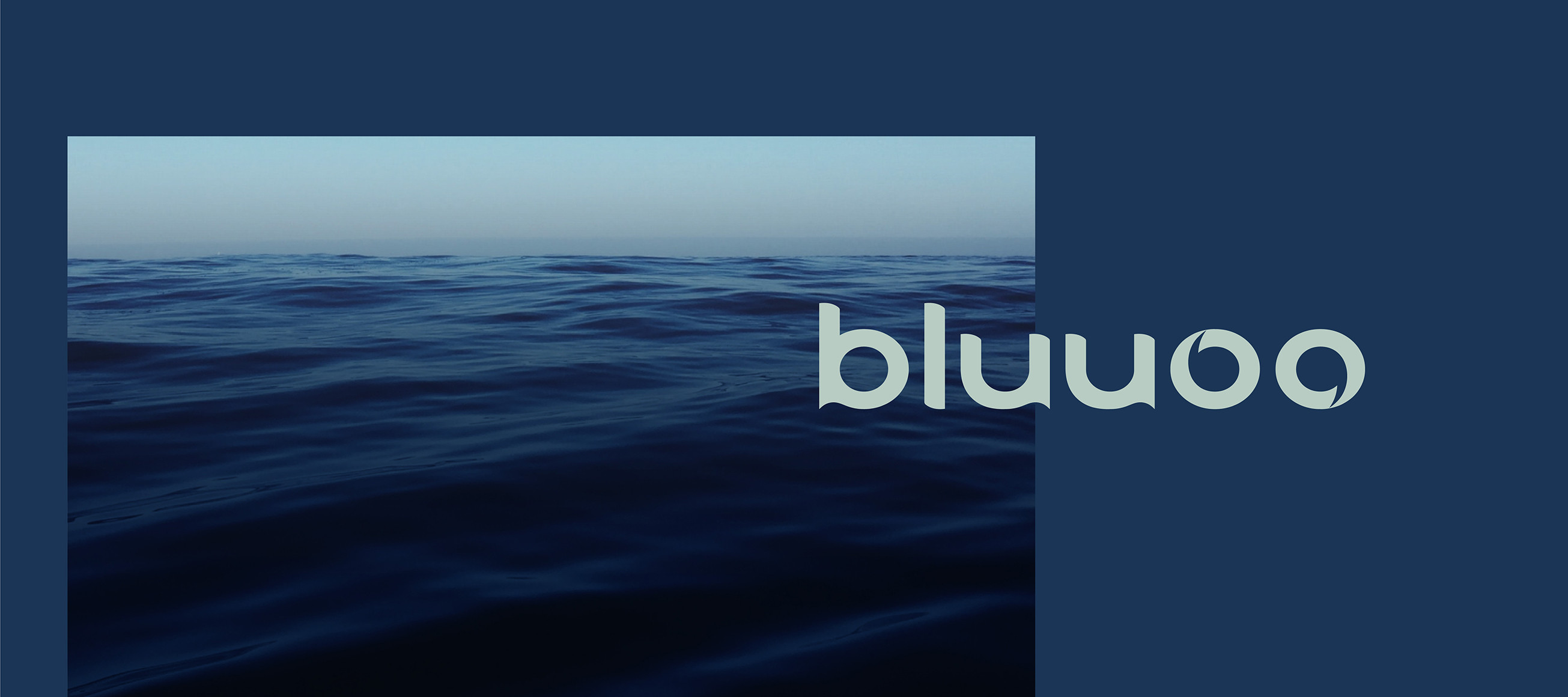
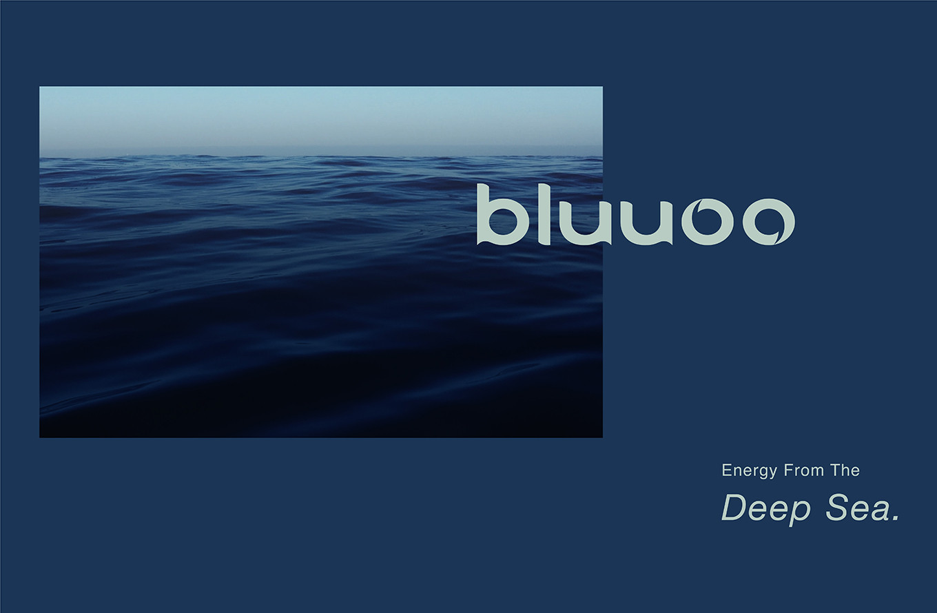
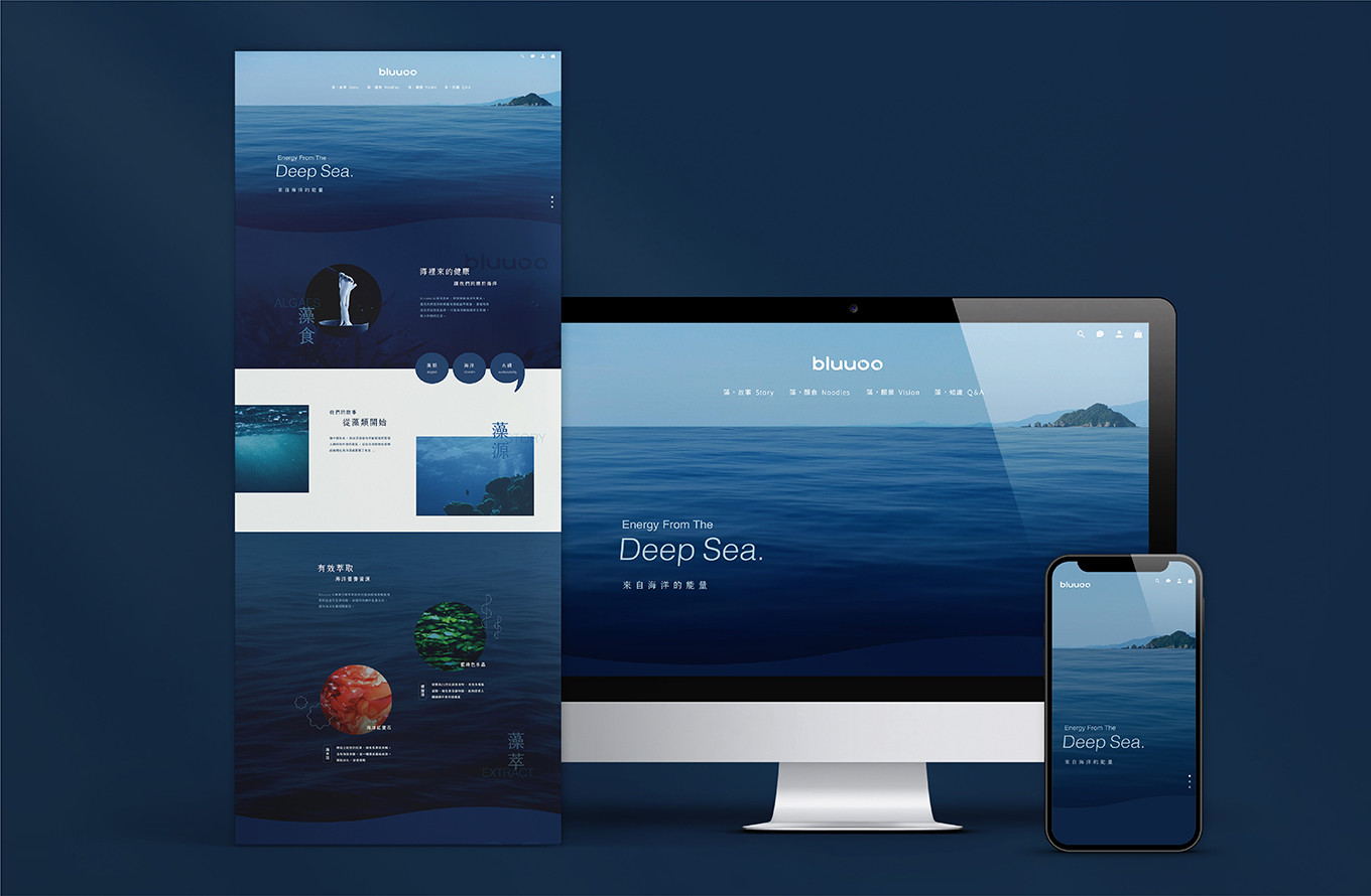
Energy From The Deep Sea.
Bluuoo 以海洋為本,運用專業萃取分層技術,萃取藻類營養成分,濃縮有效成分添加到食品中,打造天然海藻麵,剩餘的藻渣再製成可生物分解的藻紙,達到全藻利用、海洋永續;我們將品牌核心聚焦在 藻類 海洋 永續,以此延伸到品牌名概念與整體視覺。
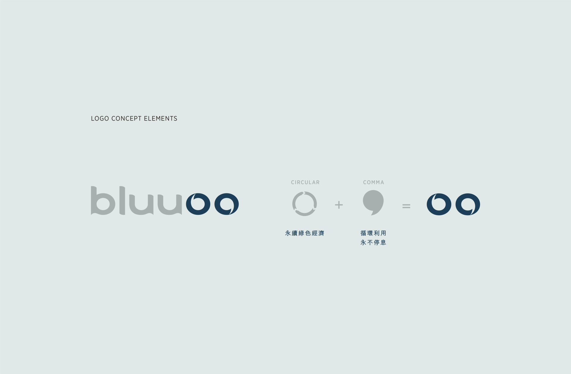
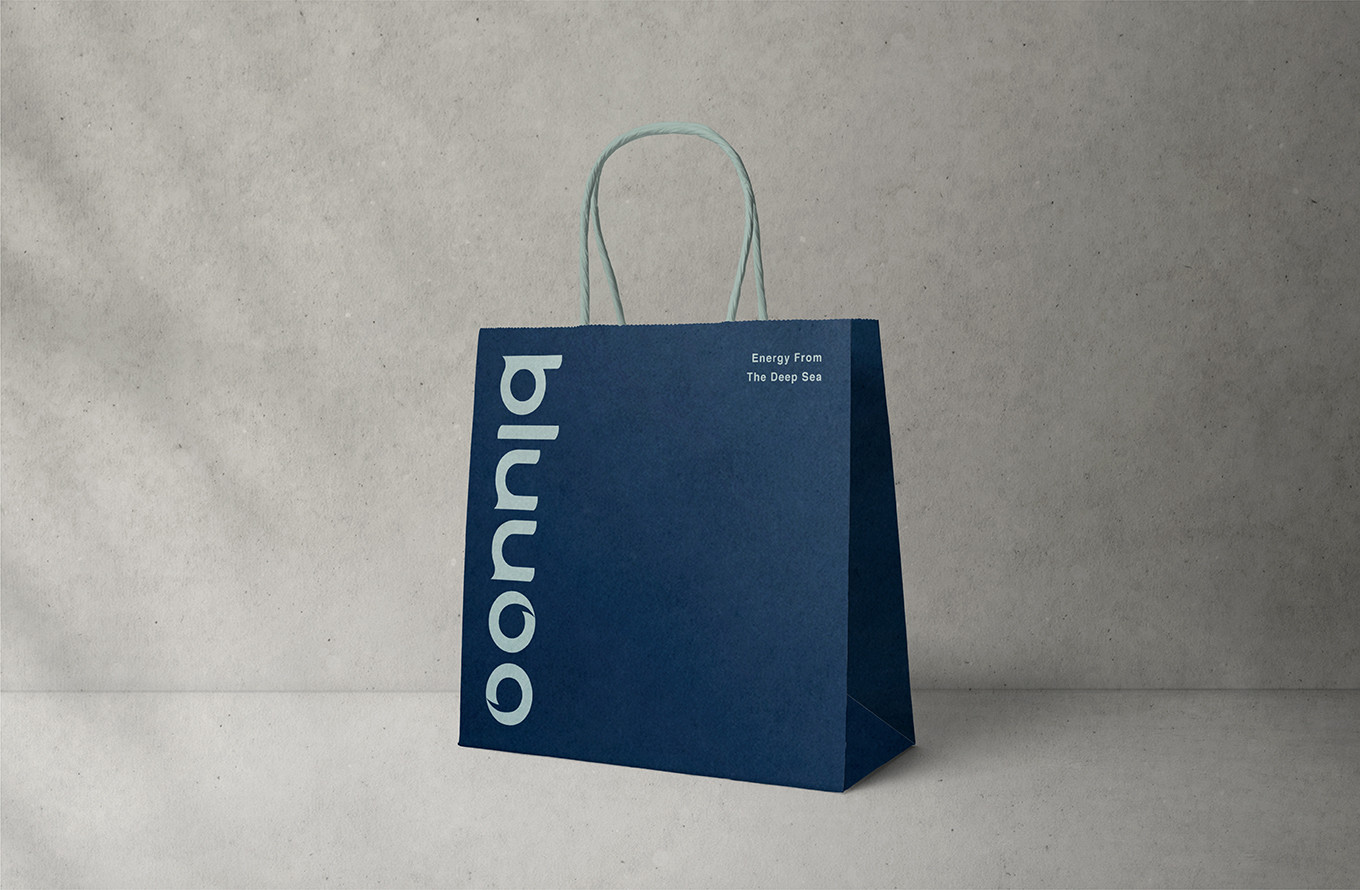
品牌名稱 Bluuoo 以大海印象藍貫穿,帶點休閒感的氛圍,展現海藻食品清爽、輕盈的印象,字尾的 oo 埋藏藻類浮游植物提供全球超過 50% 氧氣的意涵。
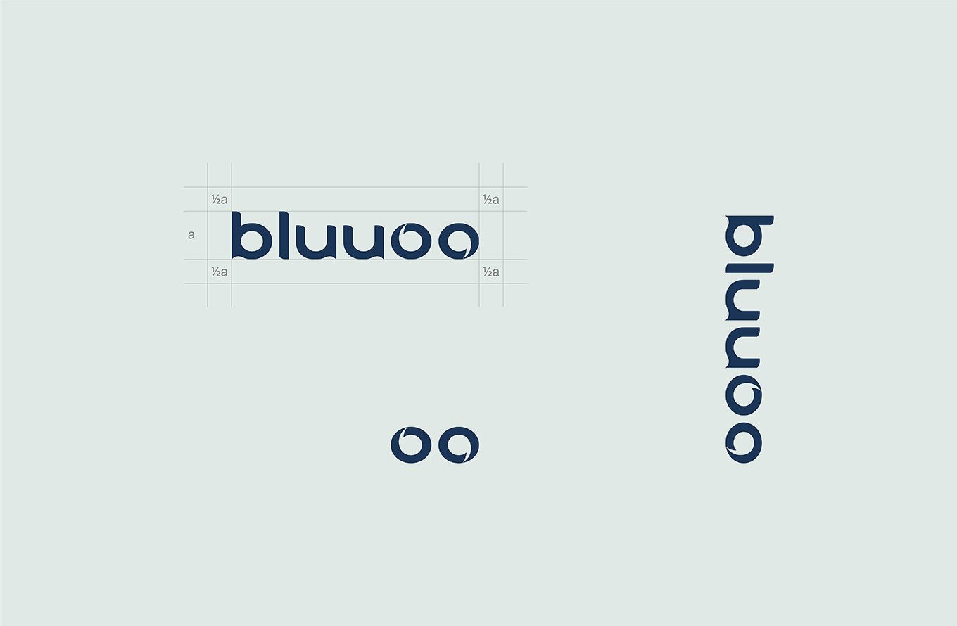
以海洋能量為識別設計主軸,字體外型如同波浪的曲線,字尾 oo 的設計,第一層帶入旋轉意象,呼應永續綠色經濟,第二層則結合逗點符號,象徵著循環利用,永不停息。
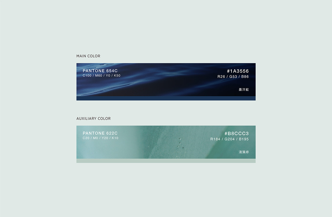
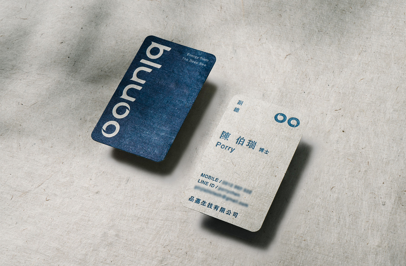
墨洋藍搭配淺藻綠的色彩計畫,讓視覺調性依循品牌核心概念,其中名片的紙材,選擇藻渣製成的手抄藻泥紙,全藻利用再製,獨特的纖維讓每一張名片都有自己的紋理走向與自然的斑駁氛圍,就像波光粼粼的海面自然閃爍。
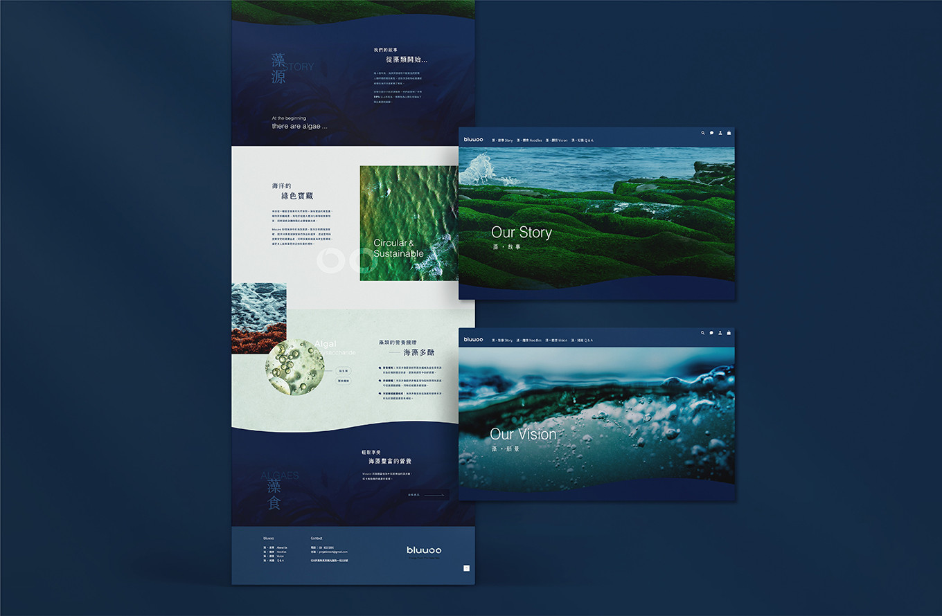
網頁設計中延續品牌的風格調性,以海洋永續、藻類專家、天然健康、低卡營養為關鍵字,透過氛圍感的圖像帶入,近一步帶出品牌理念與優勢,將文字轉化為設計插圖,圖文相互輔助,讓訴求點更快速被理解與傳播。
Bluuoo 是擁有專業生技背景的團隊,親自研發產品,藉由自身專業養藻固碳,在提供優質藻類產品的同時,不斷堅守使命投入綠色發展,共創藍色經濟。
Eat green,think blue. 海裡來的健康,就讓我們回饋於海洋!
-
Energy From The Deep Sea.
Rooted in the ocean, Bluuoo harnesses professional extraction and fractionation technology to isolate the nutritional essence of algae, concentrating its active compounds into natural seaweed-based foods. The remaining algae pulp is then repurposed into biodegradable algae paper achieving complete algae utilization and a truly sustainable relationship with the ocean. The brand's core is anchored in three pillars: algae, ocean, and sustainability a foundation that extends into every aspect of the brand name and visual identity.
The name Bluuoo carries the deep impression of ocean blue throughout, with a relaxed and breezy character that reflects the fresh, light quality of seaweed food. The trailing "oo" holds a quiet significance a nod to the fact that algae and phytoplankton generate over 50% of the world's oxygen.
Ocean energy drives the visual identity. The typeface curves like waves, and the "oo" at the end operates on two levels: the first layer introduces a sense of rotation, echoing the concept of a sustainable green economy; the second layer incorporates a comma symbol, representing the endless cycle of circular utilization — always turning, never stopping. The color palette of deep ocean blue paired with soft algae green keeps the visual language true to the brand's core. The business cards are crafted from handmade algae pulp paper a byproduct of the production process, repurposed and given new life. The unique fiber structure means every card carries its own natural texture and organic, mottled character like the shimmering, ever-shifting surface of the sea.
The website design carries the brand's tonal consistency forward, guided by four keywords: ocean sustainability, algae expertise, natural health, and low-calorie nutrition. Atmospheric imagery draws visitors into the brand's world, while written content is translated into design illustrations -text and visuals working in tandem, making every message faster to absorb and easier to share.
Bluuoo is a team with deep biotechnology roots, personally involved in every stage of product development. Through their expertise in algae cultivation and carbon fixation, they remain steadfast in their mission delivering premium algae products while championing green development and co-creating a thriving blue economy.
Eat green, think blue.
What comes from the sea, we give back to the sea.
📌看更多Bluuoo相關包裝設計:


