Branding Visual Identity Design
十方力有限公司
Ten Directions Power Co.
Brand
香爵 SGOOii
_
Executive Creative Director
Ying-Fa Wang
Executive Project Director
Hsiu-Ju Hsu
Art Director + Designer
Cih-Wan Wang|Shiang-Yin Su
Project Planning
Yen-Chi Chang
Typeface
文鼎明體
Adobe Garamond Pro
_
Published on 07. 21. 2023
Branding Visual Identity Design
「 我們在喧嘩的掌聲中回頭認識自己,
最後緊緊擁抱了一直以來堅持的精神與理念!」 — 香爵主理人 Lilian
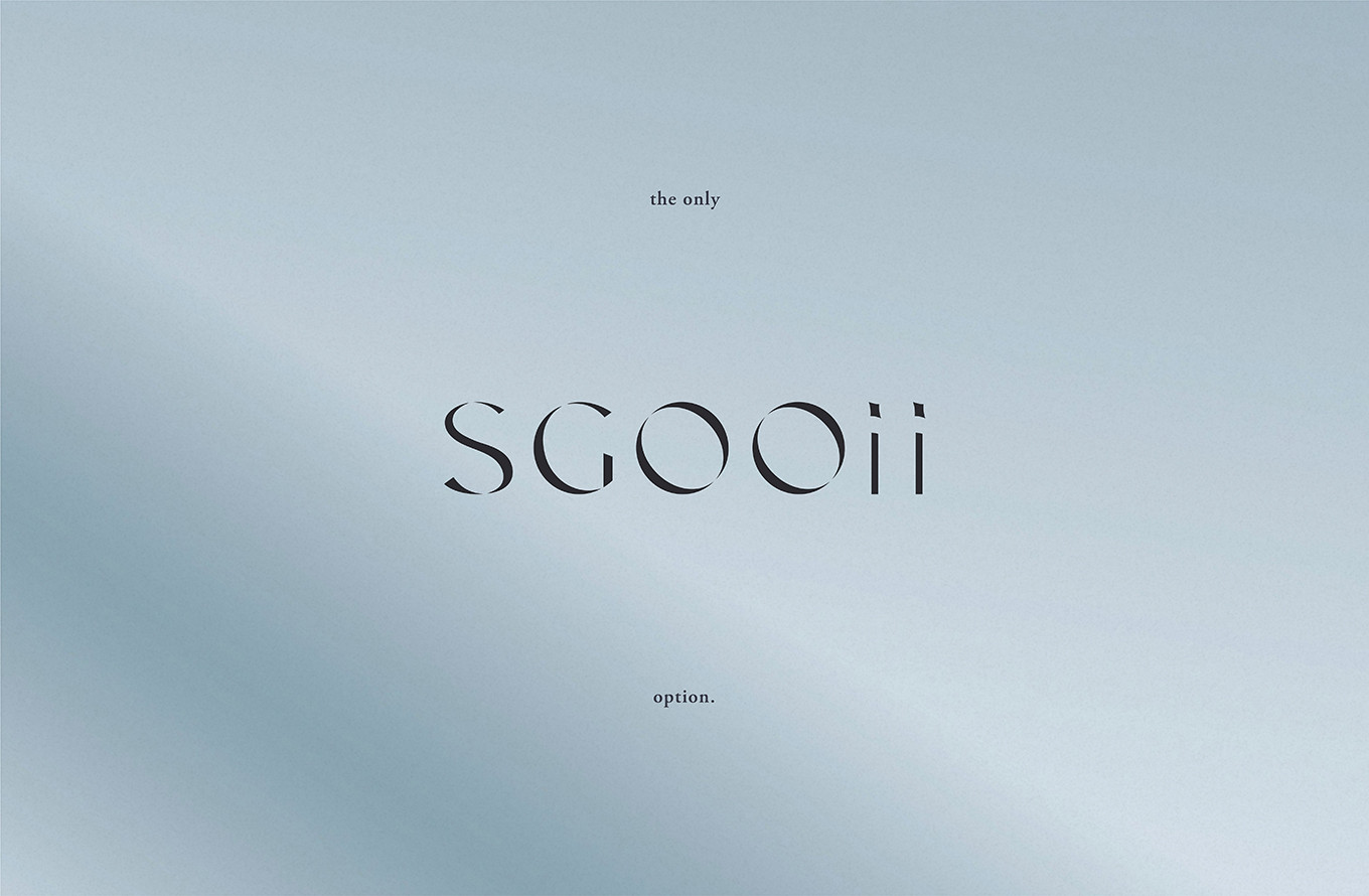
香爵從最初的主理人代購建立起口碑,成為引進多間日韓品牌的台灣唯一代理,品牌走了幾年,也做出好成績,卻在過程中逐漸迷失;前期雙方團隊深入的溝通與挖掘,我們重新聚焦回歸香爵的起點,來自真心的分享,每個產品都是主理人親身使用並且認可的品質,透過英文名的調整與梳理,更深層的與品牌連結,SGOOii - 以日文 sugoi 好極了為出發點,透過字母的重組,延續原意並與中文品牌名縮寫 SG 相互連結,英文中的 oo 代表 only option,象徵唯一嚴選,而字尾的 i i 則如同每一位消費者,都能在香爵遇見更好的自己。
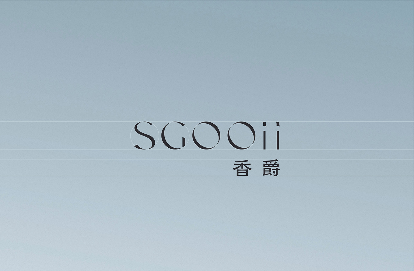
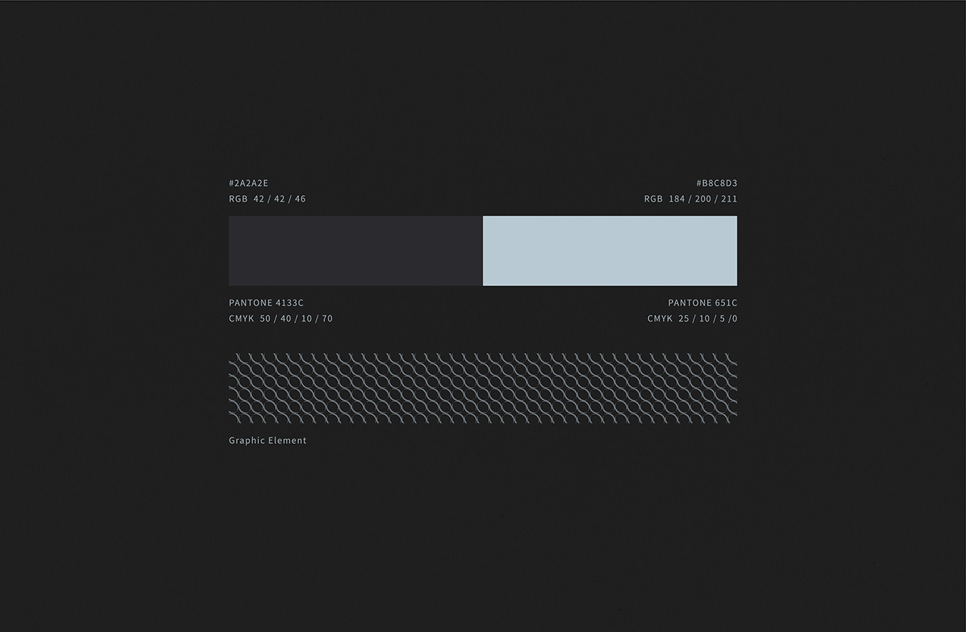
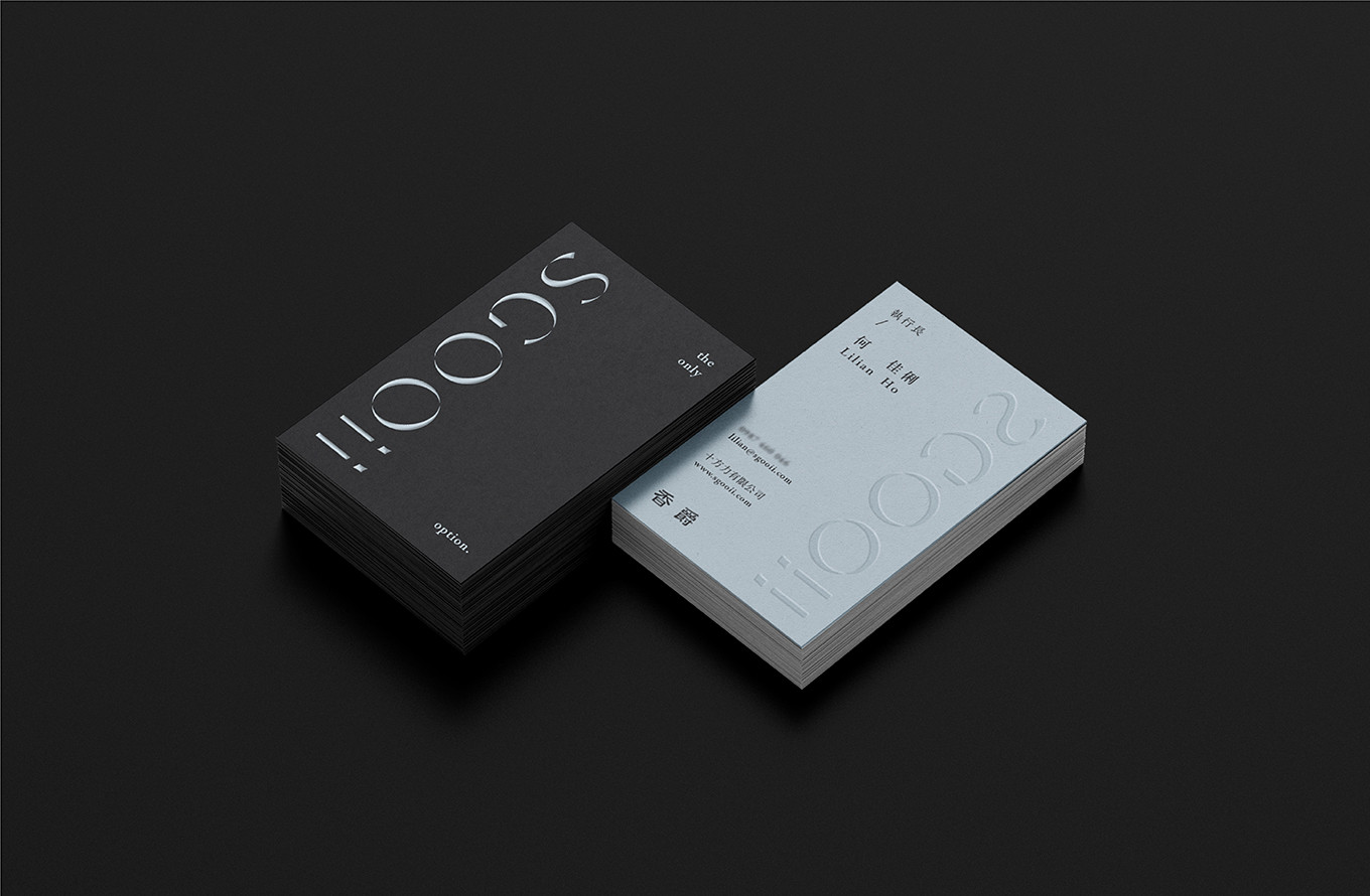
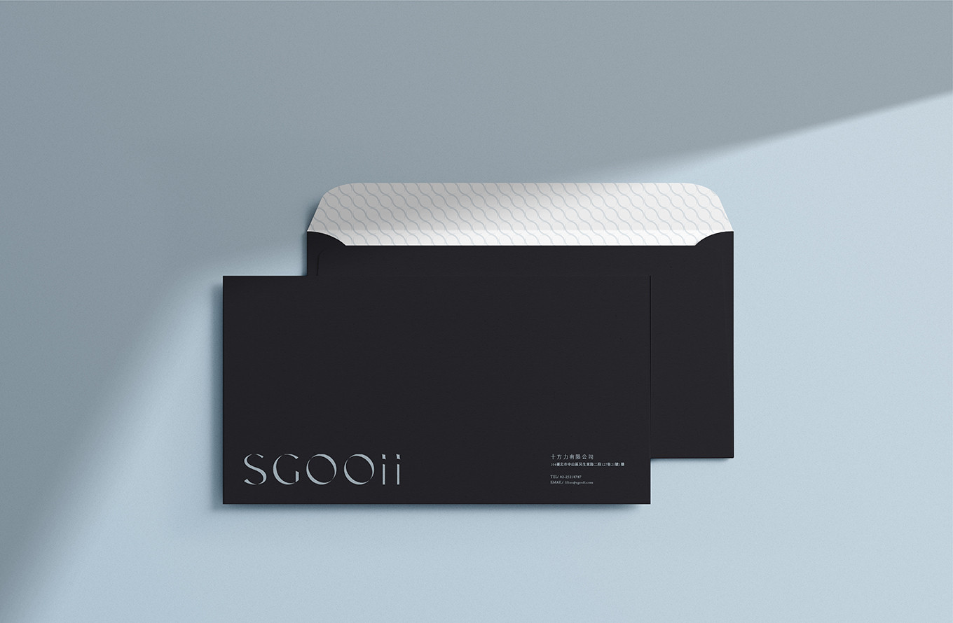
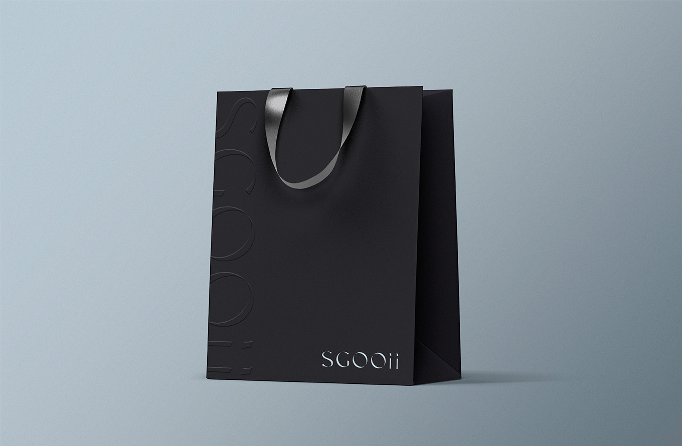
品牌標準字以細緻的襯線字體設計,傳遞出自信閃耀與優雅時尚,字體帶著立體轉動的視覺意象,如同消費者在遇見香爵後展現自信的自我;字骨內縮的曲線與尖端上揚的勾筆,也與英文標準字呼應優雅發光的概念;品牌色選擇曜岩灰與典雅藍相互搭配,有如銀河般,在宇宙中靜靜閃耀美好光芒。
檢視過程發現產品架構紊亂,導致消費者在選購過程無法快速被引導,透過四大產品線區分,解決原先頁面搜查不易、產品屬性不清晰的問題,並透過影像風格的規範,讓整體瀏覽更加統一,不會因為品牌的差異而導致視覺混亂。
走過迷惘的道路,看著香爵找回初心,品牌本質透過這段路程更加清晰,期待他們持續用挑惕的眼光,滿足每個人的日常所需。
"In the applause, we looked inward and held even closer to the values we had always believed in." — Lilian, Founder of SGOOii
SGOOii began with its founder's personal recommendations, building a loyal following through word of mouth and eventually becoming Taiwan's exclusive distributor for multiple Japanese and Korean brands. The brand achieved strong results over the years yet somewhere along the way, began to lose sight of itself. Through deep and candid conversations between both teams in the early stages of the project, we brought the focus back to where SGOOii truly began: genuine sharing. Every product is personally used and endorsed by the founder herself a standard of quality that comes straight from the heart.
Through a thoughtful refinement of the English brand name, a deeper connection to the brand's identity was established. SGOOii draws its inspiration from the Japanese word sugoi meaning "wonderful" or "incredible." Through a reimagining of the letters, the original spirit is preserved while forming a new link to the Chinese brand initials SG. Within the name, "oo" stands for only option a symbol of singular, carefully selection. And the closing "ii," like two individuals standing side by side, represents every consumer who walks through's SGOOii door and discovers a better version of themselves.
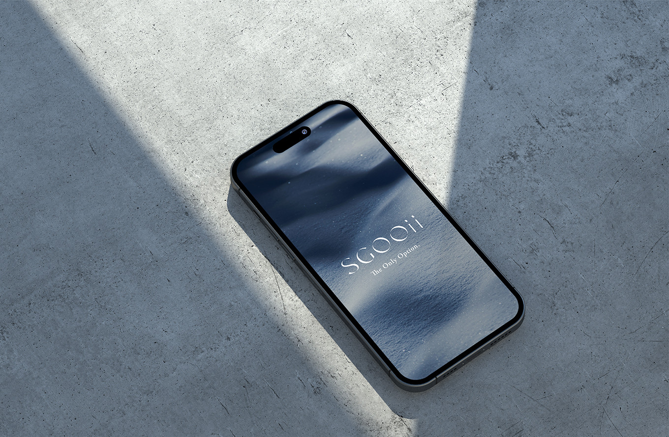
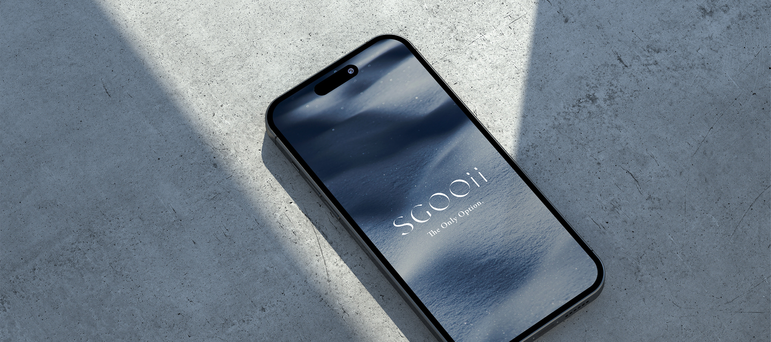
The brand logotype is set in a refined serif typeface, conveying confident radiance and elegant sophistication. The letterforms carry a sense of three-dimensional rotation as if turning to catch the light mirroring the self-assured glow of a consumer who has discovered SGOOii. The inward-curving strokes and upward-flicked terminals echo the English logotype's overarching concept of elegant luminosity. The brand color palette pairs volcanic rock grey with refined navy blue quietly shimmering together like a galaxy, casting a beautiful, steady light across the universe.
A review of the brand's product architecture revealed considerable disorder, leaving consumers without clear guidance during the shopping journey. By restructuring around four distinct product lines, the issues of difficult navigation and unclear product categorization were resolved. A unified visual style guide for imagery was also established, ensuring a cohesive browsing experience that no longer creates visual confusion despite the diversity of brands carried.
Through the haze of uncertainty, watching SGOOii rediscover its founding heart was a journey in itself. The brand's true essence has emerged from this process clearer than ever. We look forward to seeing them continue forward with their discerning eye, meeting the everyday needs of every individual they serve.