Zymore.Enzyme
Branding Visual Identity
Packaging Design
品牌 : 酵慕兒
Client : Hong Kong Healthcome International CO., LTD
Brand : Zymore | Enzyme
Published on 09. 04. 2018
Zymore.Enzyme
Branding Visual Identity
Packaging Design
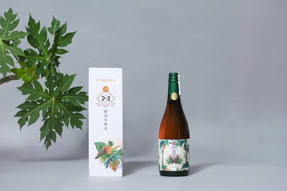
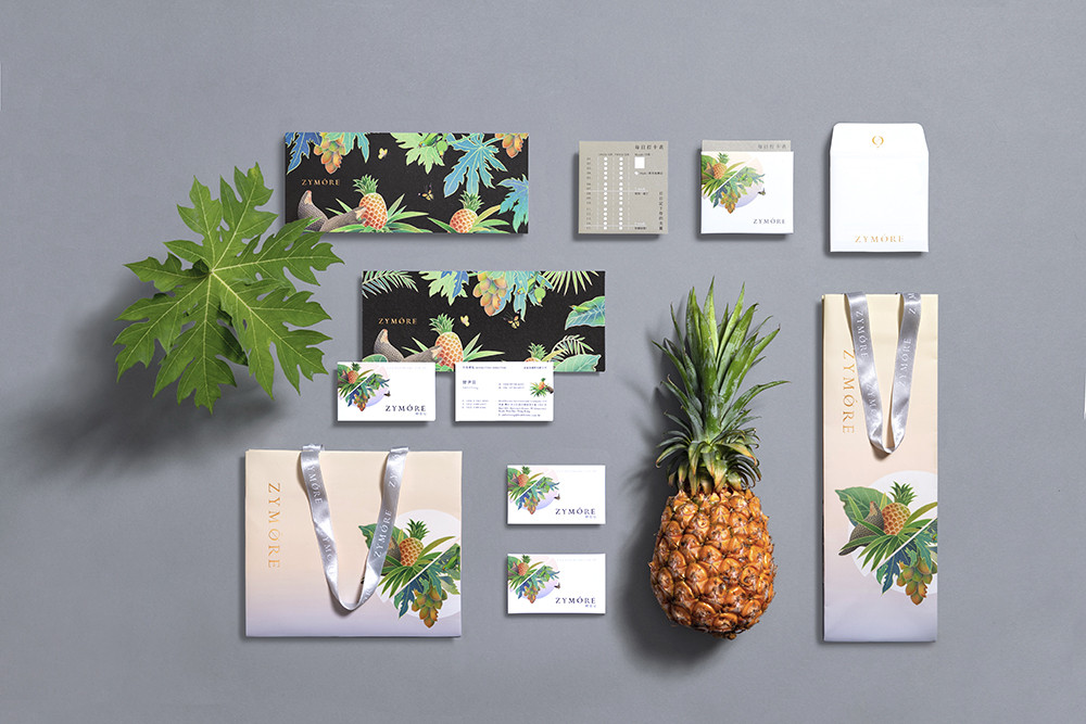
“ Zymore酵慕兒酵素 ” 將大自然的恩惠,用最單純的形式呈現。僅選揀鳳梨、木瓜兩種具高活性真酵素的水果,透過高科技萃取出二種水果酵素、調配綜合果汁,2X2的雙雙配對,打造雙倍以上營養優物。
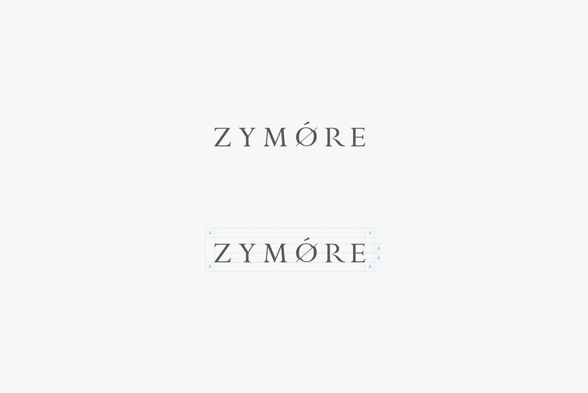
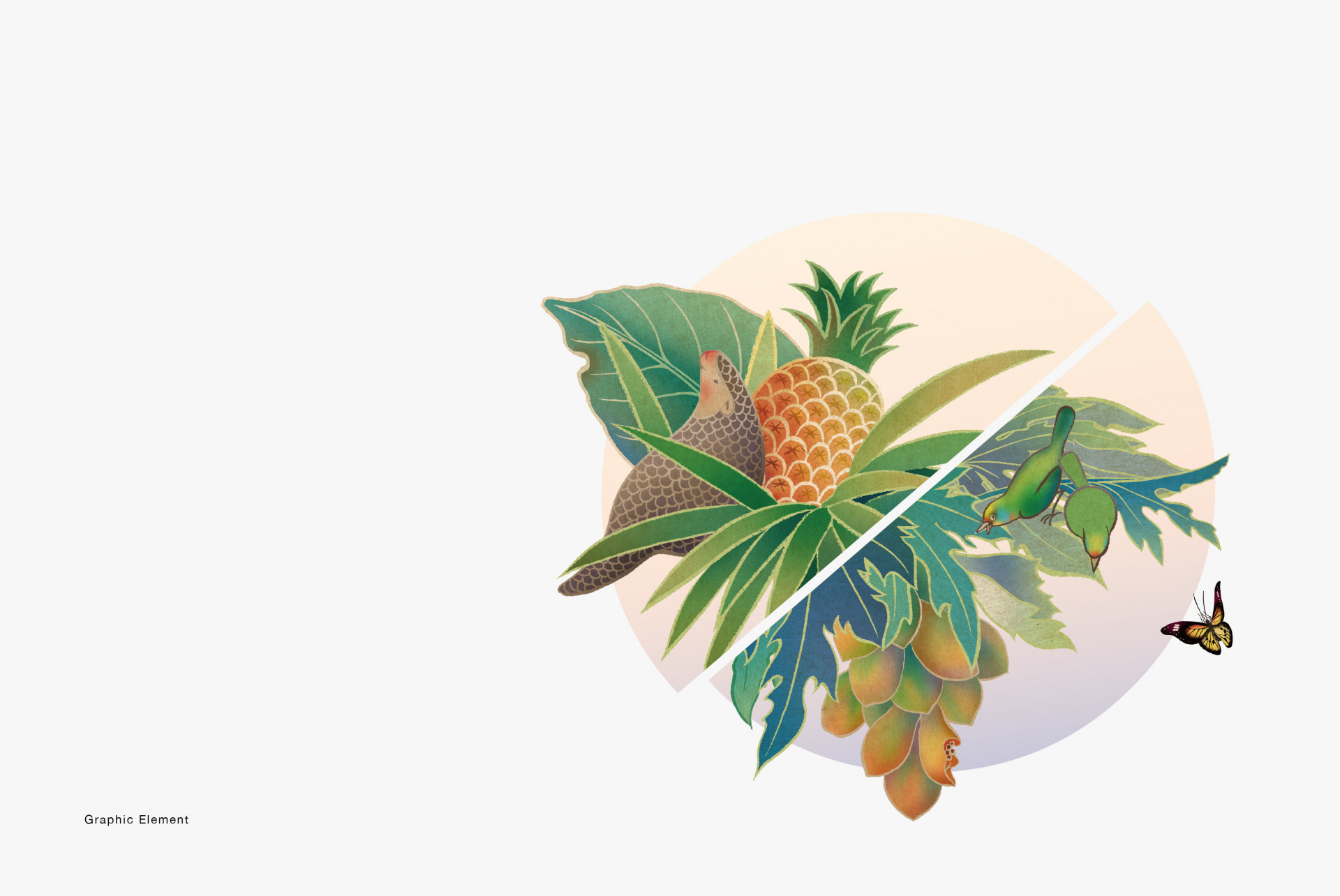
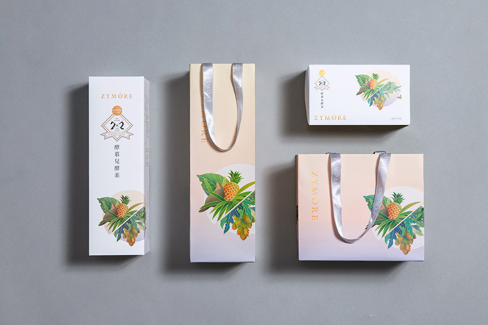
識別上將兩種水果碰撞一起的滋味透過「O」呈現,藏入兩果酵素的雙拼小巧思。輔助圖紋恰巧與logo相呼應,依據鳳梨和木瓜的屬性,連結穿梭於果園的穿山甲與五色鳥們,代表著產地的純淨無污染。包裝上為凸顯品牌使用2種原料的單純,在畫面的構成上使用對稱的手法。從形象到包裝,整體傳遞亞熱帶的摩登時尚,更呈現生活中值得細細品味的雅緻。
“Zymore Enzyme” present the grace of nature with the simplest way. Only chose two fruits “pineapples & papayas” which with highly active enzyme, extract the enzyme from those two fruits through high technology then blending comprehensive juice, pineapple enzyme multiplied by papaya enzyme equal to a double nutritionally superior drink.
In the visual image, present the two fruits bumped together in a “O”, just like two flavors bumped together in a drink. According to the characteristic of pineapple and papaya, the pangolins and the Muller’s Barbets are designed in the image represent the pure with no pollution in the place of production. From the image to the packaging, present the modern fashion of Subtropical, also shows the elegant life that needs to feel it tardily.