Branding Design
Client
同興實業股份有限公司
Brand
同興 THE food co.
_
Executive Creative Director
Ying-Fa Wang
Executive Project Director
Hsiu-Ju Hsu
Art Director + Designer
Cih-Wan Wang | Ting Ju Lin
Project Planning
Chih-Chia Chang
Published on 2025/5/25
Branding Design
{ 從八十年貿易根基到 #國際食材選配專家 的轉型之路 }
同興實業深耕市場八十年,作為台灣堅果、果乾與乳製品的重要進口推手,擁有極其深厚的專業代理底蘊,在企業穩定發展的時刻,也開始回過頭思考自身定位,在品牌八十年之際腳步持續邁進尋求更大的突破,從代理企業商的印象邁向建構同興語彙的品牌之路。
|企業既有視覺印象|
*視覺形象較傳統: 既有識別形象難以在國際市場與2B銷售中建立現代化的品牌記憶。
*價值主張待梳理: 缺乏具說服力的視覺語彙,在競爭激烈的供應鏈中,容易陷入價格戰,或面臨大型通路直採體系的挑戰。
*世代溝通的斷層: 既有的傳播風格難以觸及數位時代,需要系統化的品牌語言進行溝通。
❝ 品牌升級策略-國際食材選配專家 ❞
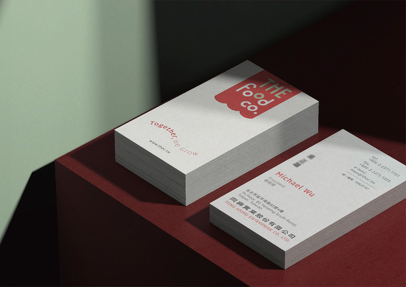
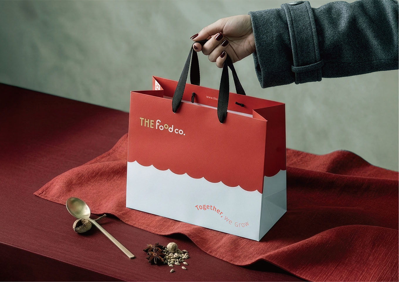
將同興從單純的商品代理商,重新定義為值得信賴的國際食材選配專家,確立「選得對、供得穩、走得遠」的品牌信念,強調對全球優質原料的把關與長期共榮的合作關係 。以Together, We Grow作為品牌標語,傳遞與夥伴共創興盛的願景。
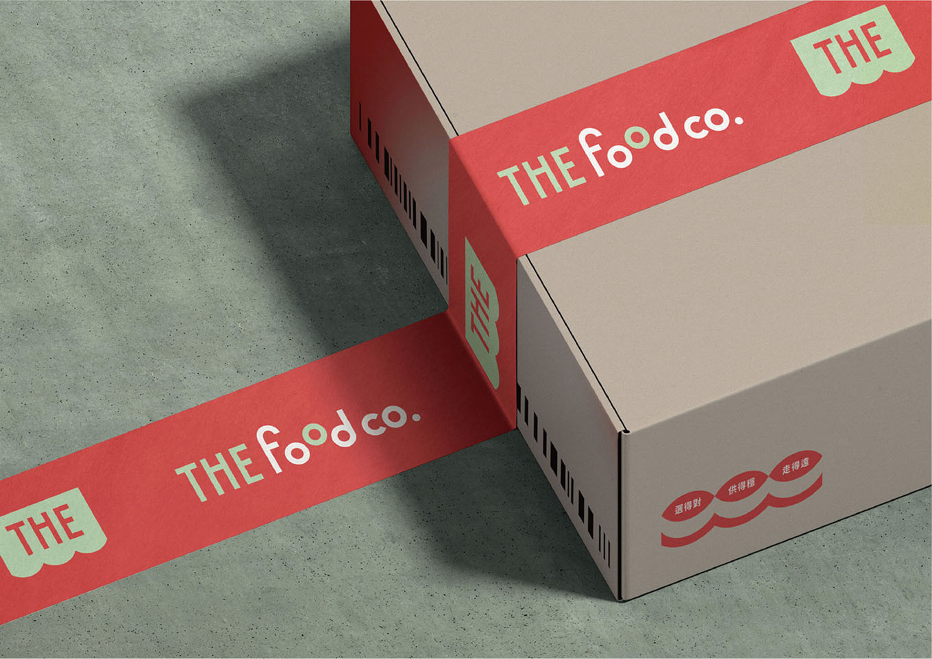
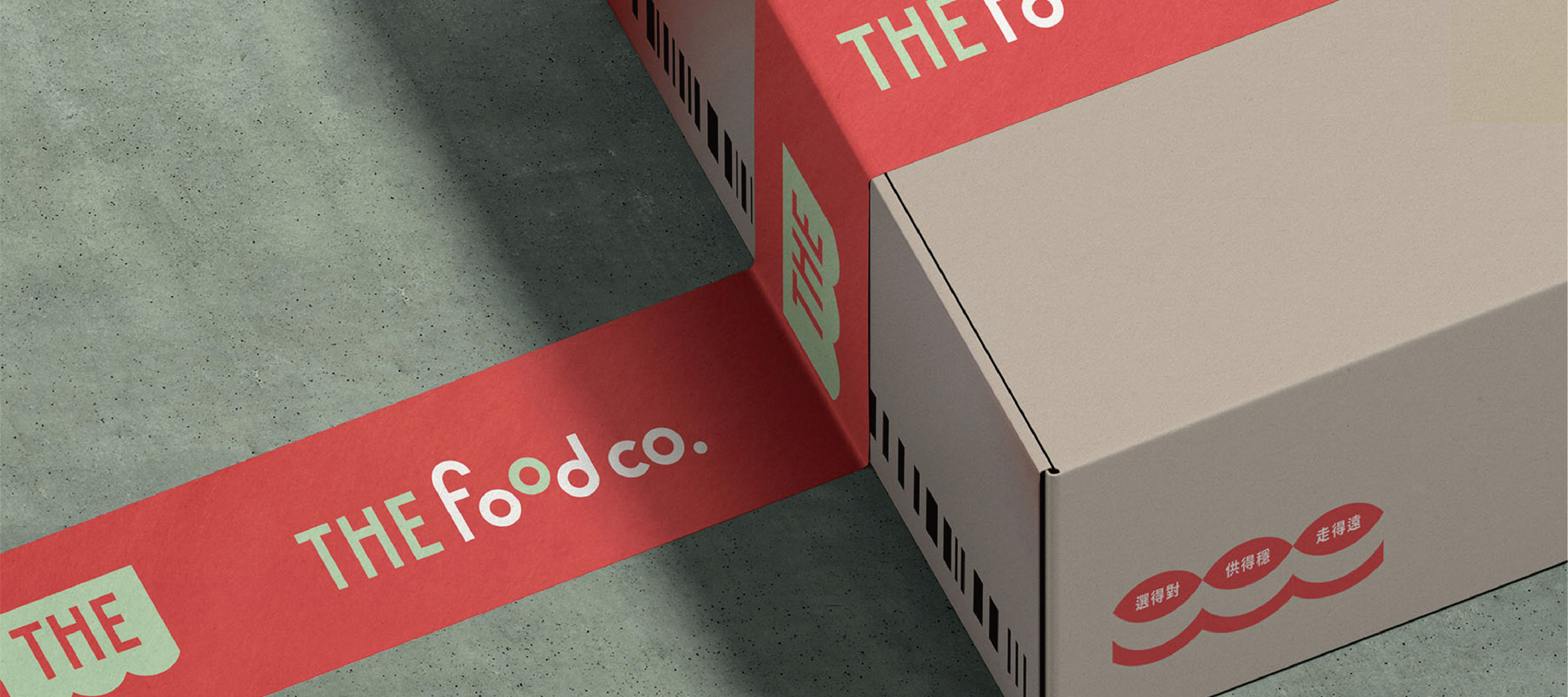
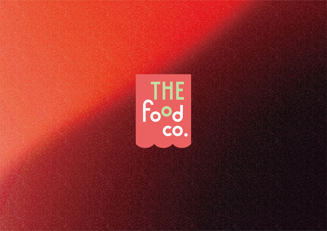
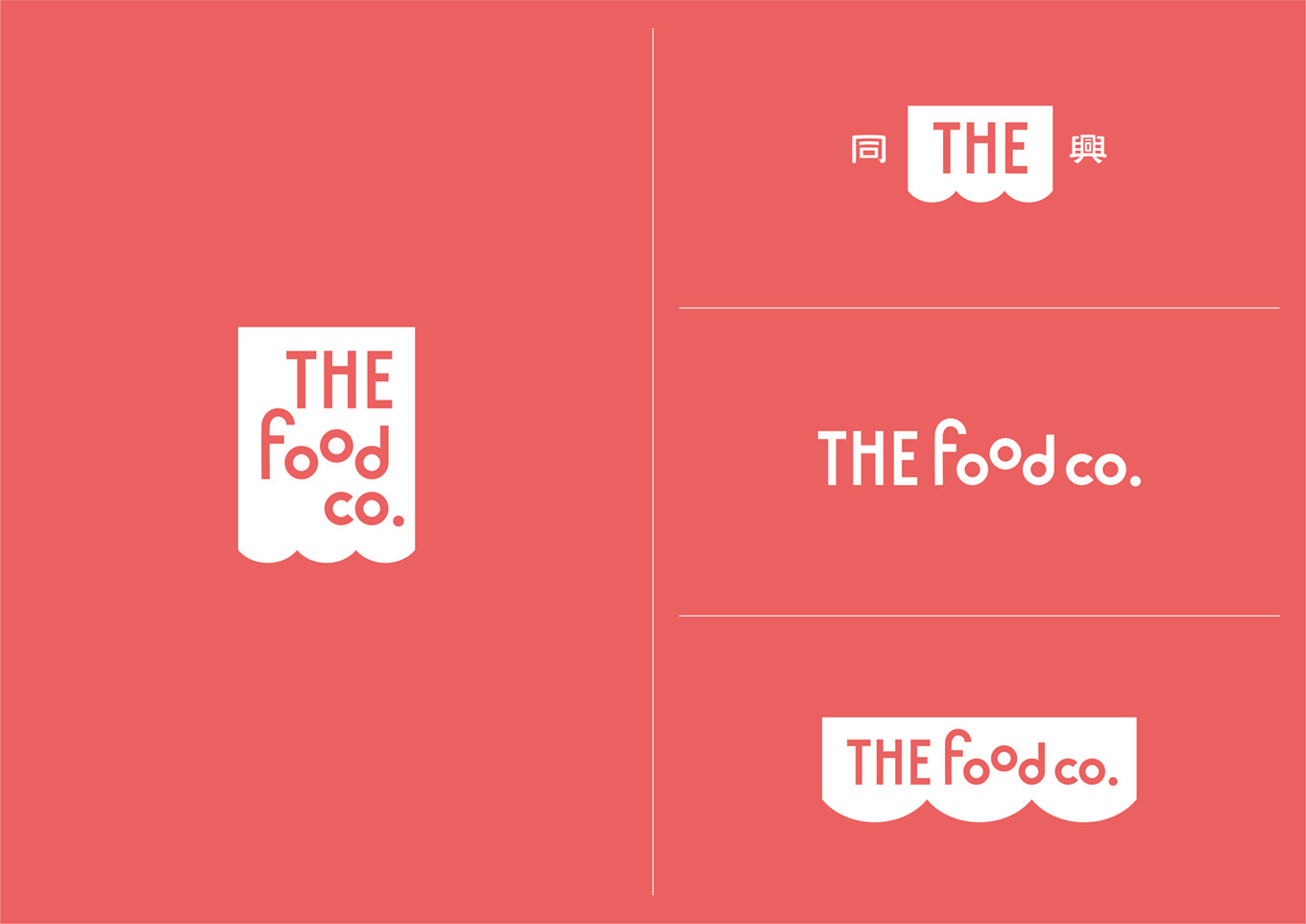
⟡品牌英文名: 重新定義及聚焦英文名稱「THE food co.」THE象徵標竿與唯一,food co.則明確傳達其為食材為核心的企業,名稱突顯同興作為可信賴的國際級食材選配專家定位。
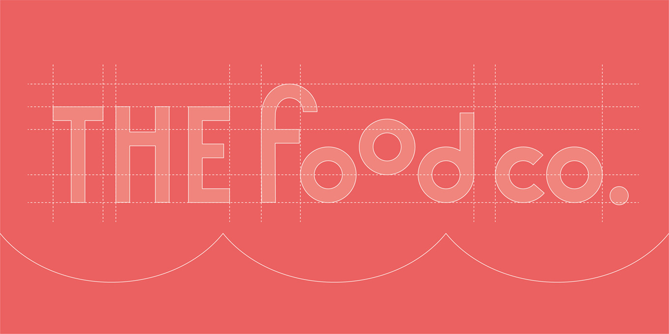
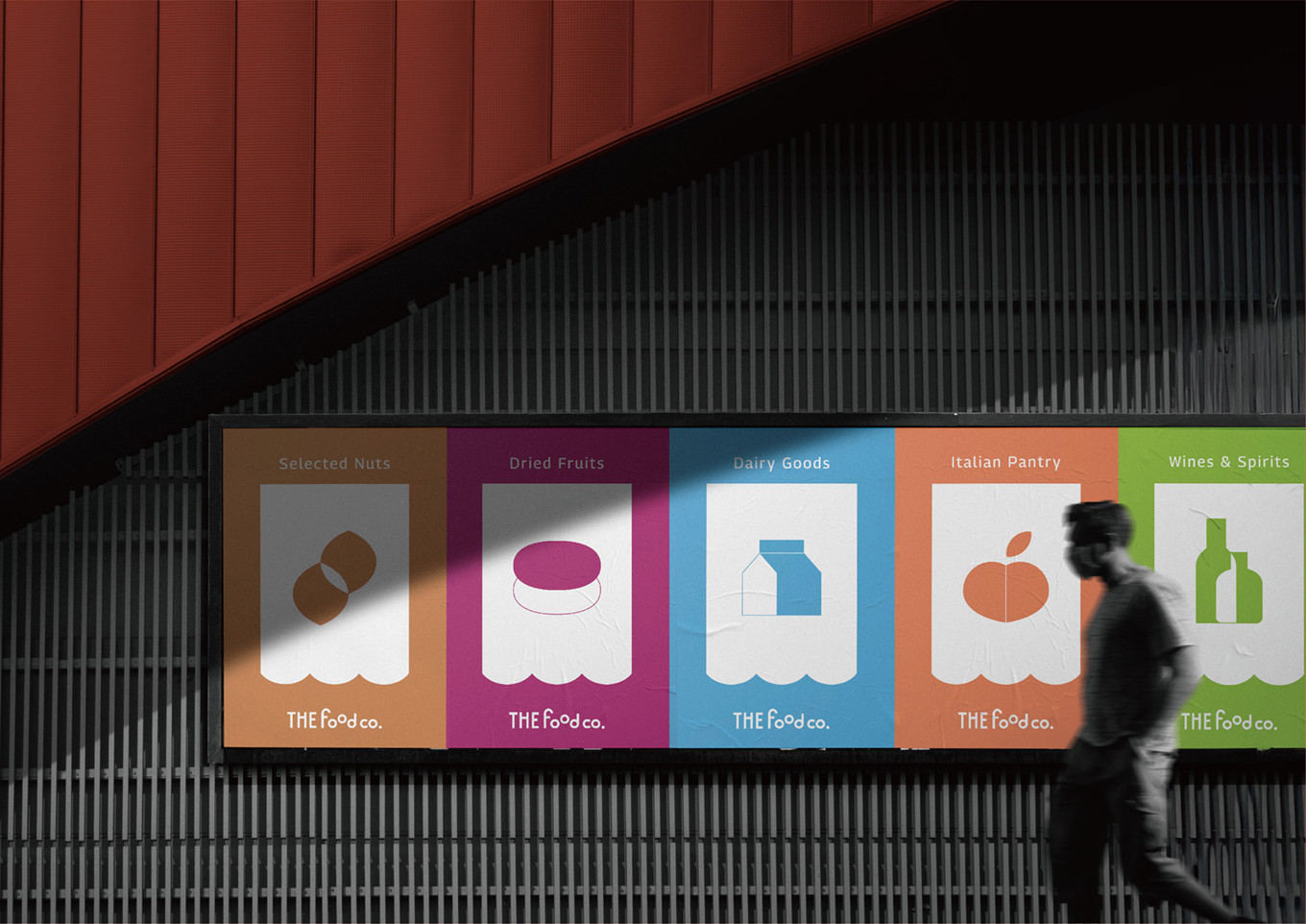
⟡識別意象: 識別靈感來自緩緩拉開的帷幕,象徵每一項食材的選配,都是一場精心策劃的展演;字體採用現代、俐落的線條,大幅提升品牌的專業感與國際識別度,字母的編排呼應自然散落的食材,錯落且富有節奏,如同攤開挑選的食材,活力中蘊含秩序。在產品分類中,運用幾何圖形組合與低飽和度色塊,營造出簡約、乾淨且俐落的氛圍,精準呈現各品類的差異化特質。
⟡色彩哲學: 以溫潤的「暖陶紅」為基調,輔以清新的「薄荷綠」,並保留大量的視覺留白。不僅承載了品牌的情感溫度,也展現出高度的統一性與辨識度。
帷幕升起,我們將繁瑣的食材貿易轉化為眼前用心專業的選品展演。
同興THE food co.品牌升級之路,不僅是對過往的榮光致敬,更是對全球夥伴的一份承諾,在共榮的道路上,我們不只供應食材,也與您一同選配出共同興盛的未來!
{ 80 years of excellence in business, now an international food selection expert. }
THE food co. has been dedicated in business for 80 years, As a key driver of imports for nuts, dried fruits, and dairy products in Taiwan. It is already a professional enterprise, at a time of stable growth, THE food co. began to reflect on their positioning.
At their 80th anniversary, they press ahead in pursuit of new breakthroughs—transforming from an import agency into a brand defined by the unique language of Tong Hsing.
| Existing Corporate Visual Identity |
⟡Visual Identity: The original visual identity lacked competitiveness in the international market and hindered brand building with customers.
⟡Refine the value proposition: Without a compelling visual language, the brand struggles to differentiate—leading to price competition and pressure from large-scale direct sourcing channels.
⟡Generation gap: A generational communication gap exists, as traditional communication styles fail to connect with the digital era, highlighting the need for a systematic brand language.
Brand Upgrade Strategy – International Food Selection Expert
Tong Hsing is being redefined from a traditional product agent into a trusted international food selection expert. This transformation establishes the brand belief of “choosing right, ensuring stable supply, and moving forward,” while emphasizing strict sourcing of high-quality ingredients worldwide and long-term, mutually beneficial partnerships.
“Together, We Grow” serves as the brand slogan, expressing a shared vision of co-growth and prosperity with global partners.
⟡ Brand Name
The brand is redefined with a focus on the English name “THE food co.”, positioning it as a benchmark of excellence and uniqueness. “Food co.” clearly reflects that carefully selected food is at the core of the enterprise’s value, while “THE food co.” further emphasizes its role as a trusted international food selection expert.
⟡ Visual Identity Concept
The visual identity is inspired by a gently drawn curtain, symbolizing how each carefully selected ingredient is part of a thoughtfully curated performance. The typography features modern, clean lines that enhance the brand’s professionalism and international recognition. Letter spacing and composition echo the natural scattering of ingredients—rhythmic yet orderly, like ingredients laid out for selection, where vitality is balanced with structure.
In product categorization, geometric forms and low-saturation color blocks are used to create a minimalist, clean, and refined visual system, precisely expressing the differentiated characteristics of each product category.
⟡ Color Philosophy
The color system is grounded in a warm “terracotta red,” complemented by a refreshing “mint green,” and supported by generous negative space. This palette not only conveys the emotional warmth of the brand but also establishes a strong sense of consistency and visual recognition.
As the curtain rises, we transform the food industry into a stage of professional curation and selection.
THE food co. is an upgrade that not only honors its legacy, but also represents a commitment to global partners on a shared journey of prosperity—moving beyond food supply toward true co-growth.
 .
.  .
.  .
.  .
.  .
.  .
.