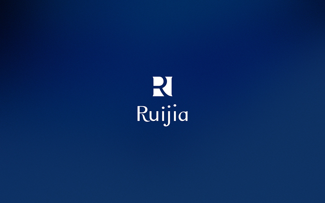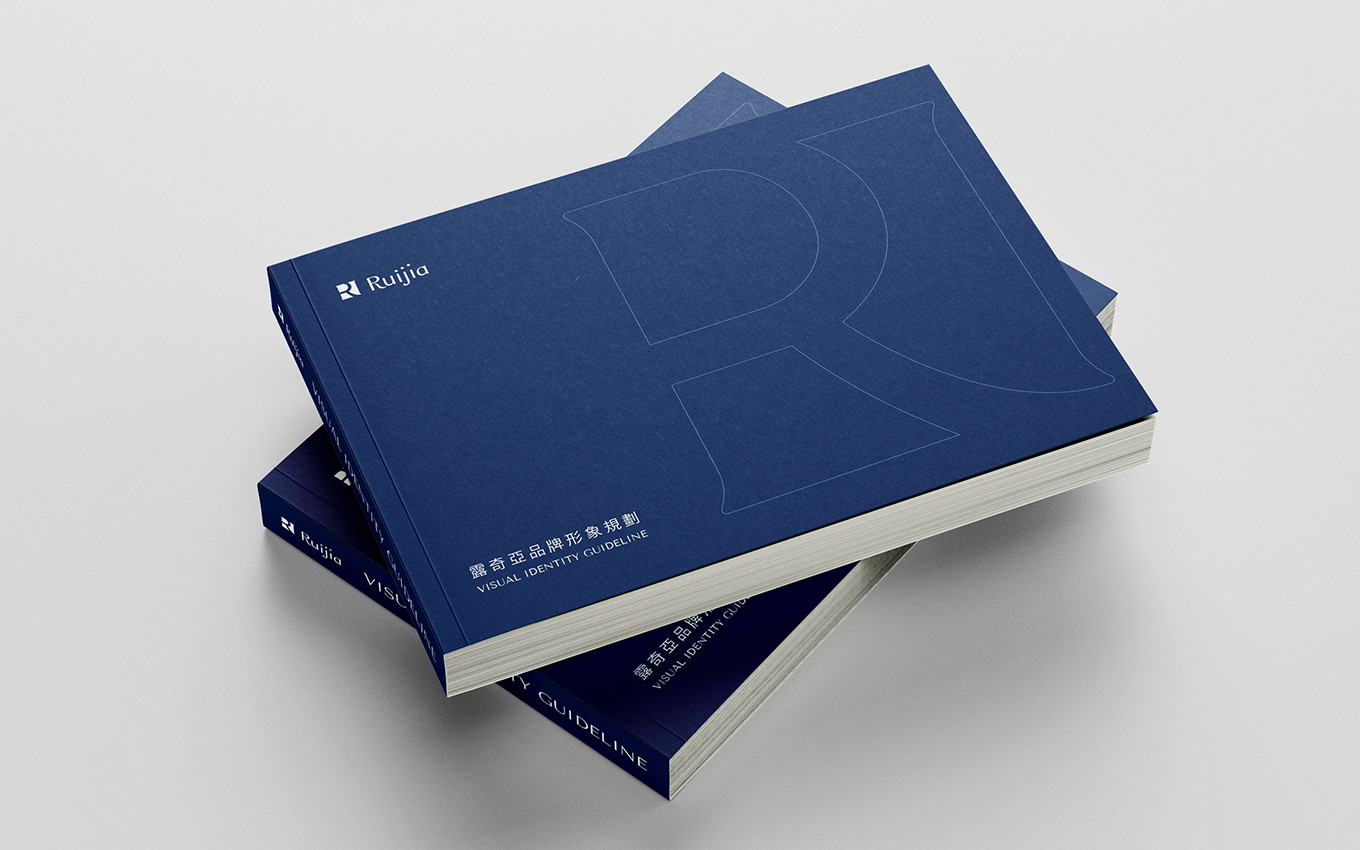
Ruijia
Health Supplements Brand
Branding Identity Design
Executive Creative Director
Ying-Fa Wang
Executive Project Director
Hsiu-Ju Hsu
Art Director + Designer
Cih-Wan Wang |
Szu-Ying Lu |
Shiang-Yin Su|
Szu-Ying Lu |
Project Planning
Mei Shiou Chen|
Chih-Chia Chang
Published on 08. 21. 2025
Ruijia
Health Supplements Brand
Branding Identity Design
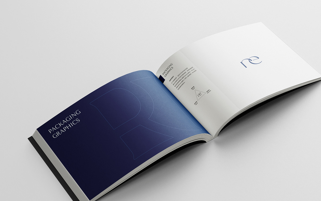
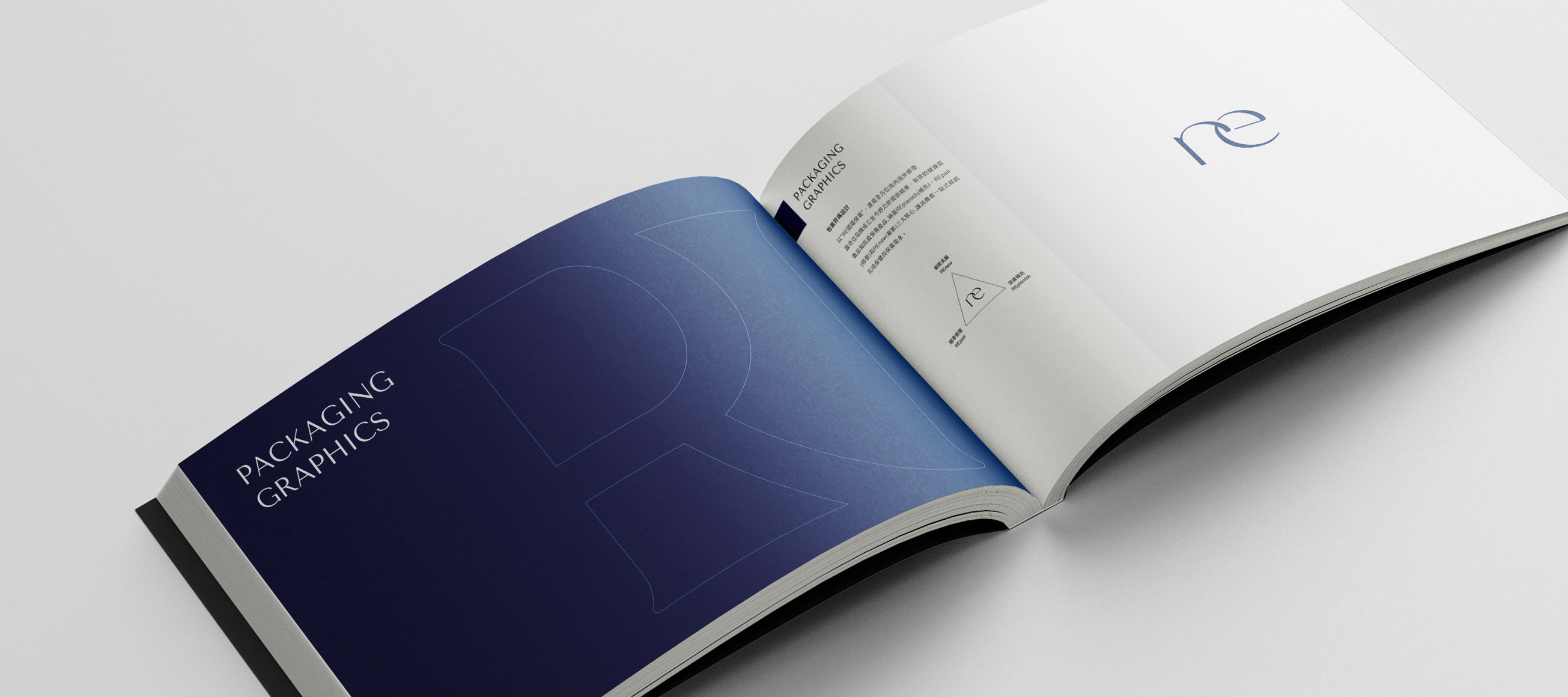
以初心信念・打造修復保健品牌💙
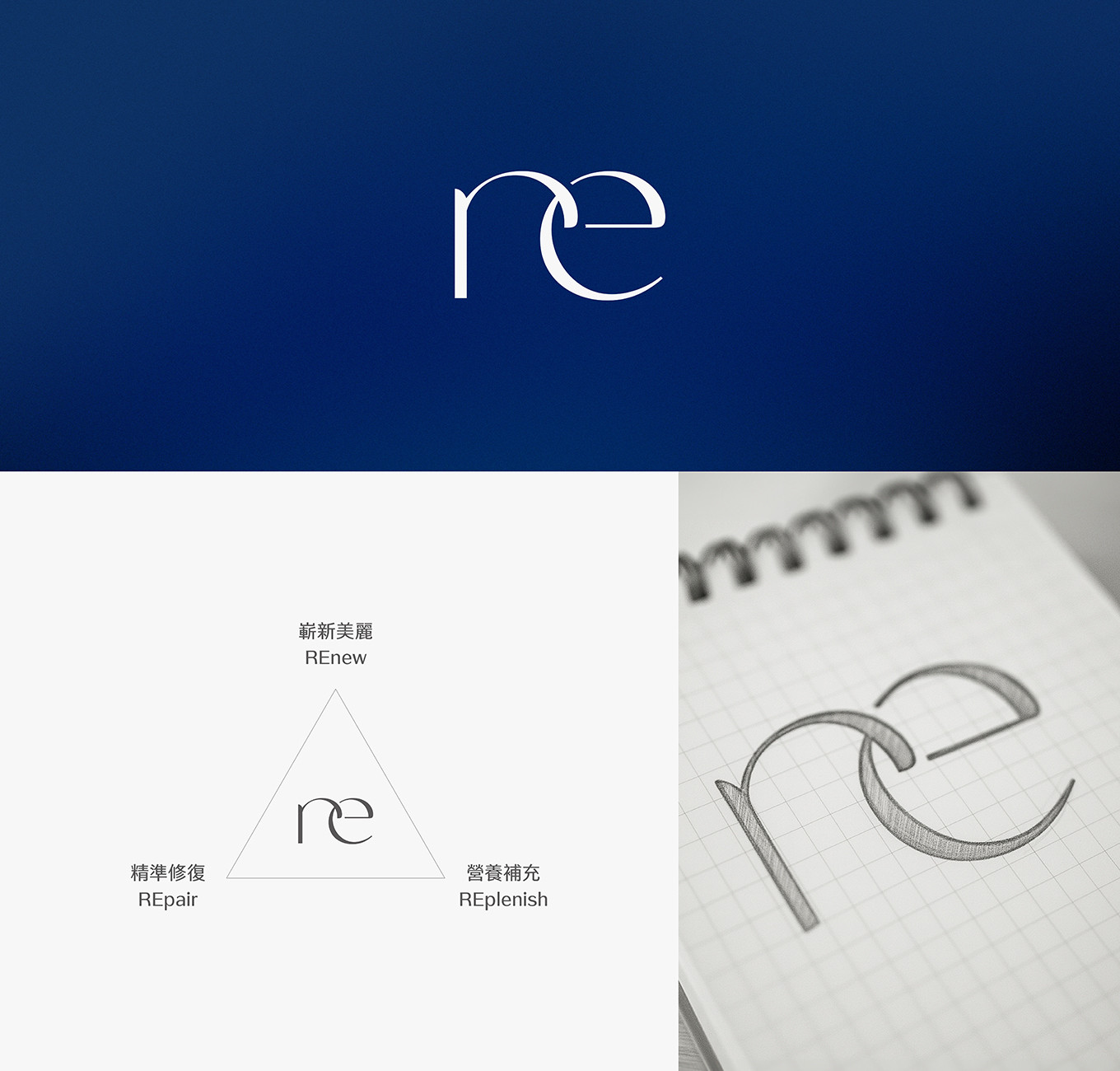
Ruijia 以致力打造「成分安心,足量有感」的本土專業保健品牌。品牌在定位與發展的過程中,經過多次深度討論與修正調整,凝聚出Ruijia獨特的品牌核心理念「re・循環保養」
・Replenish|營養補充 ・Repair|精準修復 ・Renew|嶄新美麗
以三大面向傳遞品牌從消費者需求出發,精準打造切合時下所需且高效的產品,讓消費者面對玲琅滿目的保健食品市場能有更輕鬆、安心並有感的選擇。
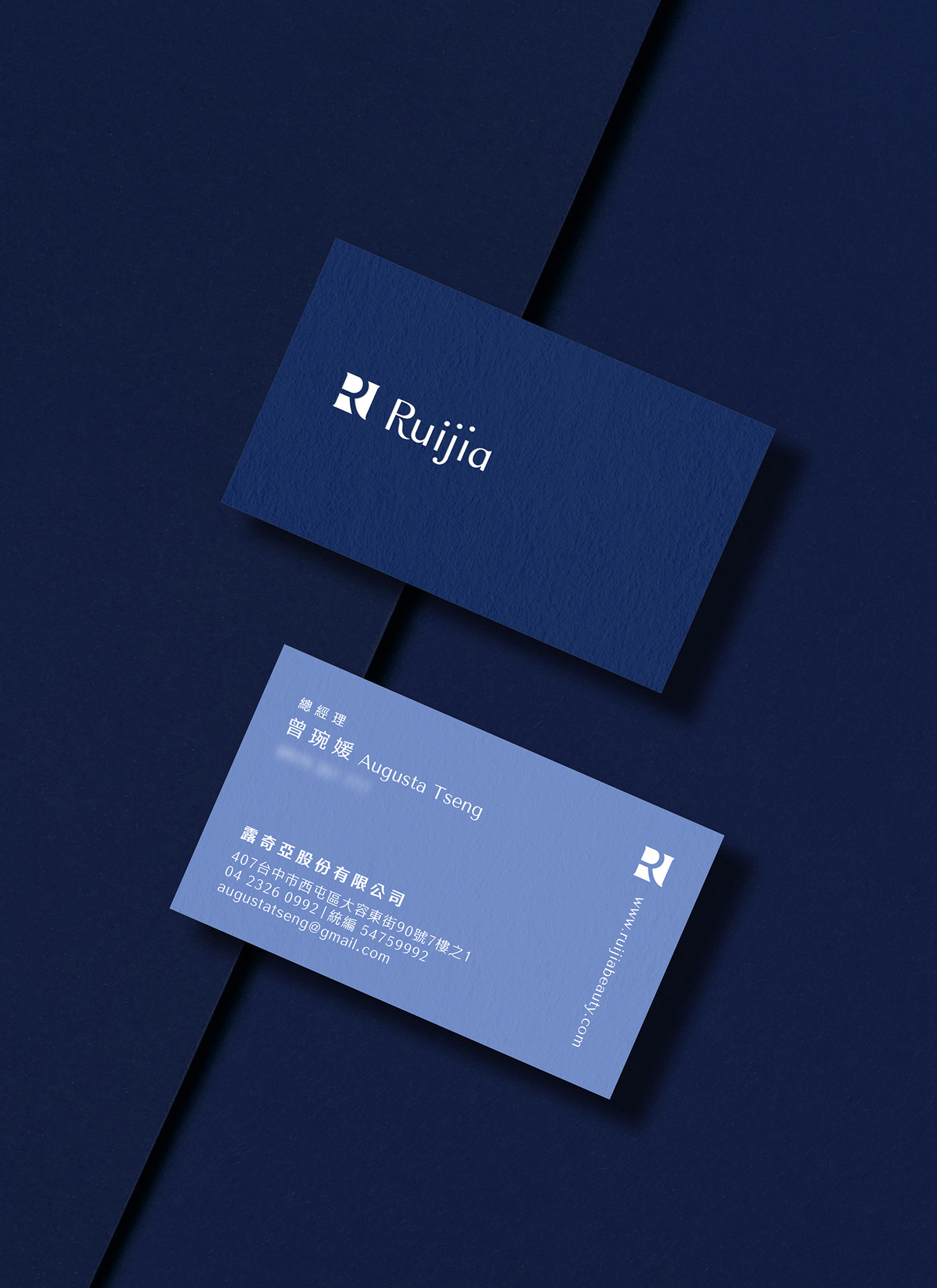
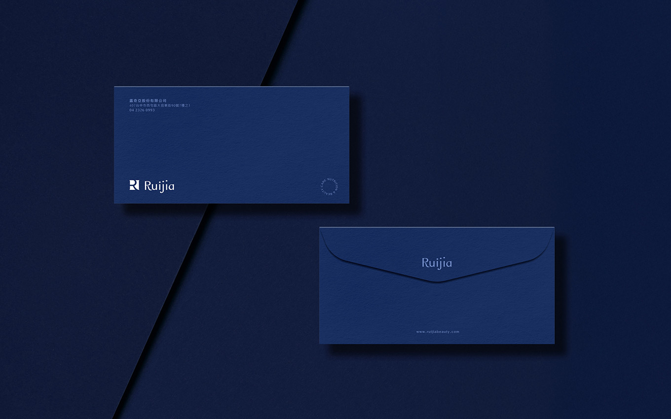
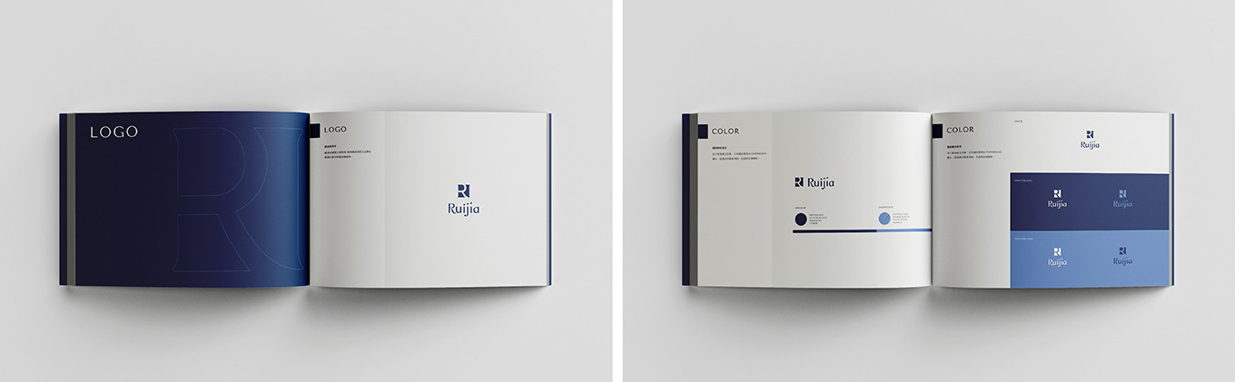
在品牌識別配色上,選擇代表沈穩與專業的深海藍作為主色,搭配象徵天然純淨的天空藍作為輔色,傳遞純粹且值得信賴的品牌理念。Logo取用品牌英文名首字母 R 作為設計,融合方正與圓弧的細膩線條,象徵產品製程的嚴謹與細節的把控,展現Ruijia對消費者保養修護的承諾。包裝設計上,將「re」字樣巧妙融入包裝視覺,並根據不同產品機能,搭配專屬符號排列成圓形圖騰,強化品牌識別度,同時傳遞出「循環保養」的品牌理念。
Building a legacy of healing, starting from the heart.💙
Ruijia is dedicated to building a premier local healthcare brand centered on the promise of "Safe Ingredients, Real Results." Through extensive refinement and strategic evolution, we have established our unique core philosophy: "re・Cyclic Care."
- Replenish | Nutritional Support - Repair | Precision Recovery - Renew | Radiant Transformation
These three pillars reflect our consumer-centric approach, delivering high-efficiency products tailored to modern needs. We aim to provide an effortless, secure, and impactful choice for consumers navigating the complex supplement market.
The brand’s visual identity features Deep Sea Blue as the primary color, embodying stability and professionalism. It is complemented by Sky Blue a symbol of natural purity to convey a brand philosophy rooted in trust and clarity.
The logo, centered on the initial "R," blends structured edges with refined curves to represent the rigor of our manufacturing process and meticulous attention to detail. This reflects Ruijia’s unwavering commitment to consumer care and recovery.
In our packaging design, the "re" motif is seamlessly integrated into the visual layout. Based on specific product functions, unique symbols are arranged into circular patterns, which not only strengthens brand recognition but also visually manifests our core philosophy of "Cyclic Care."