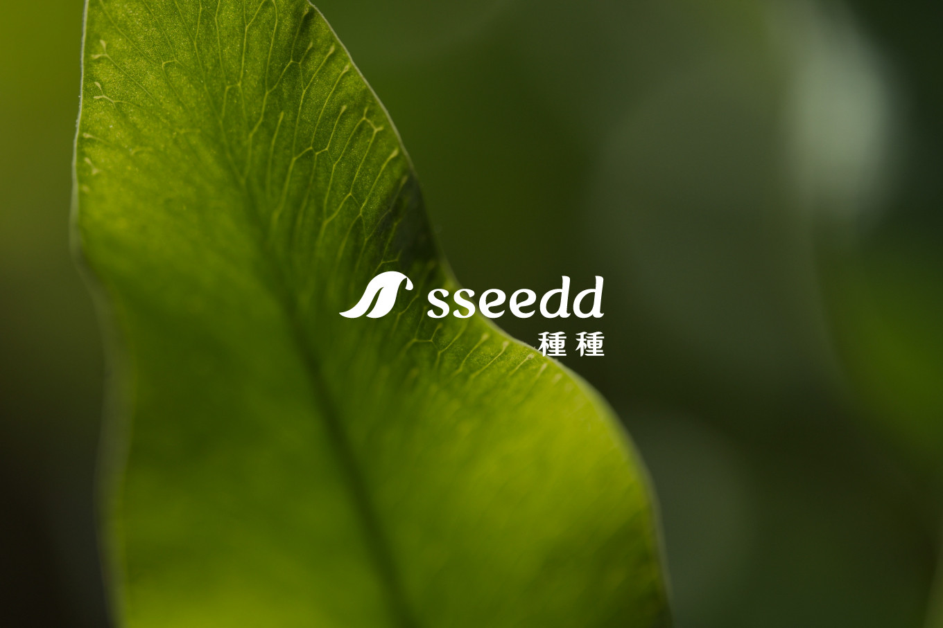
sseedd
Oil Product Line Brand
Branding Identity Design
Executive Creative Director
Ying-Fa Wang
Executive Project Director
Hsiu-Ju Hsu
Art Director + Designer
Cih-Wan Wang |
Shiang-Yin Su |
Ting Ju Lin
Project Planning
Chih-Chia Chang
Partner Company
祈邑設計 Chiyi Design
Published on 08. 08. 2025
sseedd
Oil Product Line Brand
Branding Identity Design
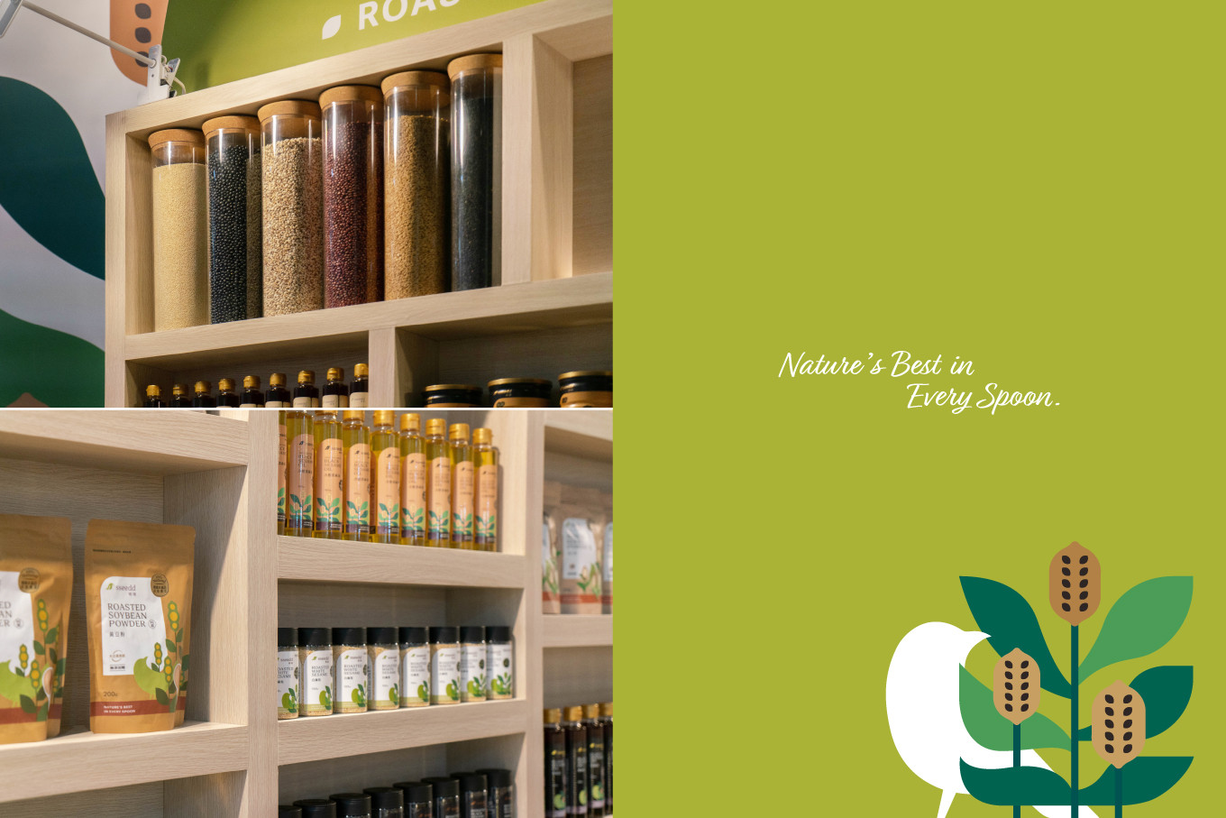
每一匙,都是大地的精華
Nature’s Best in Every Spoon.
三代傳承的經典品牌,隨著時代的步伐,悄然蛻變、煥然新生✨
從一顆細小的種籽出發,傳承的是對土地的敬意與對品質的極致堅持。超過一甲子的品牌,對原料的挑惕與對品質的細究堅持,而逐漸站穩市場;隨著消費市場變化,老品牌也期待打造新面貌。
〔品牌命名〕
sseedd 種種,品牌命名以「種」為靈魂,傳達 #好生活,從一顆好種子開始,扣合品牌主力產品為各種植物種籽,經由低溫冷壓與傳統壓榨工藝萃取而出的植物醇油系列、養生穀粉系列及拌醬佐食、機能營養系列等豐富多元的品項,疊字的命名設計,不僅強化記憶點,也帶有自然純真的俏皮感。
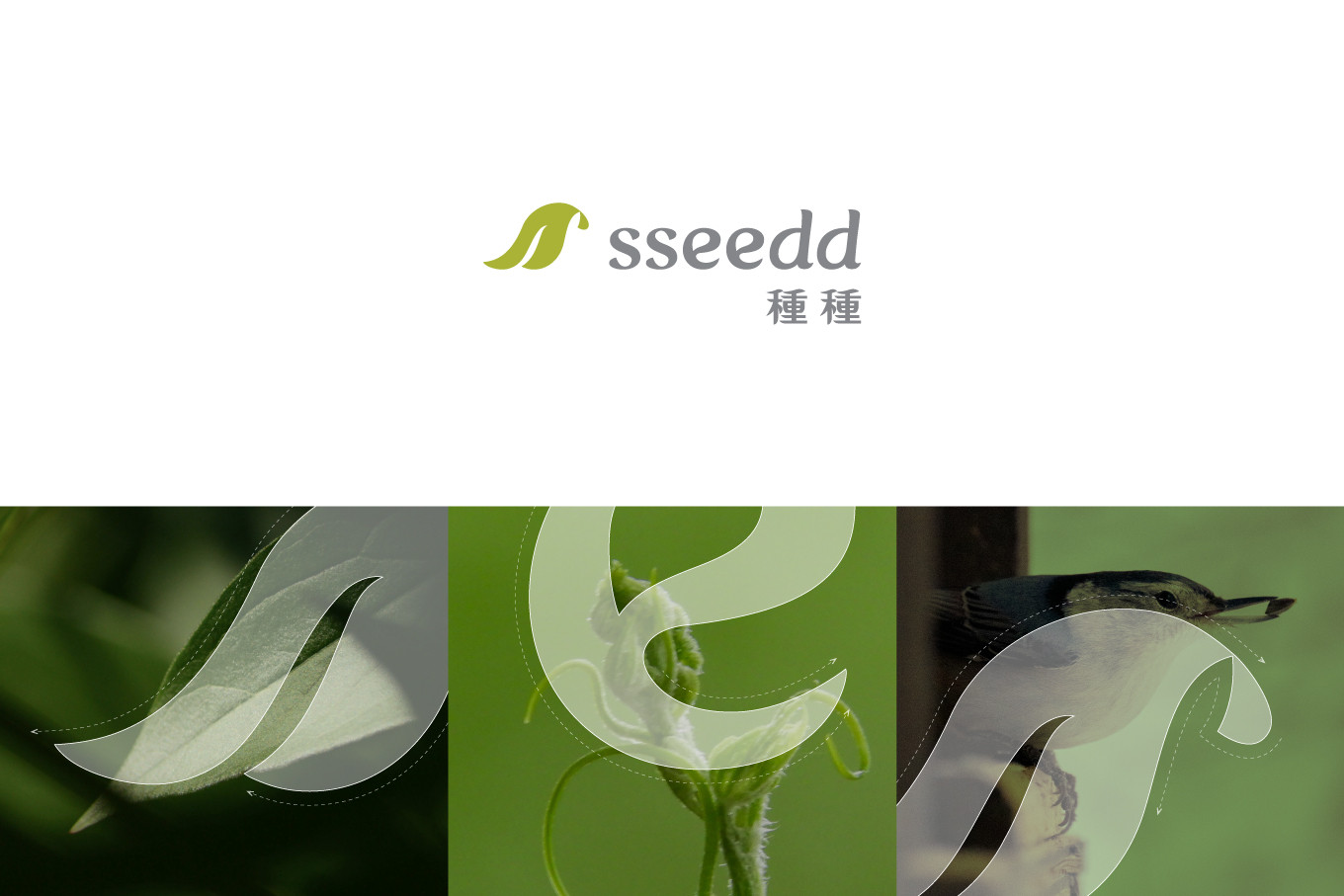
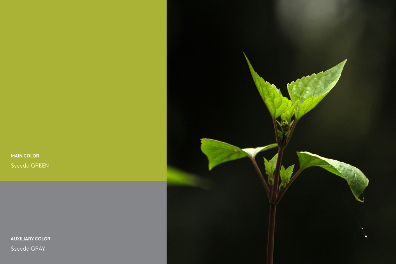
〔Logo設計X色彩規劃〕
以鳥散播種子的概念融合了葉片意象,傳達品牌與 #自然 共存的理念與富具#生命力。色彩規劃上以 #嫩芽綠 來連結品牌全產品提供消費者輕鬆照顧健康的面向;搭配中性灰來平衡整體視覺,也藉以傳達品牌沈穩踏實,嚴格把關製程。
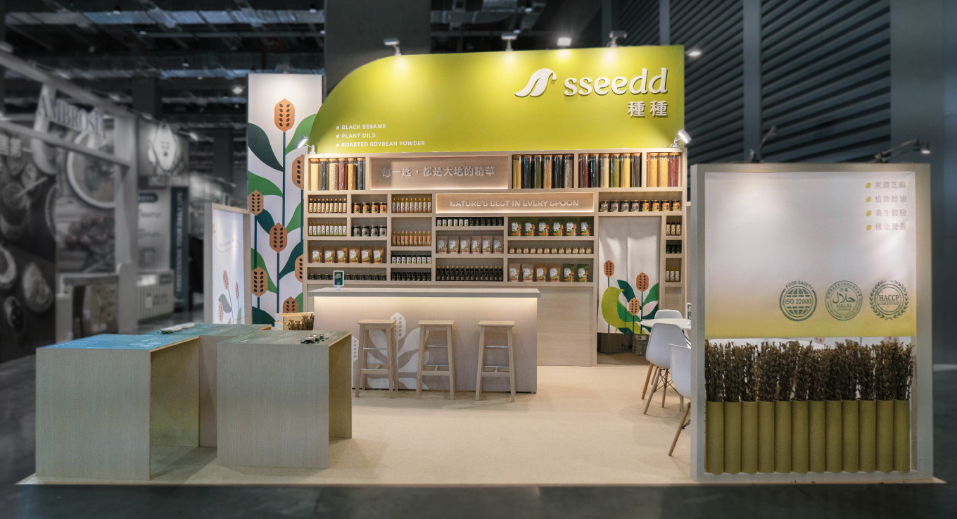
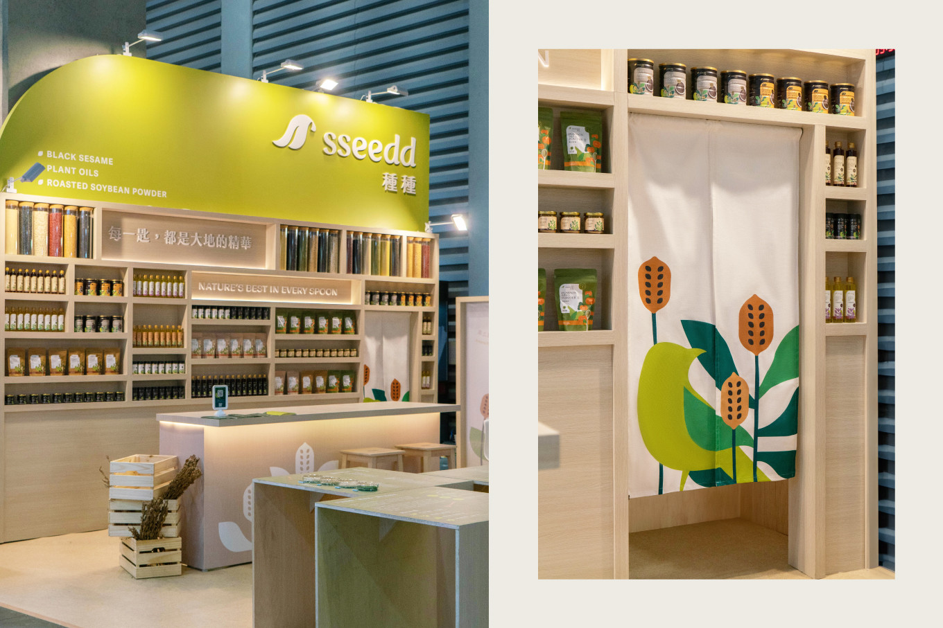
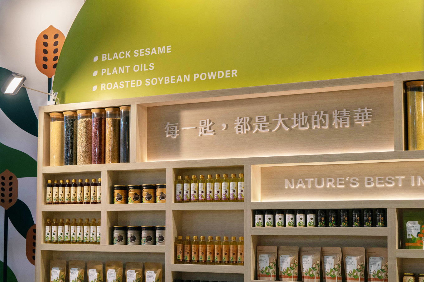
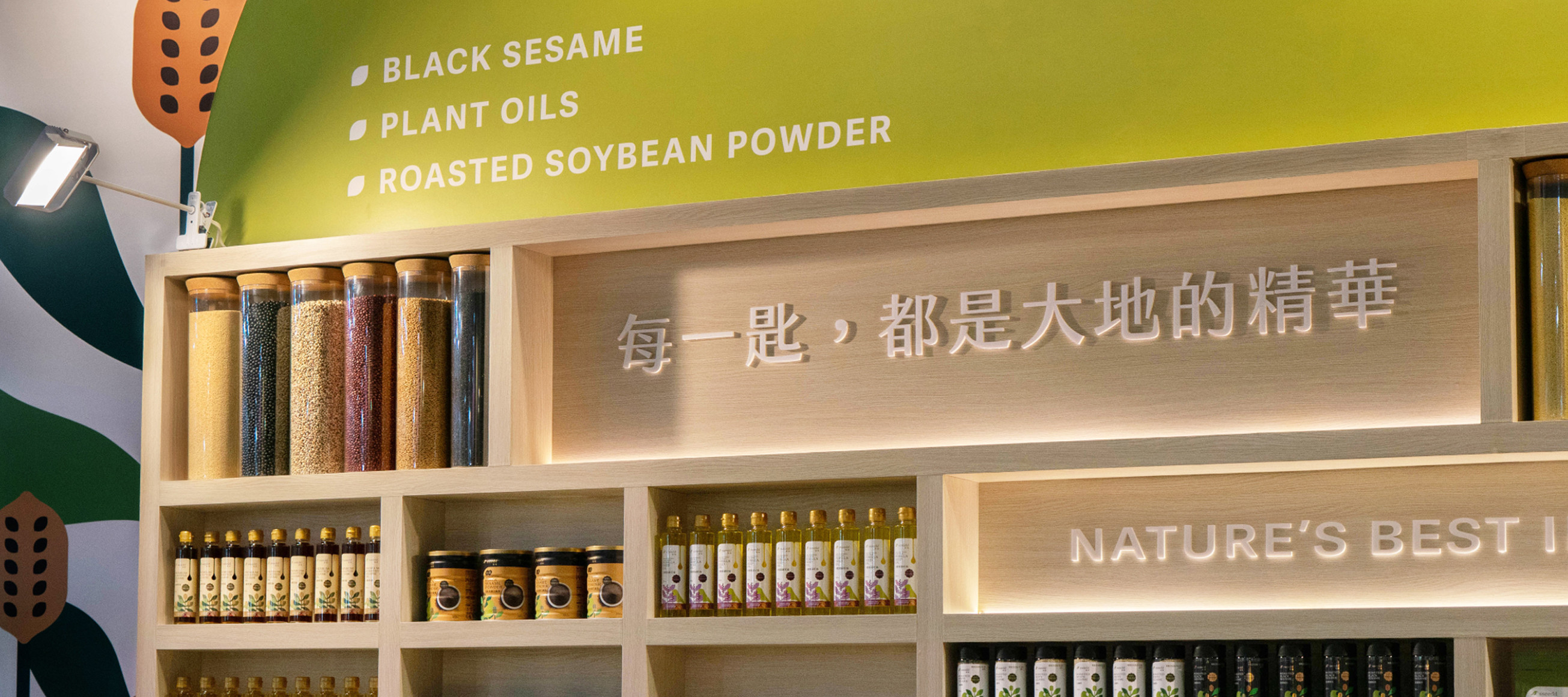
〔展場形象打造〕
展場規劃,除品牌主色 #嫩芽綠 之外,選擇了原物料木質調做搭配呈現傳達產品天然、純粹的意象。品牌牆完整展現品牌理念與全系列產品也規劃用系列透明罐展示不同種籽藉以強化品牌產品張力;搭配中央展示桌,讓參展者能細細品讀品牌故事、產品標準與理念,共同探索sseedd 種種全新的生命力,也更能理解品牌核心理念,逐步打造品牌好感度。✨
一起品嚐「種種」・重新定義每日的健康儀式!
Nature’s Best in Every Spoon.
A legacy spanning three generations, evolving and revitalized with the rhythm of time. ✨
It all begins with a single seed—a heritage of deep reverence for the land and an unwavering commitment to excellence. For over sixty years, their meticulous selection of ingredients and obsession with quality have defined their place in the market. Now, as the world changes, this storied brand embraces a bold new vision, blooming with a fresh identity.
〔Brand naming〕
sseedd: Where a good life begins with a single, exceptional seed.
At the heart of our identity lies the "seed"—the soul of everything we grow. Our name, sseedd, reflects our diverse range of premium plant-based oils, nutritional grain powders, and functional health series, all extracted through meticulous cold-pressing and traditional techniques. The playful, doubled-letter design not only creates a lasting impression but also captures the pure, rhythmic essence of nature.
〔Logo Design & Color Strategy〕
The logo concept visualizes a bird dispersing seeds, seamlessly integrated with leaf motifs to symbolize the brand’s coexistence with nature and its vibrant vitality. For the color palette, "Sprout Green" was chosen to represent the effortless health and wellness provided by the products. This is balanced by a "Neutral Gray," which grounds the visual identity and conveys the brand’s steady, meticulous commitment to quality control.
〔Exhibition Space & Brand Identity〕
The exhibition design pairs our signature "Sprout Green" with natural wood tones to evoke a sense of purity and organic origin. A dedicated brand wall showcases our philosophy alongside the full product range, featuring a curated display of various seeds in transparent jars to amplify the visual impact of our raw materials. At the central display table, visitors are invited to linger and explore the story of sseedd—delving into our standards and vision. It is a space designed to foster brand affinity and redefine daily wellness rituals. ✨
Experience "sseedd"—Redefining your daily health ritual.