Branding Visual Identity Design
芮暄國際興業有限公司
Brand
Rutini芮媞倪
_
Executive Creative Director
Ying-Fa Wang
Executive Project Director
Hsiu-Ju Hsu
Art Director + Designer
Cih-Wan Wang|Szu-Ying Lu
Project Planning
Chih-Chia Chang
Photographer
Ya-Chi Hu
_
Published on 12. 01. 2023
Branding Visual Identity Design
[營造植萃舒適的品牌氛圍]
Rutini芮媞倪以安心植萃成分、專業科學技術給肌膚最溫柔的呵護!
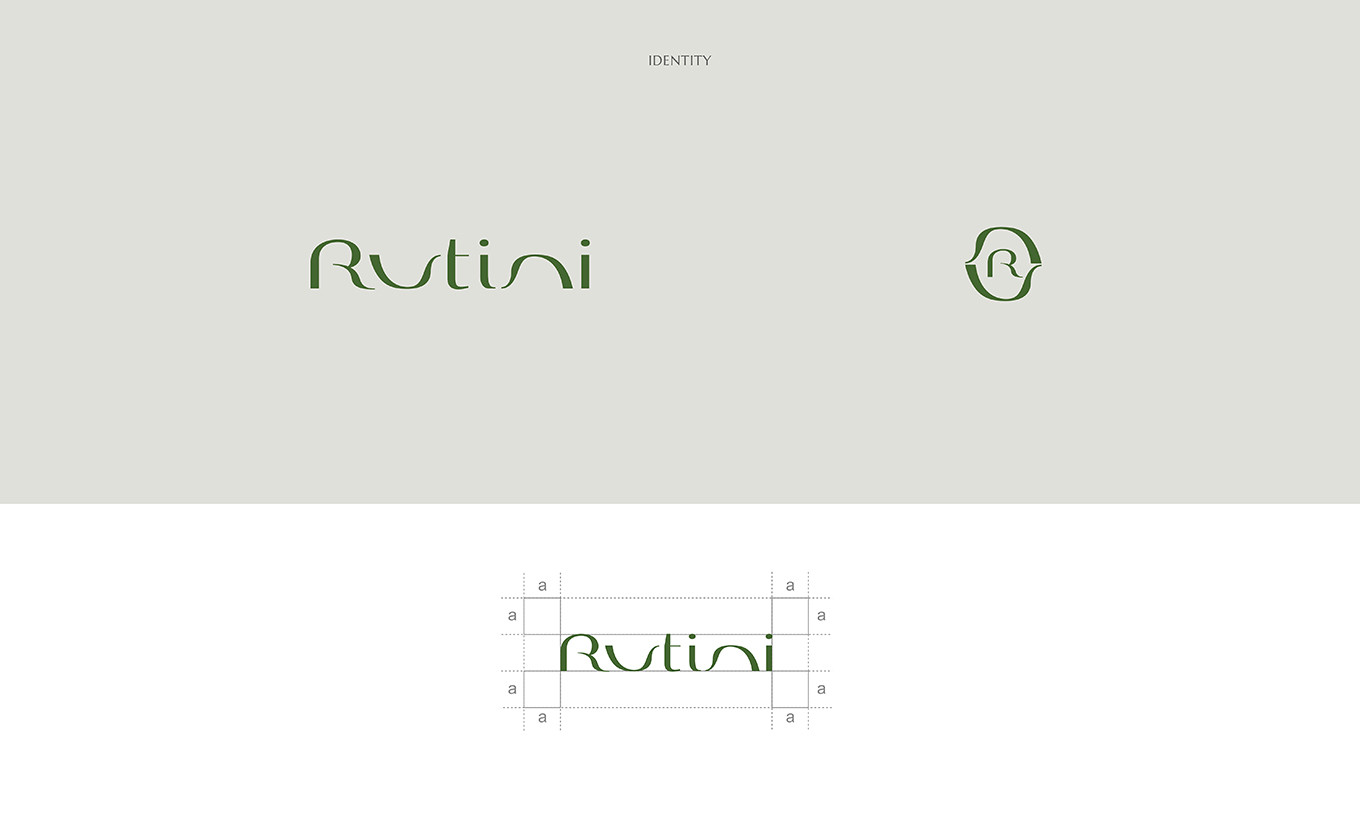
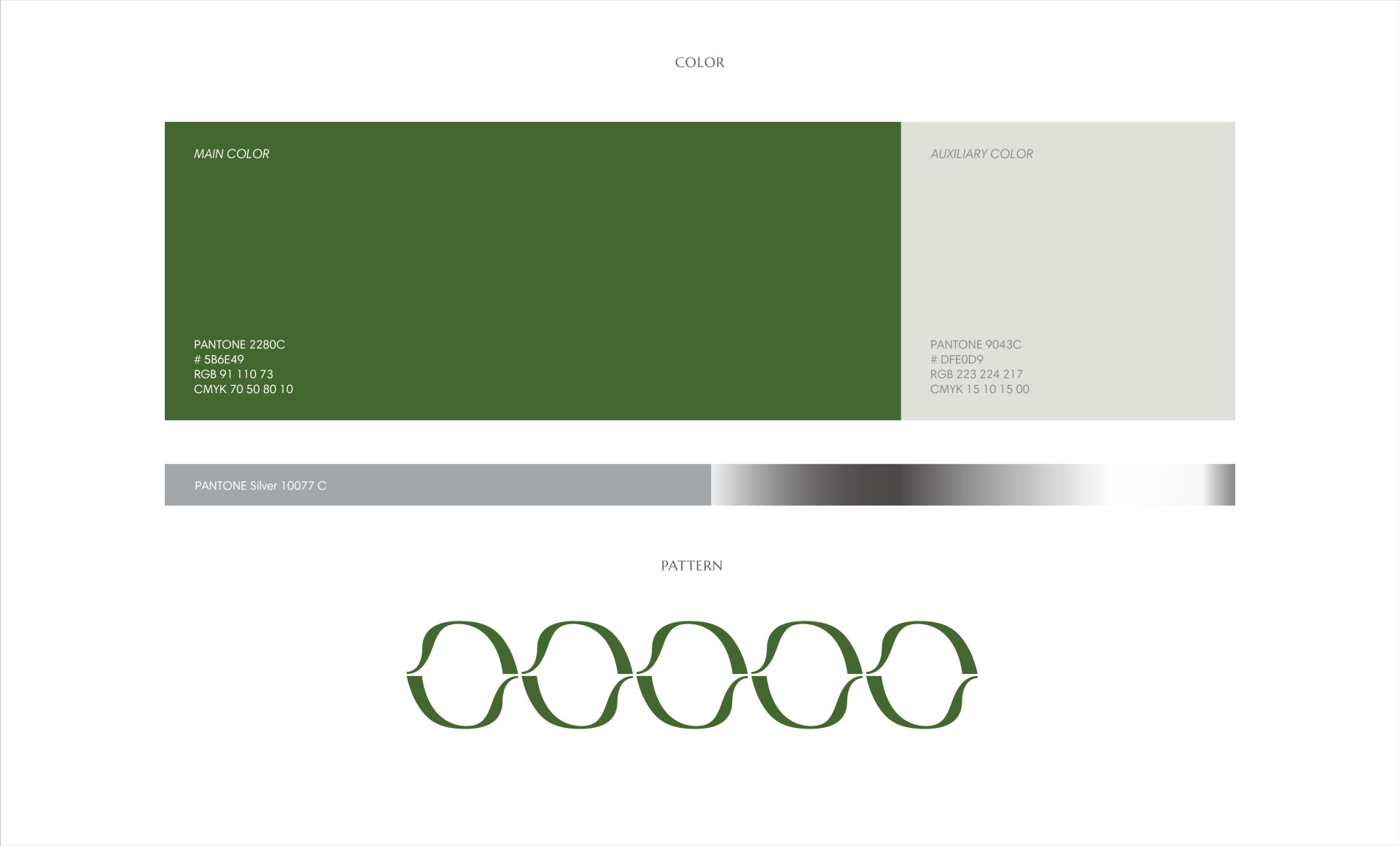
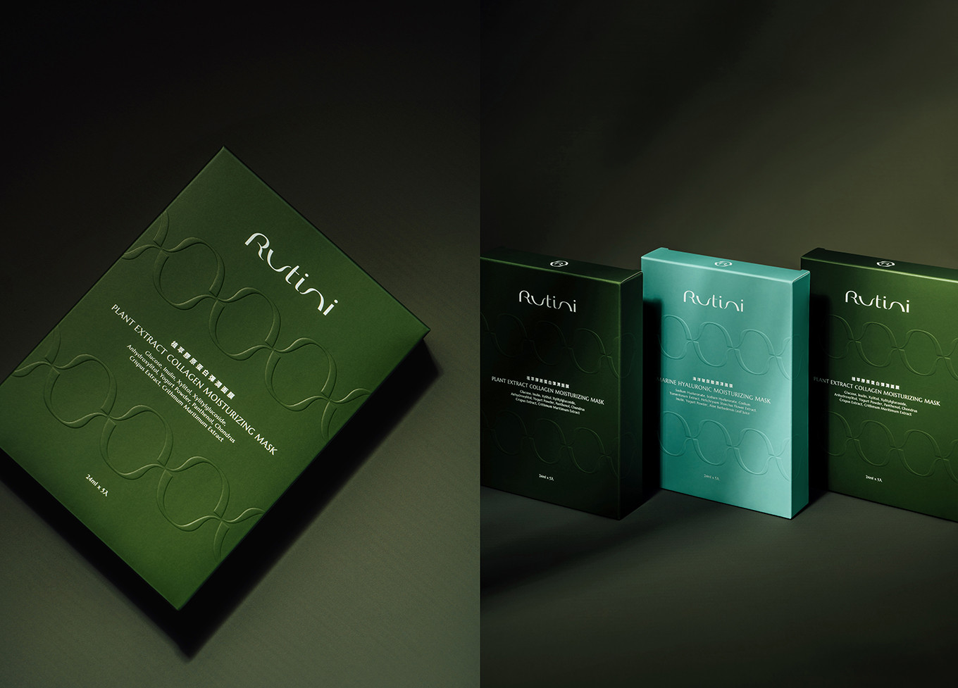
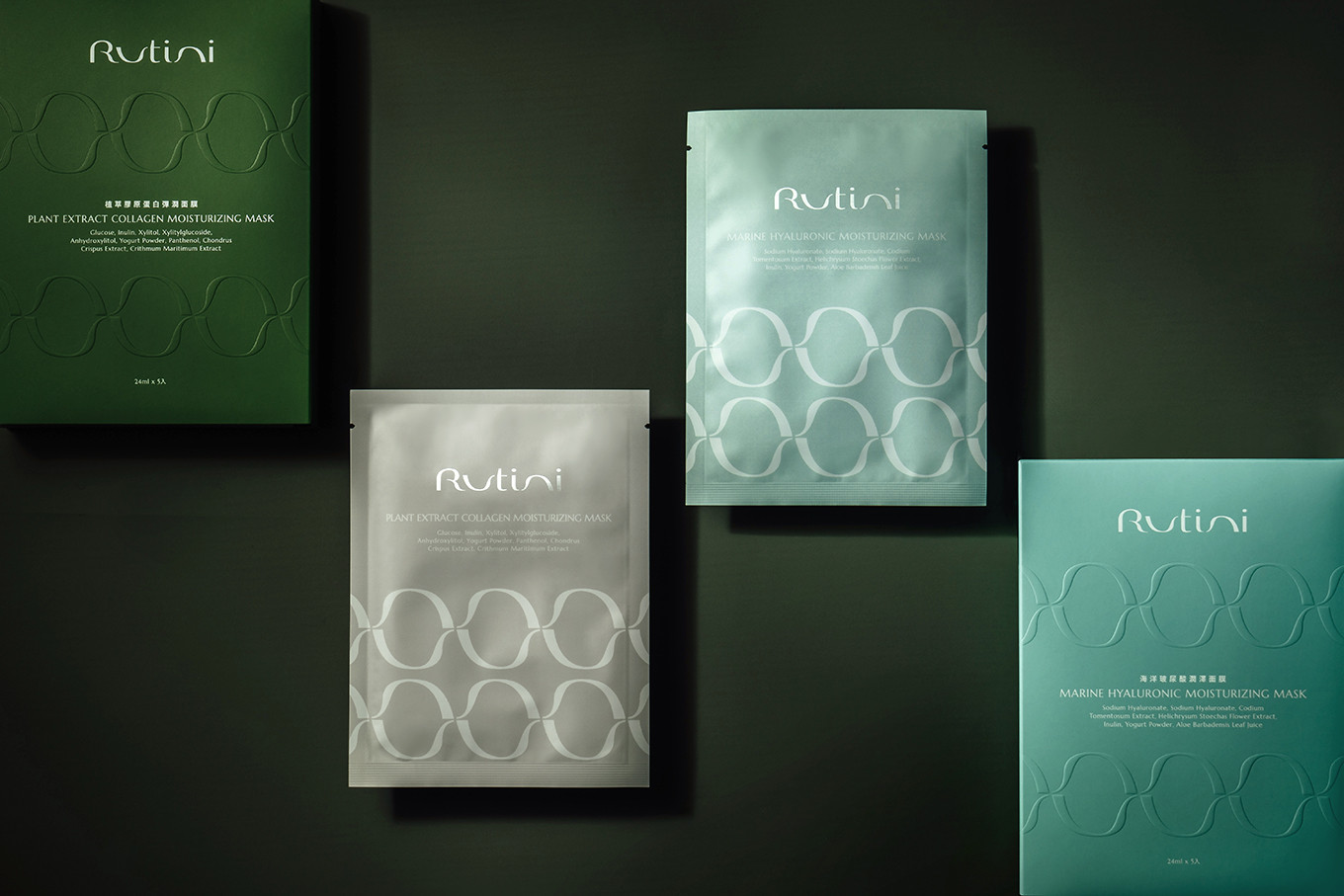
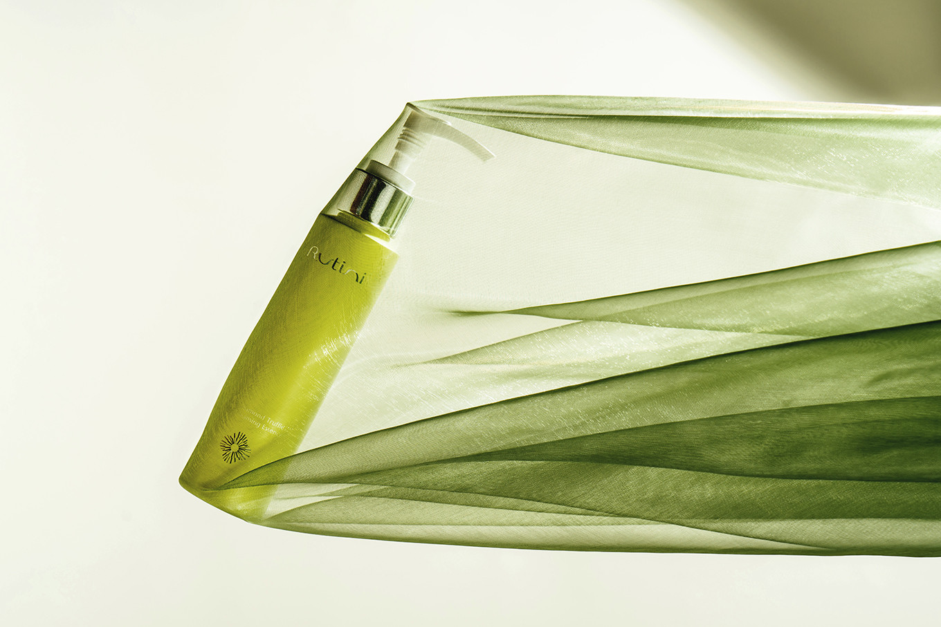
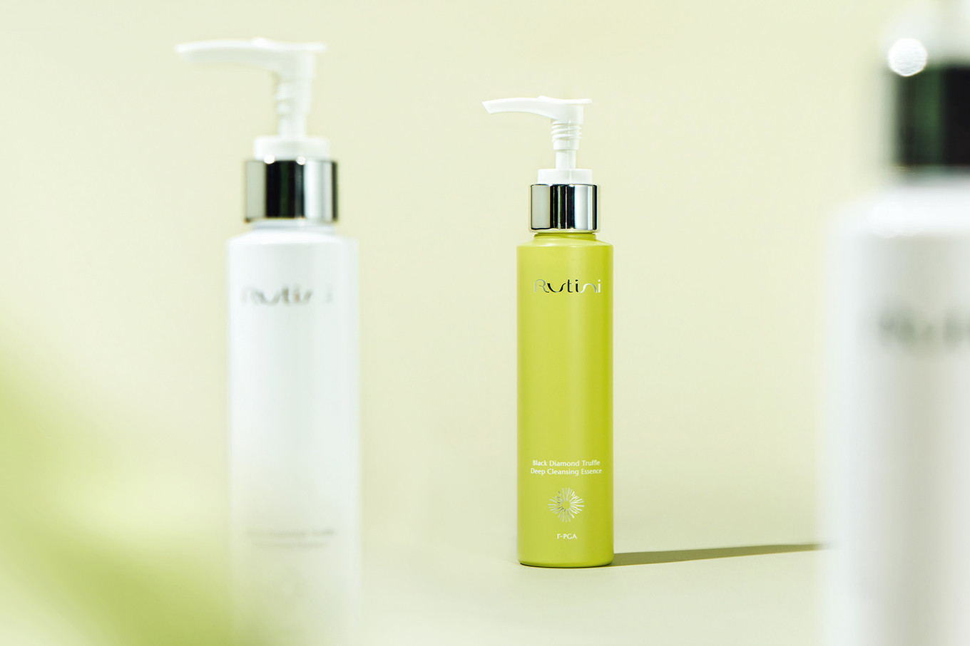
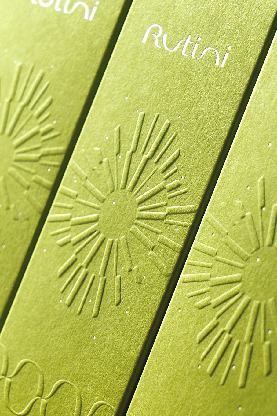
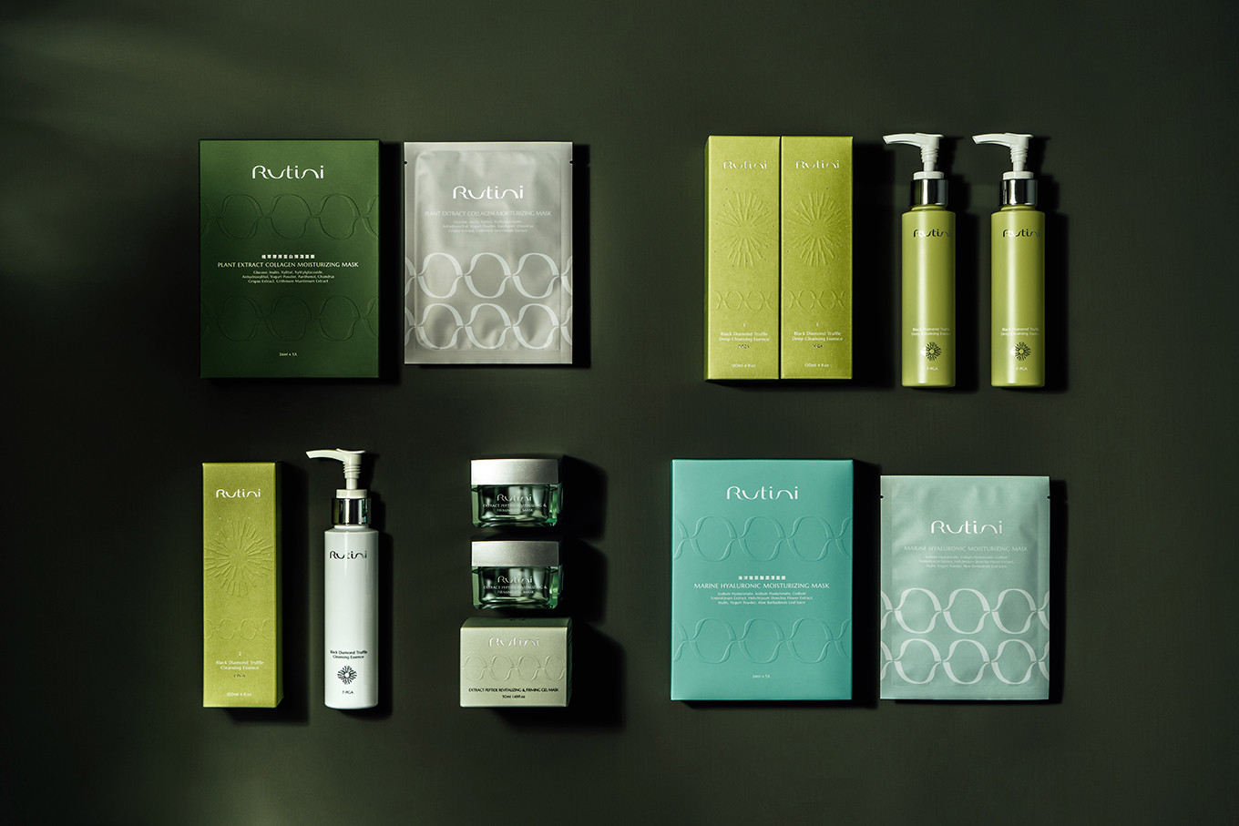
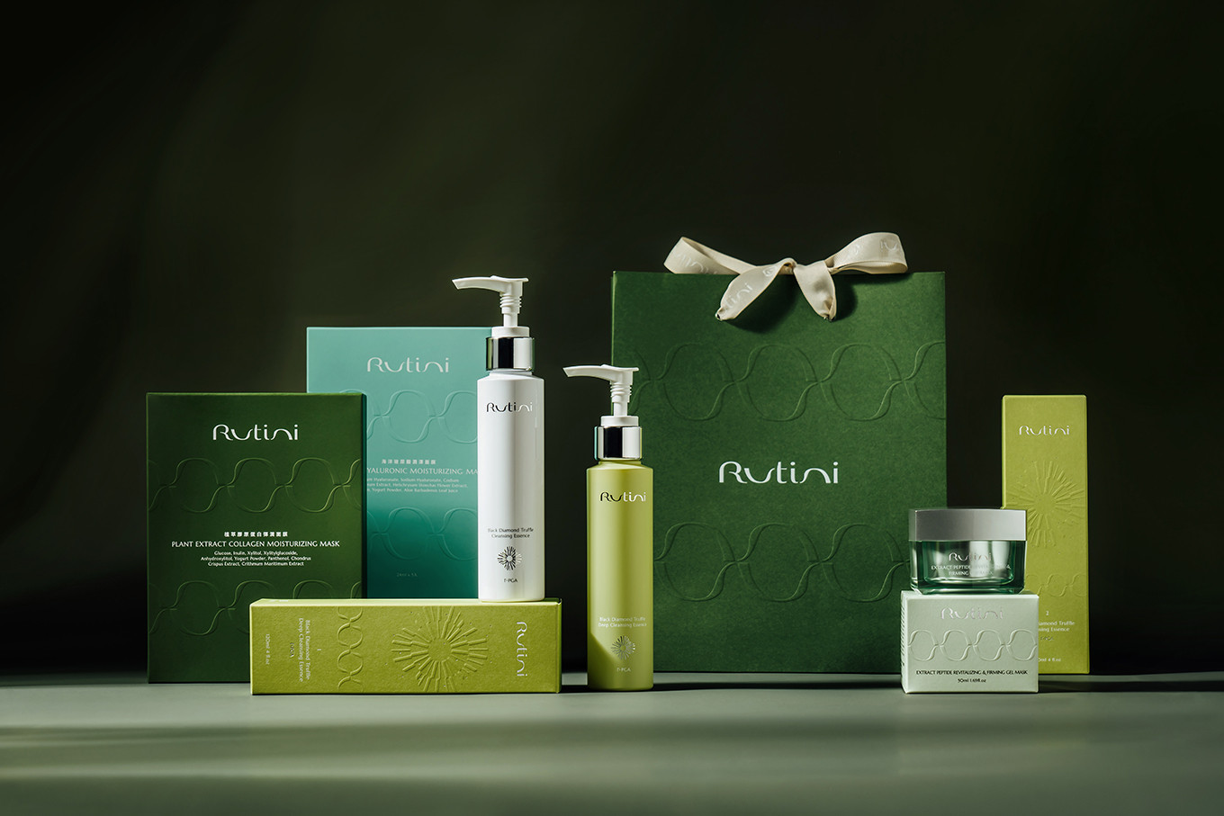
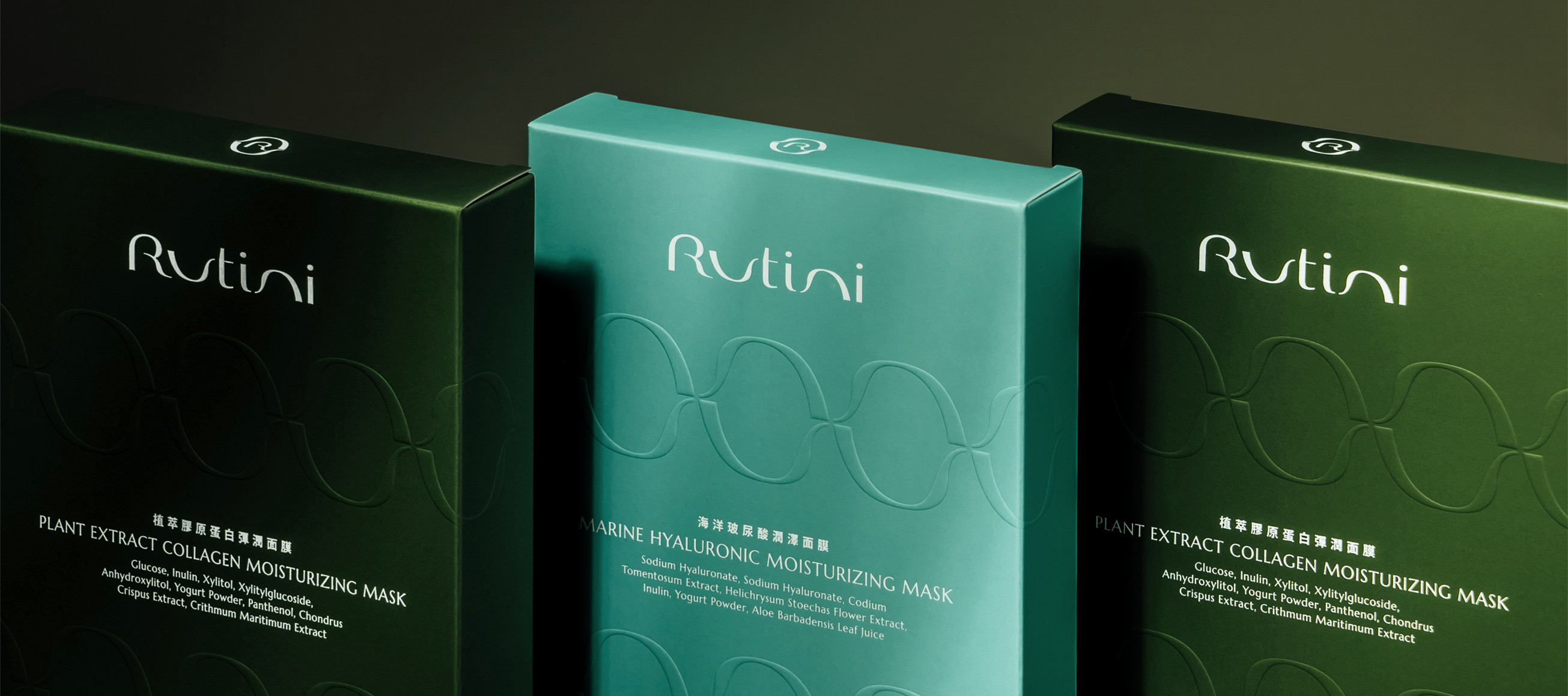
品牌命名以每日保養Routine和自我獨特Unique做結合,象徵Rutini為消費者打造專屬保養程序,成就美麗獨特的自己;Logo字體設計,使用柔軟圓潤的線條勾勒,輔助圖形提取logo中的u與n,呼應肌膚循環、溫柔呵護的概念,字體扁平化加上綿延意象的線條,展現品牌舒適、放鬆、循環的理念,使品牌形象更具特色;品牌色彩選擇以森林綠搭配石灰綠,展現自然、親膚的調性。
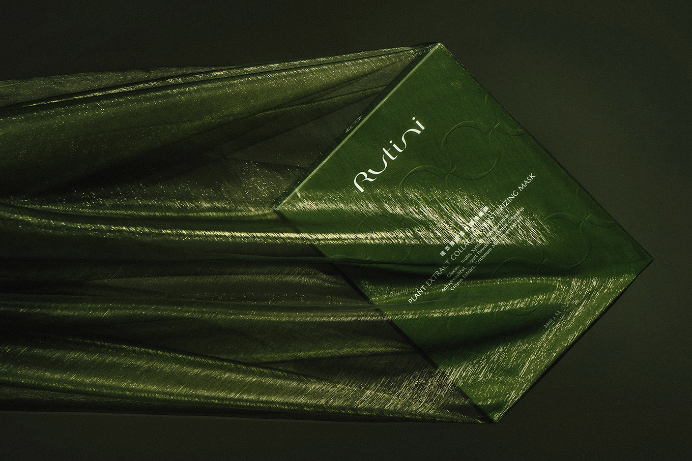
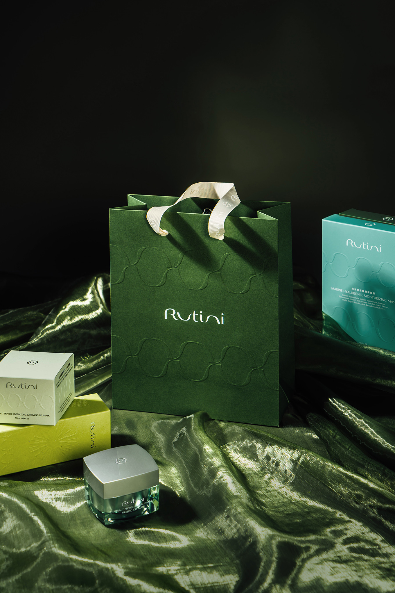
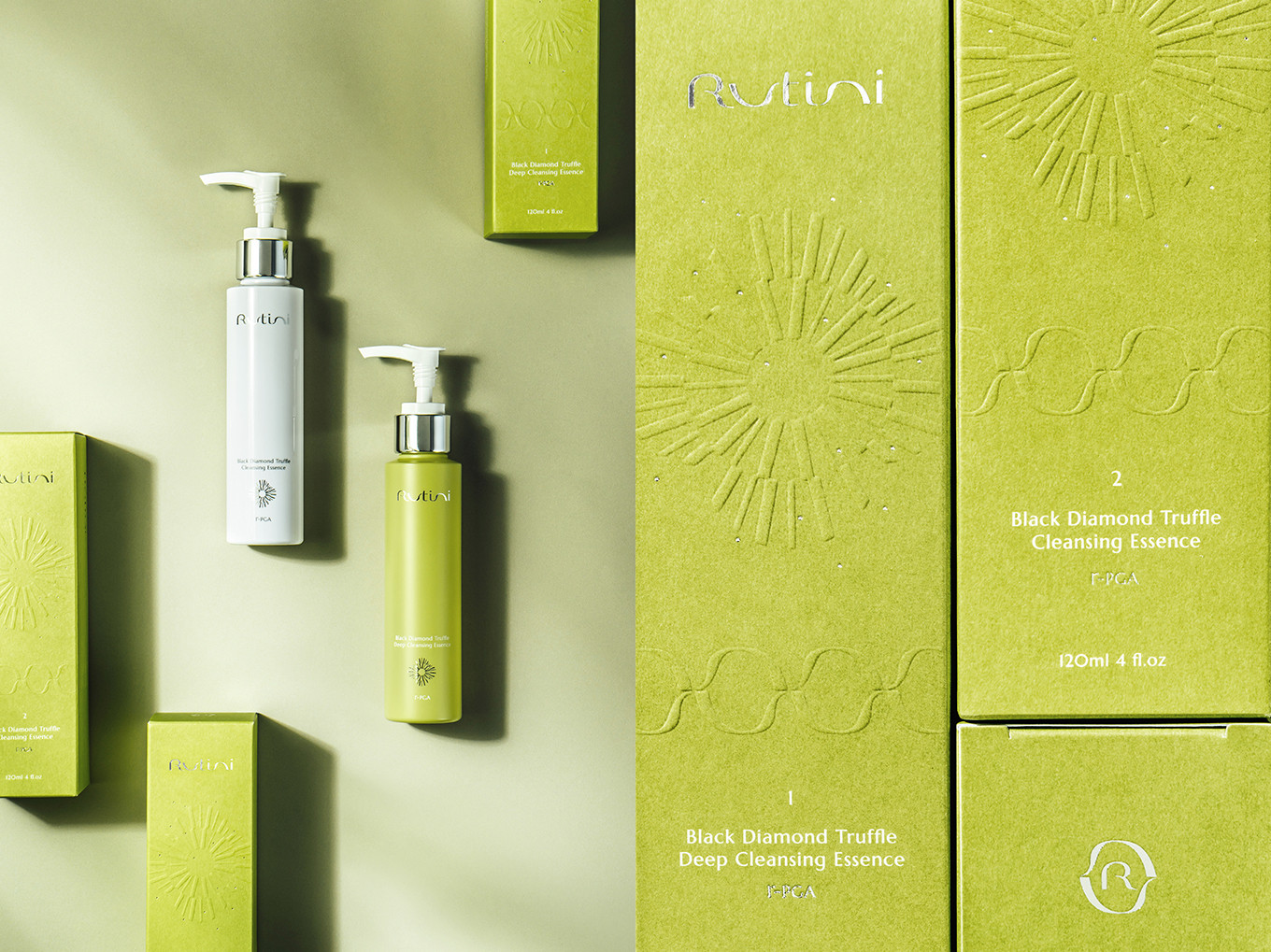
[品牌符碼建構包裝系統]
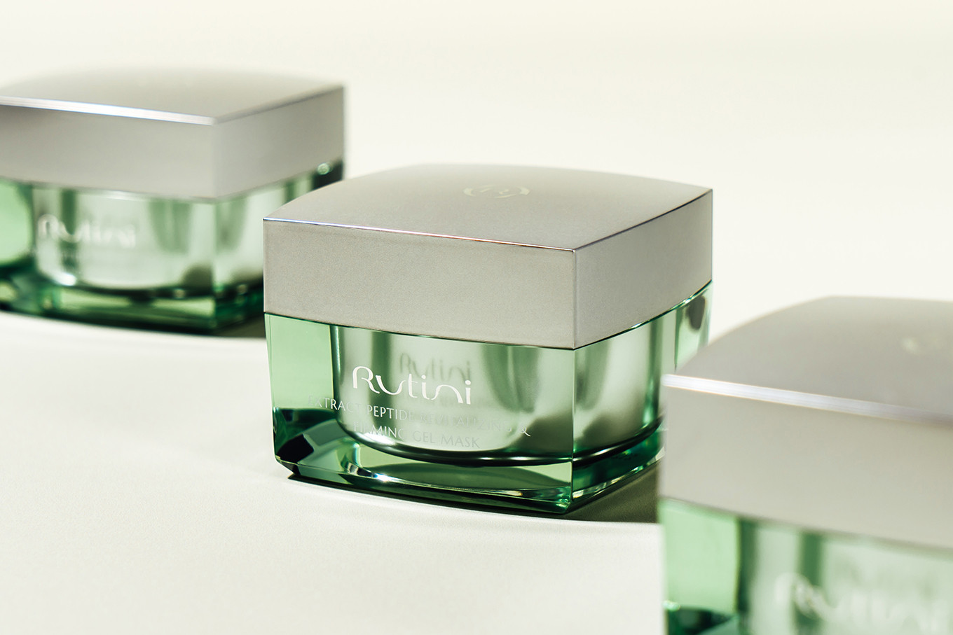
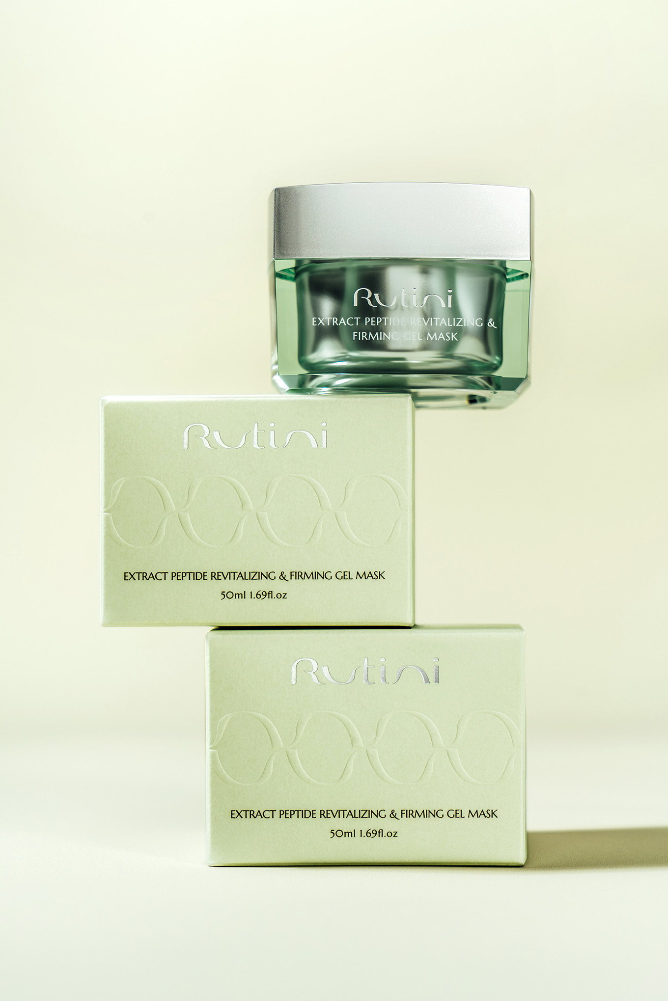
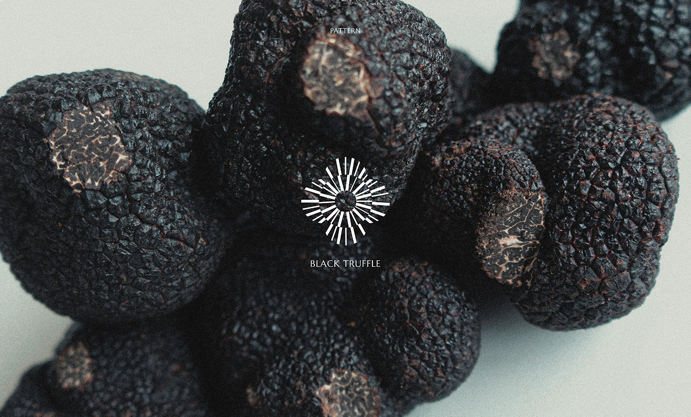
包裝調性以大地色系、輕奢質感為目標,創造植萃的綠色系保養學,呼應品牌有機認證、無香料、無酒精的產品訴求,在常規保養系列的產品中,融入品牌符號,運用後加工打凸,保留整體優雅的氛圍,適當展現品牌個性;頂級黑松露產品系列,則以綻放的光芒線條做區分,局部的點綴燙銀,與icon的打凸呈現,剛剛好的高雅,呼應產品優質原料的內涵;Rutini從產品研發到包裝設計,從每一個細節做起,只為給肌膚最適當的呵護。
[ Cultivating a Botanical Brand Atmosphere ]
Rutini nurtures the skin with the gentlest care, powered by reassuring plant-based ingredients and professional scientific expertise.
The brand name is a fusion of daily skincare Routine and individual uniqueness .Unique symbolizing Rutini's dedication to crafting a personalized skincare ritual that helps every consumer become their most beautifully distinctive self. The logo typeface is rendered in soft, rounded strokes, while the supporting graphic elements draw from the "u" and "n" within the logo echoing the concept of skin renewal and tender care. The flattened letterforms, paired with flowing continuous lines, embody the brand's philosophy of comfort, ease, and cyclical renewal, giving the brand identity a character that is distinctly its own. The brand color palette pairs forest green with lime green, evoking a natural, skin-friendly sensibility.
[ Building a Packaging System Through Brand Codes ]
The packaging aesthetic aims for an earthy palette and a touch of understated luxury creating a botanical green-toned skincare language that echoes the brand's commitment to organic certification, fragrance-free, and alcohol-free formulations. Across the everyday skincare series, brand symbols are seamlessly integrated, brought to life through embossing as a finishing technique — preserving the overall elegance of the design while allowing the brand's personality to surface with just the right touch. The premium Black Truffle series is distinguished by radiant, blooming lines, with selective silver foil stamping and embossed icons lending a refined opulence a subtle luxury that mirrors the exceptional quality of the ingredients within. From product formulation to packaging design, Rutini begins with every detail all in pursuit of giving skin exactly the care it deserves.