PINETATA
Visual Identity Design
Client
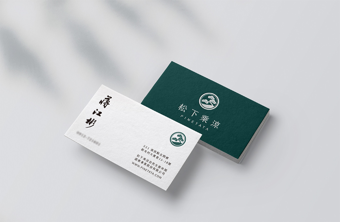
松下乘涼自然生態休閒遊樂事業股份有限公司
BREEZY PINES GARDEN
Brand
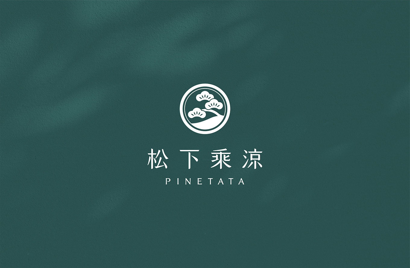
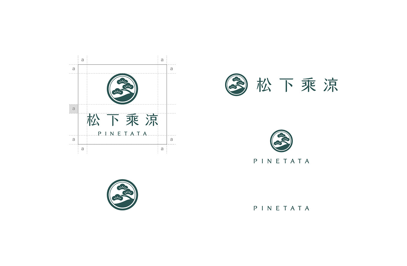
松下乘涼 PINETATA
_
Executive Creative Director
Ying-Fa Wang
Executive Project Director
Hsiu-Ju Hsu
Art Director + Designer
Cih-Wan Wang|
Shiang-Yin Su&Szu-Ying Lu
Project Planning
Chih-Chia Chang
_
Published on 10. 01. 2023
PINETATA
Visual Identity Design
涼風徐徐,坐聽松濤
位在海拔四百公尺的松柏嶺曾有佈滿坑谷的松柏樹群,這裡也是松下乘涼創辦人的故鄉,熱愛這片土地的他,期望發揚舊時的美麗景緻,分享這片土地給他的力量與美好,運用植樹造林、設計建設,打造一座複合式觀光休憩園區,讓你我在此陶冶身心,品嚐有益健康的食品,在松柏林間感受大自然的美好,自在且享受。
前期我們聚焦在品牌價值梳理、品牌個性定調、英文名稱檢視,並同步思考企業理念與園區規劃到現行包裝的脈絡與串連,朝向統一調性且保有各區塊特色為目標。
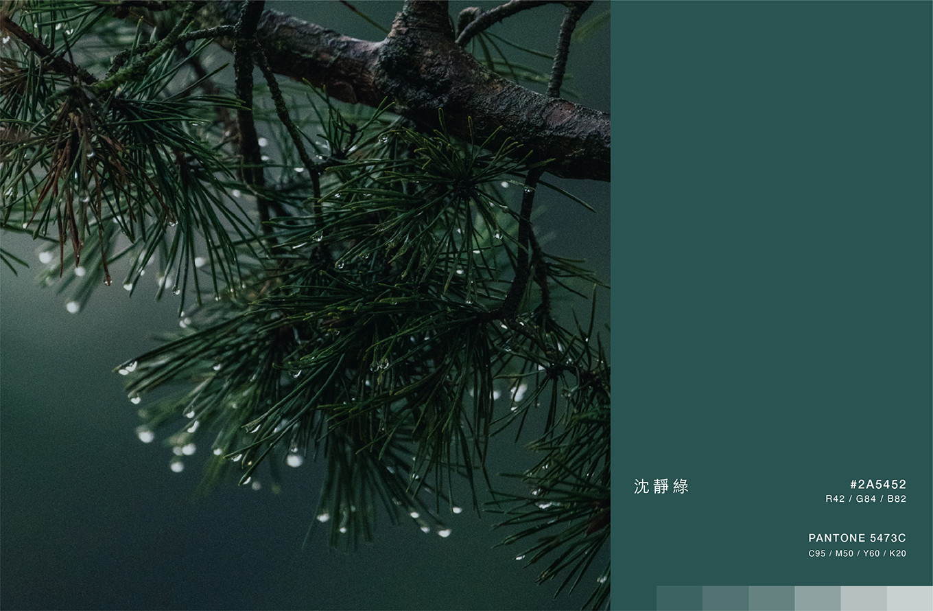
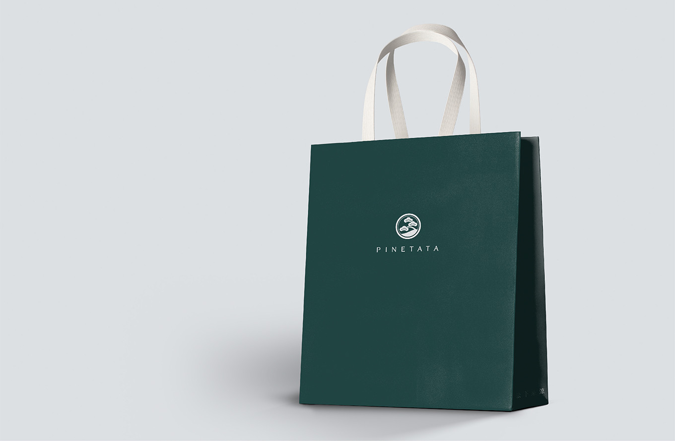
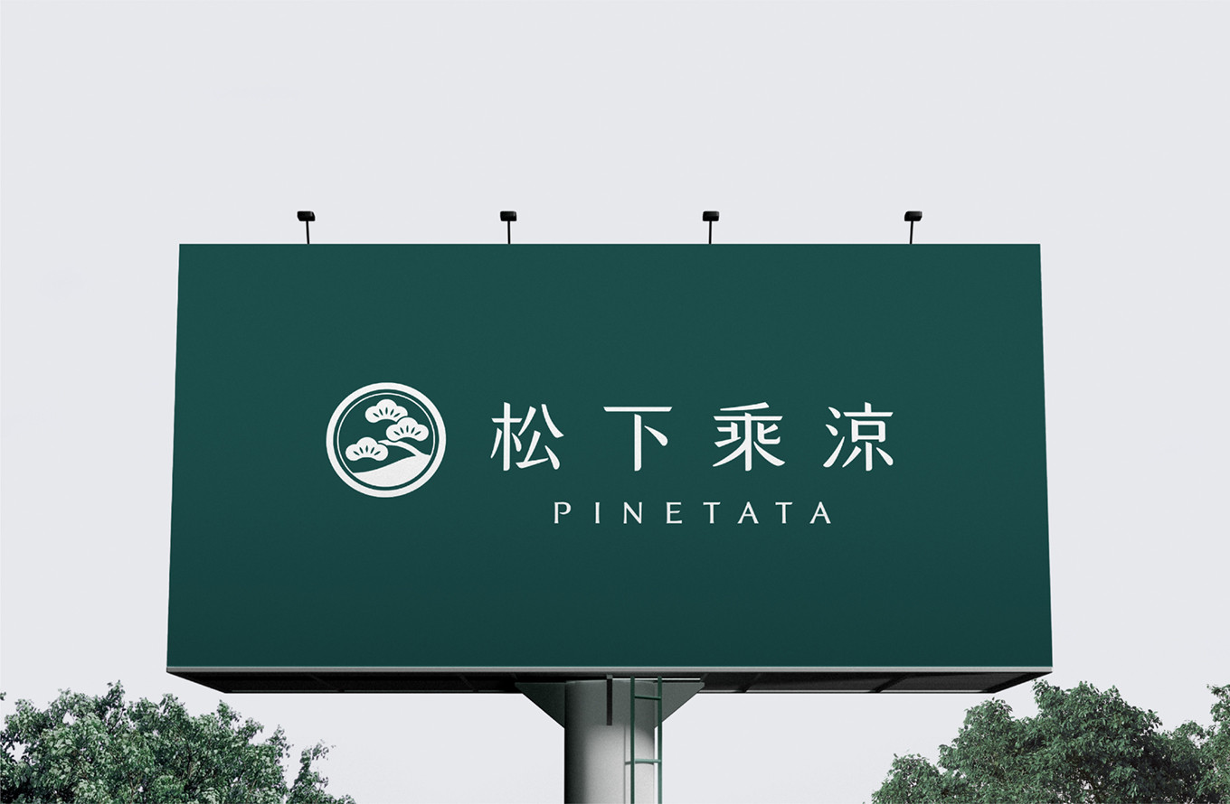
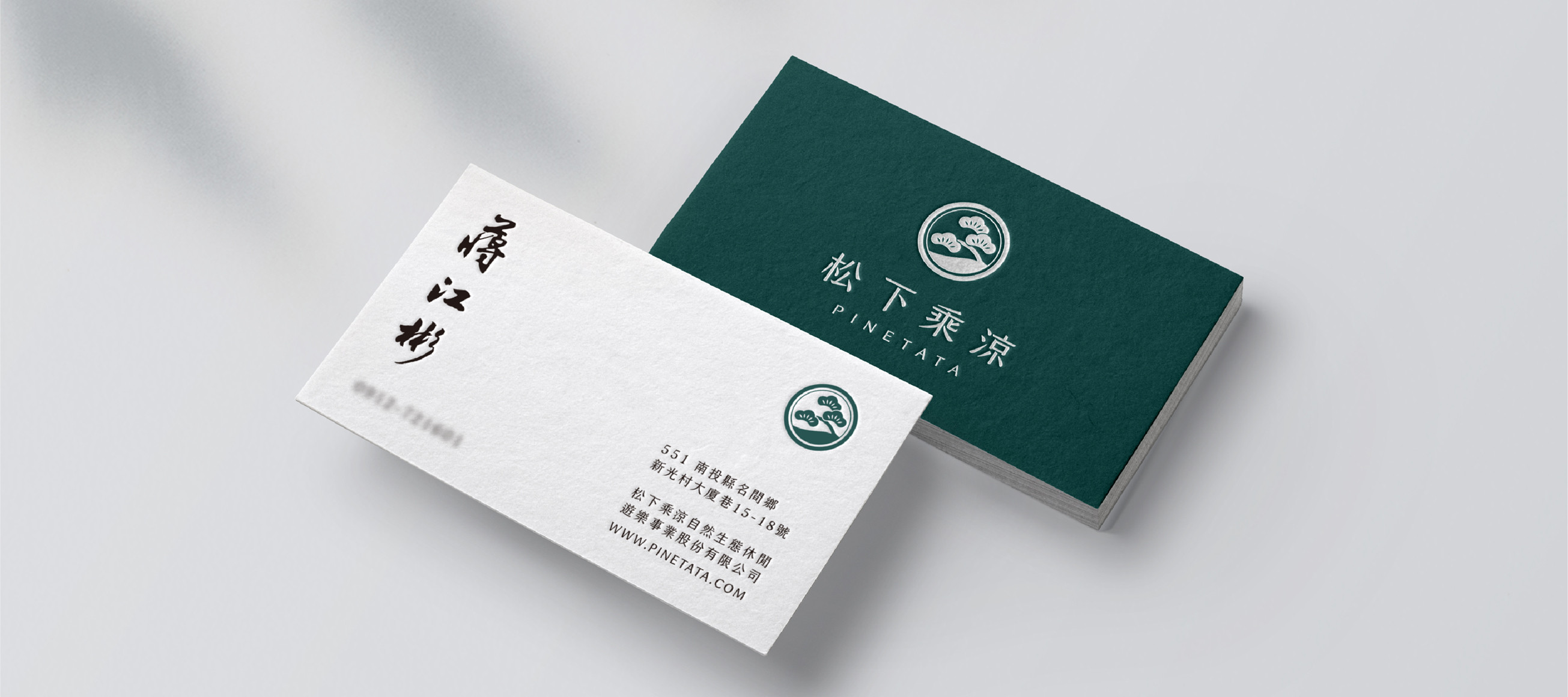
品牌英文名PINETATA是義大利文松樹林PINE與招呼語TATA的結合,帶有下回見的意思,如同品牌與消費者約定再相見之意;在視覺形象的建立中,我們希望帶入大自然的氛圍,識別設計結合五葉松,搭配柔和的線條、圓潤的色塊,傳遞植物帶來的寧靜與舒適,主色選擇森林感的沈靜綠,呈現出品牌的人文底蘊。
期待未來園區開放的那天,在一片沃野綠樹的景致中,微風吹拂松下乘涼,每一個到訪的人都能感受園區帶來的平靜與能量!
-
A Gentle Breeze, the Soft Song of the Pines
Nestled at an elevation of four hundred meters, Songbailing was once blanketed by groves of pine and cypress filling its valleys and hillsides. It is also the hometown of Pinetata's founder a man whose love for this land runs deep. Driven by the desire to revive its former beauty and share the strength and serenity this place has always given him, he set out to build a multi-faceted leisure and tourism destination through reforestation, thoughtful design, and purposeful development. A place where you and I can come to restore the spirit, savor wholesome and nourishing food, and simply be free and at ease among the pines.
In the early stages of the project, we focused on clarifying brand values, defining brand personality, and reviewing the English name while simultaneously mapping the connections between the brand philosophy, the park's development vision, and the existing packaging. The goal: a unified tone that still allows each section of the brand to retain its own distinct character.
The brand's English name, PINETATA, is a fusion of the Italian word for pine forest — PINE — and the Italian greeting TATA, which carries the warm meaning of "see you next time." It is the brand's quiet promise to every visitor: we'll meet again. In building the visual identity, we sought to bring the atmosphere of nature into every element. The logo design incorporates the five-needle pine, paired with soft, flowing lines and rounded color forms that convey the stillness and comfort that only nature can offer. The primary color — a deep, grounded forest green — speaks to the brand's quiet cultural depth and humanity.
We look forward to the day the park opens its doors. Amid a landscape of lush greenery and open sky, a gentle breeze drifting through the pines — may every visitor who arrives feel the calm and the quiet energy this place holds.