Branding Visual Identity Design Project
品牌 : 新肌霓
Client : FOUREST CO., LTD.
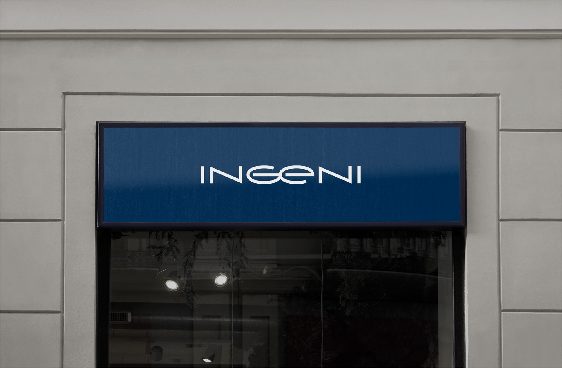
Brand : INGENI
Published on 06. 08. 2022
Branding Visual Identity Design Project
「 我們相信,擁有健康的肌膚才能有健康的生活 」三位理科先生這樣說著,從深受背痘困擾而踏入保養領域研究,帶著自己的專業,從客觀的角度深入保養品市場,致力研發出高效能產品,讓肌膚重返自然的美麗。2017年,在推出創始產品背膜後,新肌霓就此誕生,堅持成為專注於解決肌膚問題的保養護理品牌,並持續開發出“看得見改變”的產品。而在現今社會不斷追求“天然”的情況下,新肌霓並不盲目的信仰天然,而是從多種原料中,選用最有效並安全的成份,讓肌膚的改變看得見,才是新肌霓堅守的信仰。
在前期品牌挖掘的過程中,我們思考著新肌霓想要改變的心,然而改變卻無需理由,只為尋求更好的自己,並展現最真實的自我。新肌霓以「新肌美學、全效配方、身體保養、肌膚調理」為品牌基礎的關鍵字,而在這個基礎上,如何展現「生活“新”態度」是美可特一直在思考的,在不斷地討論並挖掘後,我們定下了四個方向「健康生活、展現自我、自然美肌、追求更好」,期望新肌霓將不只在肌膚上看的出改變,更進一步地改變生活。然而一個品牌的價值,不在於只有單一訴求,在追求美好肌膚的過程中,需要結合感性與理性的平衡;新肌霓所主張的理性為「安全成分,全效配方」「由三位理科先生研發」「點 – 線 – 面 – 體的保養邏輯」,加上感性的訴求「做你肌膚的好管家」「展現新肌霓的生活新態度,提升你我的生活品質」「回歸本美 Innate Beauty」「真誠對待 Be Genuine」,期待結合理性的配方與感性的訴求,找出對自我最好的樣貌。
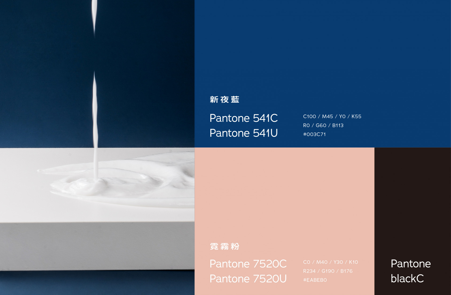
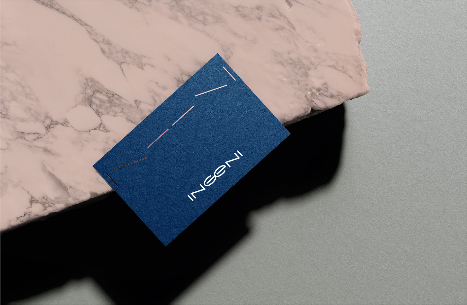
在品牌標準字的調整上,有別於舊識別較於纖細的柔軟形象,新識別著重於理性與感性的中性簡約結合,以 Ge 為視覺中心,將兩字以鏡射方式取得視覺平衡,呈現出品牌由 IN 向外的保養美學,英文大寫 G 與小寫 e 搭配上有如調理攪拌的迴圈,強調品牌以回歸本美為出發點,創造美好與善的循環。品牌色的選擇上,則以理性冷色調新夜藍搭配上感性暖色霓霧粉,串連出理性與感性的平衡。
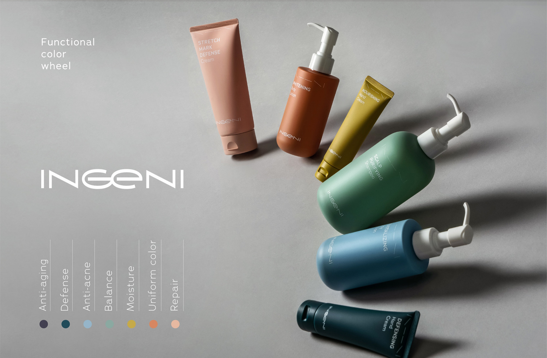
|產品功能色相環|
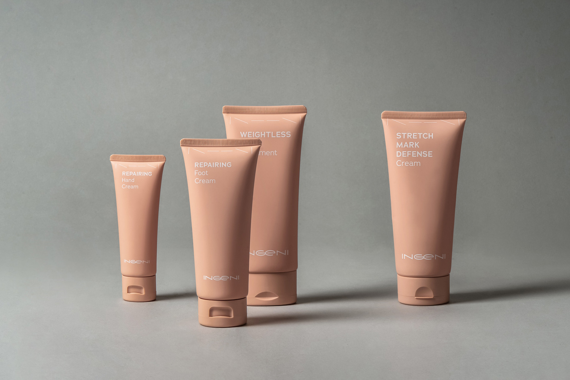
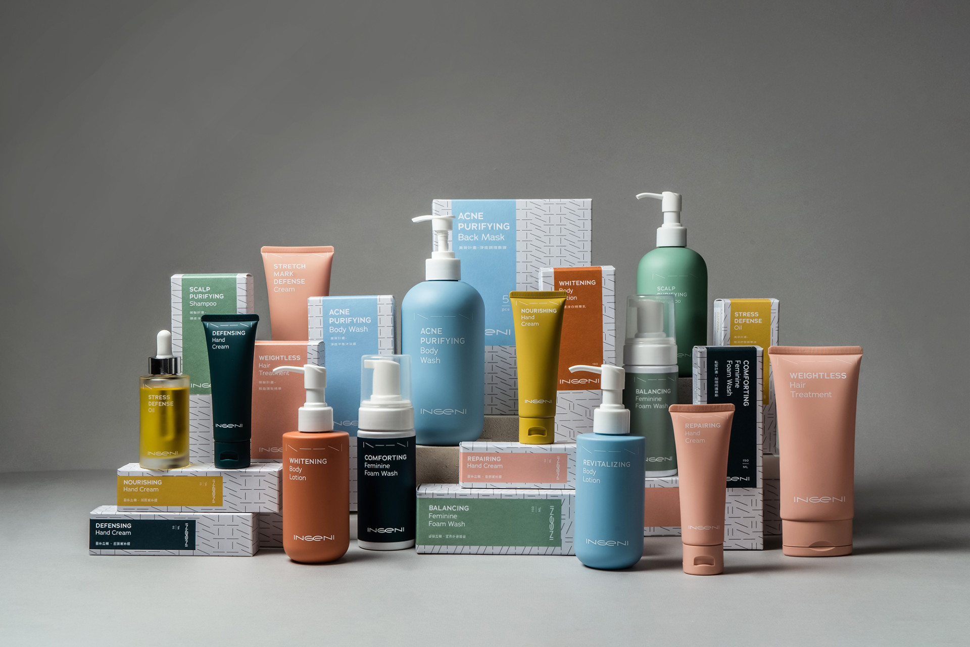
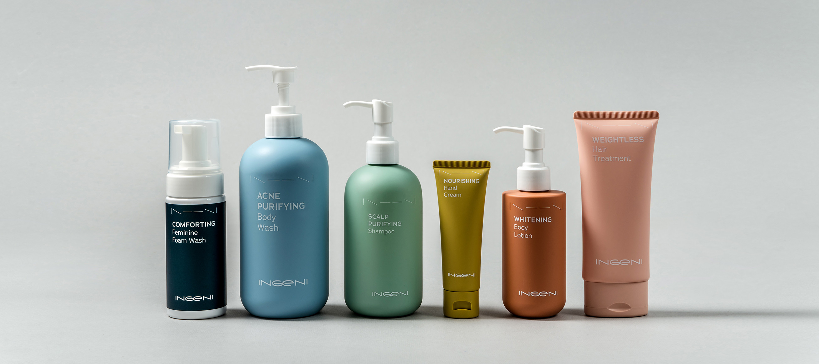
產品的色彩規範,以品牌名「霓」為概念,將產品功能劃分成七大類,並搭配霓虹色制定出專屬於新肌霓的品牌產品系列色,而專屬於新肌霓的霓虹色系,有別於飽和度極高的色系,在顏色的配比上,採用較為柔和的色感,不僅讓整體產品減少衝突感,也讓識別搭配更契合。
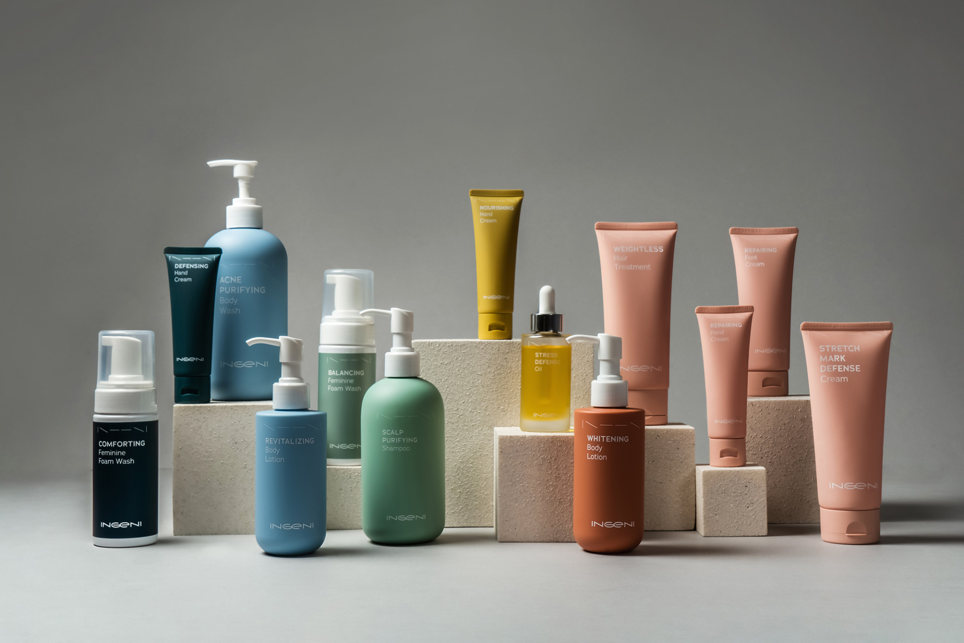
|點線面肌因密碼|
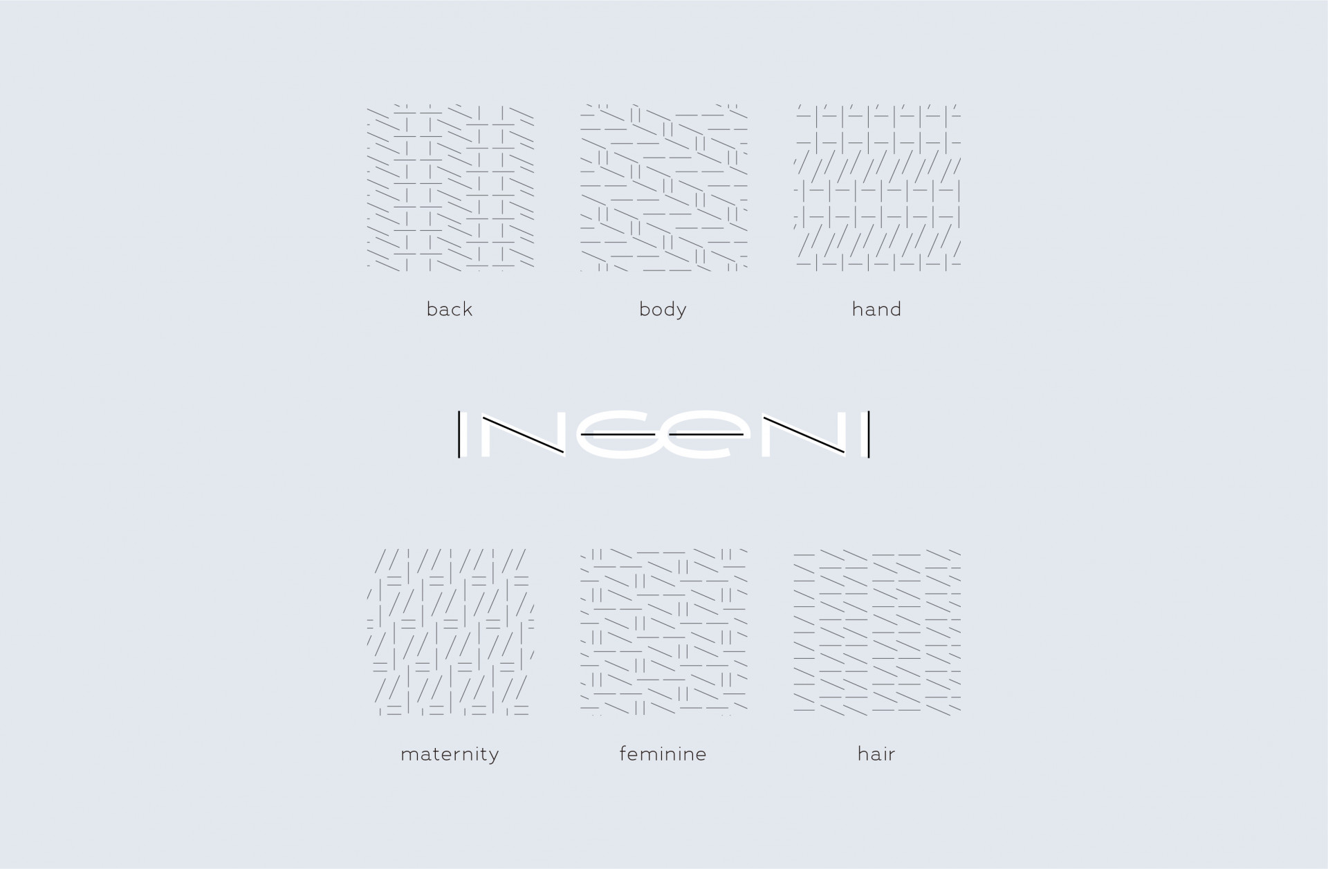
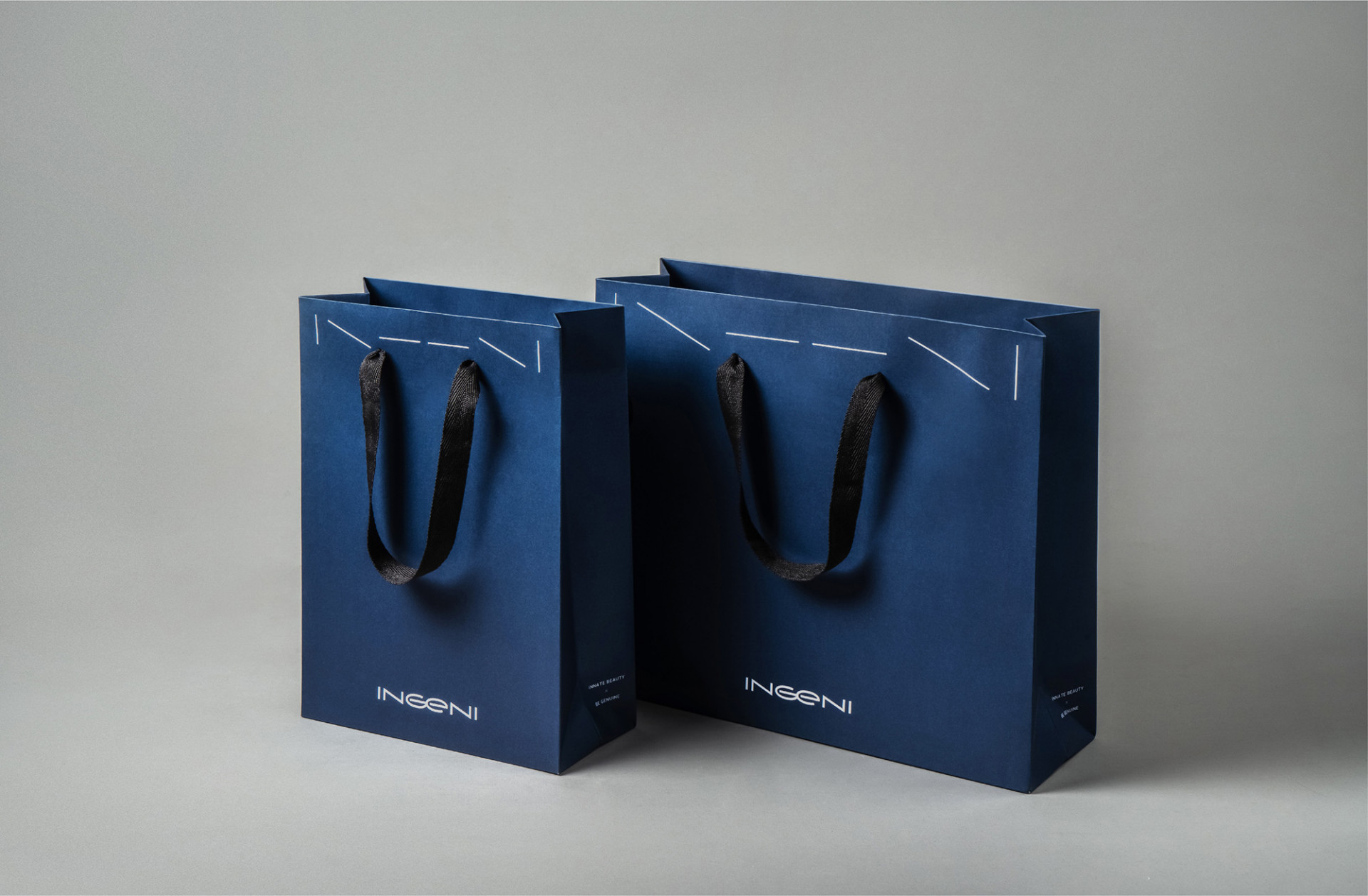
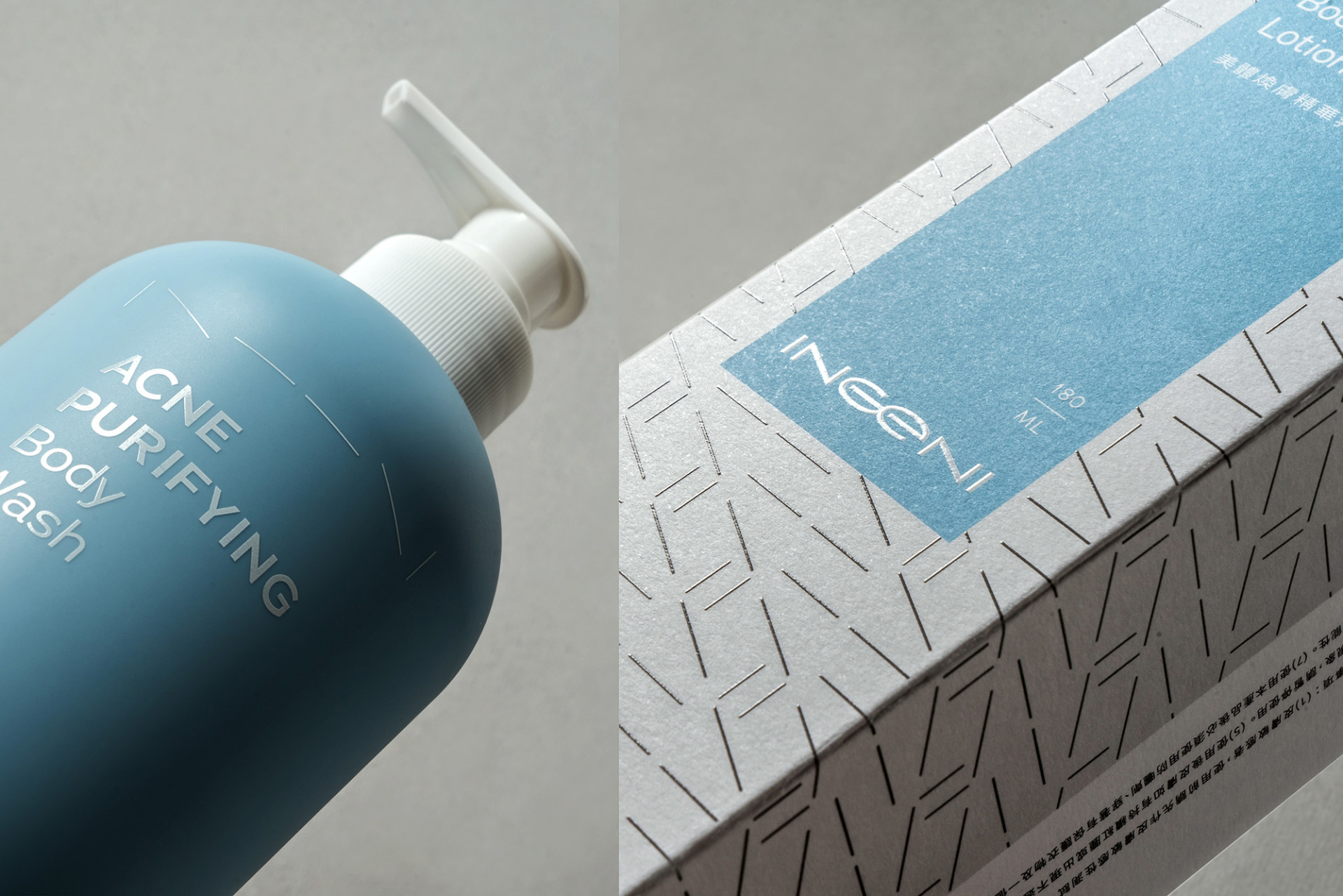
擷取英文品牌名 INGENI 的直線、斜線與橫線,簡化成線性輔助圖形「| \ – – \ | 」,並用於所有延伸產品、用品版面設計上;依照產品的使用部位,如美背、美手、美體、私密、美孕、御髮等六大項目,排列不同順序的輔助圖形便延伸出專屬的「肌因密碼」,因為每個部位皆有獨特的保養需求,以各自排列的肌因密碼凸顯產品的獨特性,可以完整的規範出產品與功能的不同需求,在使用上將更有系統地運用,並做出市場區隔。
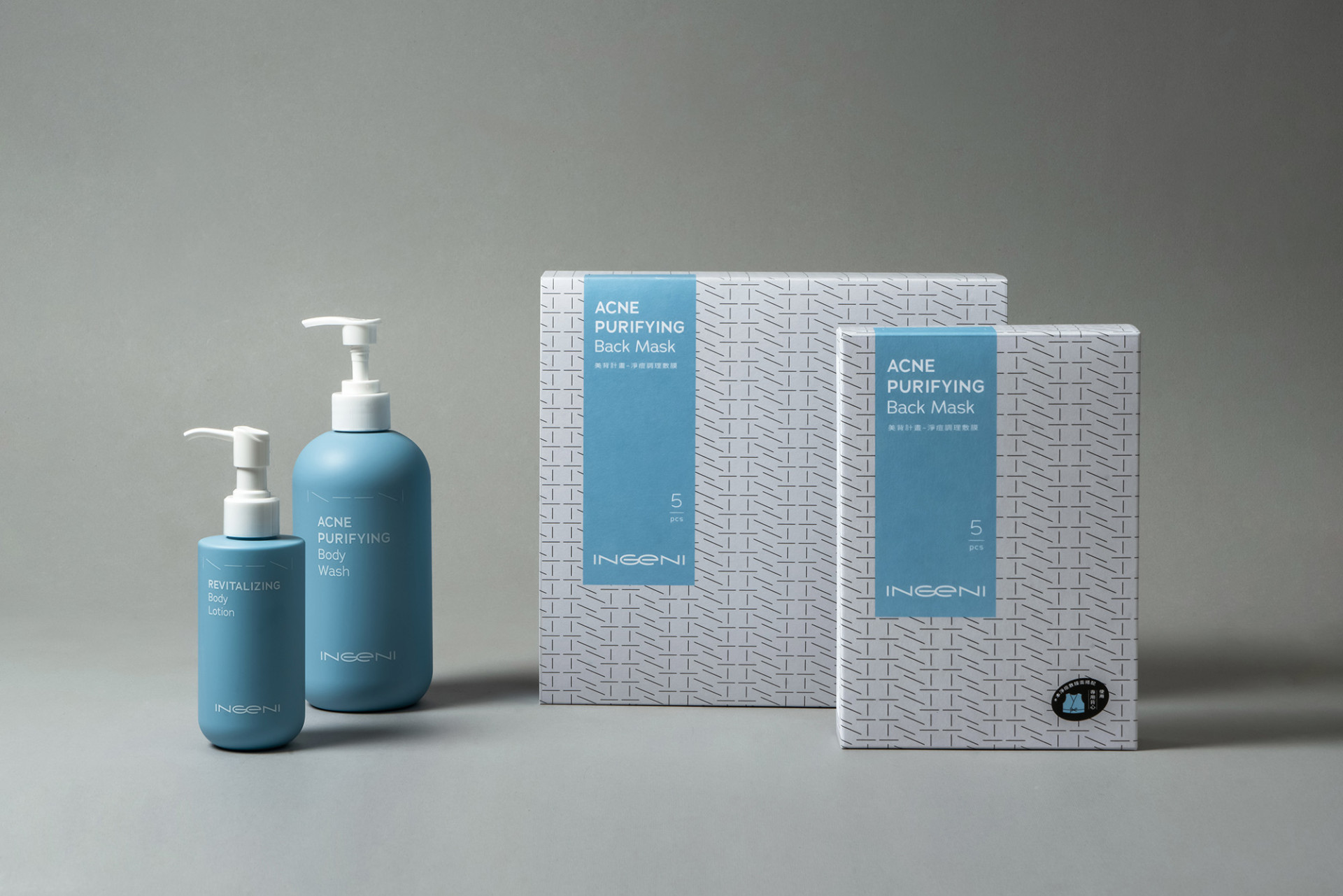
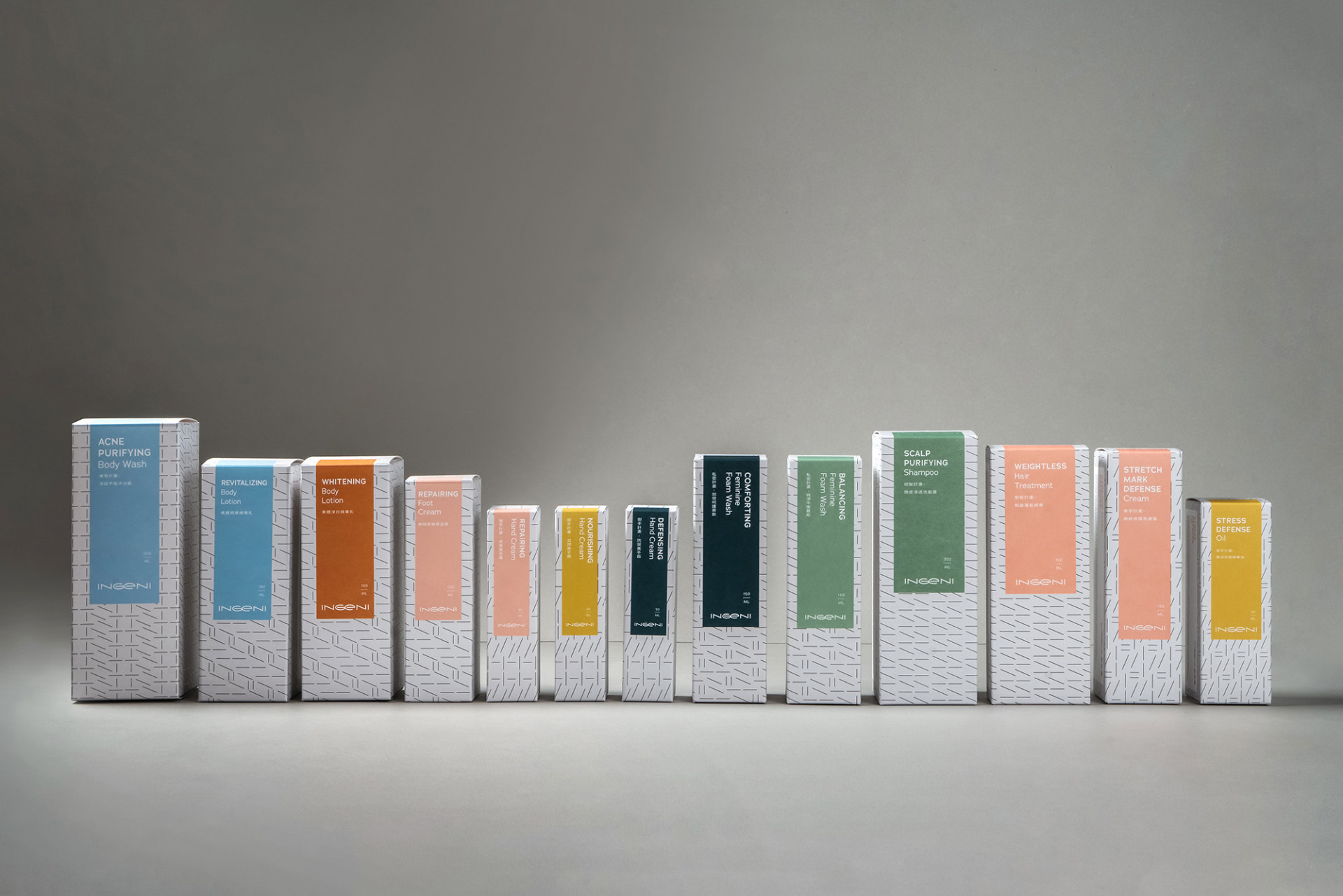
|包裝設計版面規劃|
在歸納出產品功能色相環與肌因密碼後,以簡約與一致性為主要設計目標,版面的規劃也訂下了一致的規範,以專屬的「肌因密碼」為主版面底圖,並加上以功能導向的霓虹專屬色,便組成了新肌霓的全系列產品包裝設計規劃,包裝上依照部位系列的不同,制定了個別的版面設計配比,讓產品做出區隔,也呈現設計的小巧思。全系列包裝設計,皆以局部上光與打凸的加工方式強調出產品特性,亦保持了版面的簡約度,而產品內袋與瓶身則皆以霧面方式呈現出產品的內、外在質感,提升膚觸的溫暖。
為建立長遠的品牌調性與一致性,品牌的影像風格調性也是建構品牌的一大考量,除了傳達理念與品牌感受外,在視覺感受上是為最直覺的要素之一;以光影結合肢體,傳達出品牌堅定並柔和的形象,訴求在科學的理性形象中,存在感性對待消費者的心;視覺背景選擇藍底搭配流動柔順的材質,傳達出信任、專業、質感、科學的簡約俐落感受。新肌霓從不同的問題「點」解決肌膚狀況,延伸出專屬產品「線」,達到肌膚的穩定「面」,最終讓每個人都能展現自信的本「體」。在一步一步的規劃與建構中,堅守著理性與感性的兩大原則,每個訴求點都有著雙向的特性,並將所有產品以定調的規範設計,讓品牌呈現一致性,並創造出品牌風格與特性;這樣的改變,讓新肌霓(從內)自身的改變,到(往外)讓消費者感受對於生活的新態度,完整地傳達了新肌霓的核心價值『看得見改變』。
We believe that healthy skin is the foundation of a healthy life.
Driven by this philosophy and their own battles with back acne, three scientists entered the skincare industry. Leveraging their professional expertise to objectively analyze the market, they set out to develop high-performance products that bring skin back to its natural, beautiful state.
INGENI was officially launched in 2017 with its debut product, the Back Acne Mask. Since then, the brand has remained dedicated to targeted skincare solutions, continuously developing products that promise visible results. While today’s market blindly pursues "natural" labels, INGENI refuses to follow the crowd. Instead, we rigorously select the safest and most effective ingredients. For INGENI, delivering visible dermatological transformation is our ultimate belief.
In the early stages of brand discovery, we contemplated INGENI’s inner drive for change—a change that needs no excuse, as it is solely about seeking a better self and embracing who you truly are. INGENI established its brand foundation on four keywords: "New Skin Aesthetics, Comprehensive Formulation, Body Care, and Skin Conditioning." Building upon this infrastructure, the core question Victor Design kept exploring was how to project a "New Lifestyle Attitude."
Following extensive discussions and deeper insights, we established four guiding directions: Healthy Living, Expressing Individuality, Natural Beautiful Skin, and Pursuing Excellence. We envision INGENI not merely as a catalyst for visible skin transformation, but as a brand that steps forward to transform everyday life.Yet, a brand’s true value transcends a single proposition. The journey toward radiant skin requires balancing rationality with sensibility. INGENI’s rational pillars comprise "Safe Ingredients, All-Effect Formulations," "Formulated by Three Scientists," and "A Multi-Dimensional Skincare Logic (from Points to Dimensions)." Conversely, its emotional essence advocates "Serving as Your Skin’s Dedicated Guardian," "Embracing a New Lifestyle Attitude to Enhance Quality of Life," "Returning to Innate Beauty," and "Be Genuine." Ultimately, merging rational formulas with emotional connection allows us to look within and find our finest self.
For the logotype refinement, we moved away from the slender, soft impression of the previous identity to create a minimalist, neutral balance between the rational and the emotional. With "Ge" as the visual centerpiece, the two letters are mirrored to establish visual symmetry, reflecting the brand's skincare philosophy of transforming from within. The combination of the uppercase "G" and lowercase "e" evokes a mixing loop, underscoring the brand’s core mission—returning to innate beauty—and generating a positive cycle of wellness. In terms of color strategy, the pairing of Midnight Blue (a rational, cool tone) and Mist Pink (an emotional, warm tone) beautifully bridges the two core essences of the brand.
|Product Functional Color Wheel|
The product color guidelines are conceptualized around "Ni" (the neon/rainbow element of the brand name). By dividing the product functions into seven core categories and pairing them with tailored neon shades, we defined a proprietary color system for INGENI's product lines. Deviating from high-saturation neon colors, this signature palette adopts a gentler color ratio. This approach tempers the visual intensity, minimizing conflict among diverse products while creating a more harmonious pairing with the brand identity.
|The Dot-Line-Plane "Skin Code"|
We captured the vertical, diagonal, and horizontal strokes from the logotype "INGENI" and simplified them into a set of linear secondary graphics: "| \ – – \ |". This graphic system is implemented throughout the packaging and editorial layouts of all extended products. Based on six targeted skincare categories—including Back, Hands, Body, Intimate, Maternity, and Hair—the graphics are arranged in varying orders to create a unique "Skin Code" for each line. Since each body part possesses distinct care requirements, these personalized graphic arrangements emphasize product uniqueness. This approach forms a comprehensive guidelines for diverse functional needs, streamlining the product system while sharpening its competitive edge in the market.
|Packaging & Layout Design|
With the product color wheel and "Skin Code" successfully defined, we focused on simplicity and consistency as our primary design goals. A standardized layout guideline was developed: combining the exclusive "Skin Code" as the background matrix with function-oriented neon accents, we formed the packaging design framework for INGENI’s full product line. The layout proportions are meticulously adjusted according to each specific body category, ensuring product differentiation while showcasing clever design nuances. The entire packaging series employs spot UV coating and embossing to highlight key product characteristics, maintaining a clean aesthetic. Furthermore, both the inner foil packaging and individual bottles feature a matte finish, projecting an premium texture from the inside out while enhancing a warm, comforting touch for the consumer.
For long-term brand alignment and consistency, establishing a definitive photography style was a crucial consideration in building the identity. As visual perception is the most intuitive element, it serves to directly communicate the brand’s philosophy and emotion. By fusing light, shadow, and physical form, the imagery conveys INGENI’s steadfast yet gentle image, revealing the emotional empathy behind its scientific, rational persona. The visual backgrounds feature a blue palette paired with fluid, smooth textures, projecting a minimalist and sleek aesthetic that evokes trust, expertise, quality, and science.
By resolving skin issues from specific "Points," INGENI extends its solutions into dedicated product "Lines," achieving a stabilized skin "Plane," and finally enabling individuals to radiate their confident, authentic "Presence (Volume)." Through every phase of planning and structuring, the two guiding principles of rationality and sensibility remain uncompromised. Every proposition carries a dual nature, and the entire product lineup adheres to a unified design standard, securing consistency while shaping a distinctive brand character. This profound shift drives INGENI’s own transformation from the inside out, empowering consumers to experience a new perspective on life and completely articulating INGENI’s core value: Visible Change.