
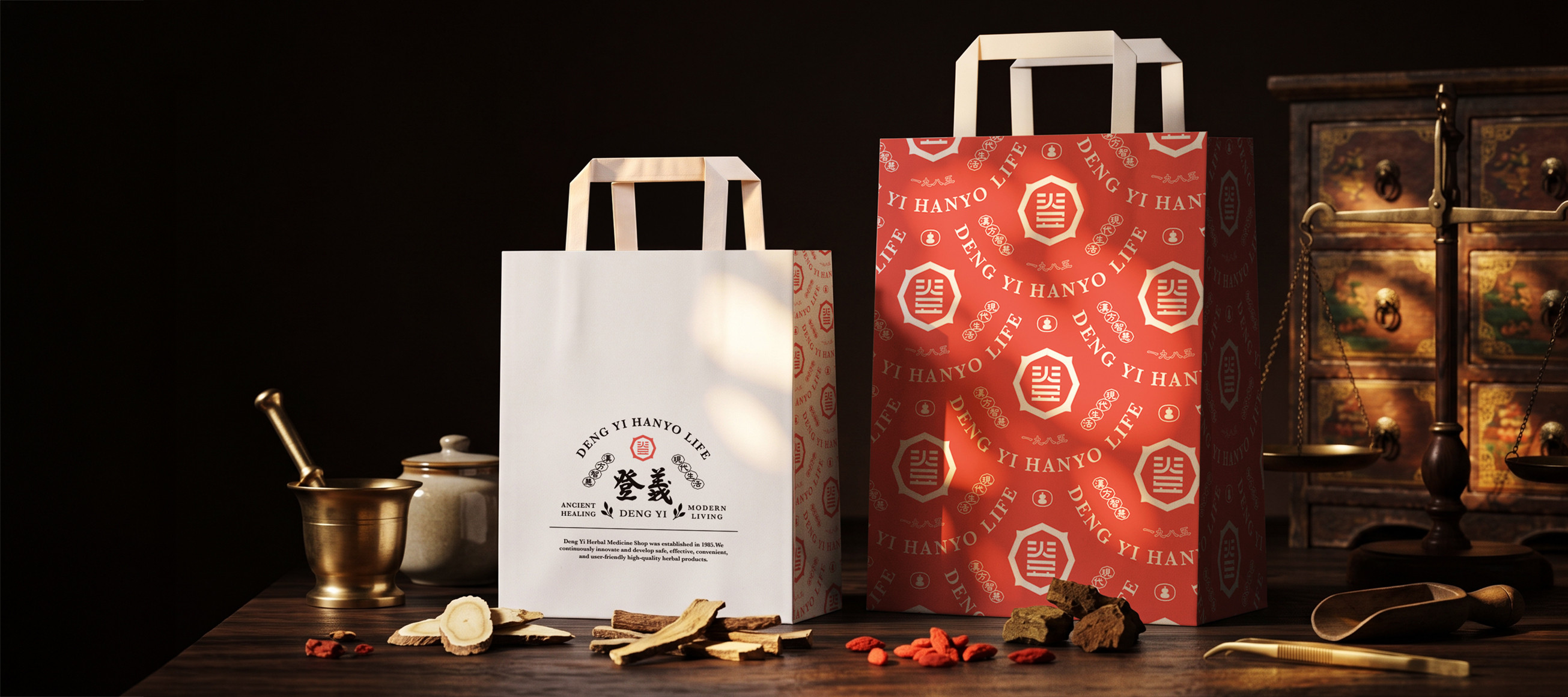
Deng Yi
Branding Identity System Design
Client
Deng Yi
Executive Creative Director
Ying-Fa Wang
Executive Project Director
Hsiu-Ju Hsu
Art Director + Designer
Cih-Wan Wang | Szu-Ying Lu
Project Planning
Yen-Chi Chang|Chih-Chia Chang
Published on 2026/09/17
Project Start Date 2024/06
Deng Yi
Branding Identity System Design
#漢方智慧・現代生活
登義將傳統漢方草本智慧融入現代生活,期望人們透過日常實踐,從飲食、茶飲到生活調養,感受漢方與自然共生的智慧,以古老的漢方智慧,陪伴並守護每一個日子。
美可特透過品牌名稱「登義」爬梳其品牌理念。「登」有登高望遠之意,象徵不斷前進、持續探索,也呼應品牌將傳統中藥智慧帶入現代生活的方向;「義」則帶有正直、正確的意味,傳達品牌不論如何都要堅持做對的事,以健康為本、希望透過漢方智慧陪伴人們日常生活的使命感。從「登」與「義」之間,建立品牌向前行、也向人而行的核心精神。
不僅僅是從品牌名稱,也同樣從品牌價值、信念與堅持中抽絲剝繭,並將登義中藥行的歷史結合文化脈絡,確立了品牌新舊融合,讓漢方養身走入生活日常的核心價值,並定調登義為「漢方生活的實踐家」
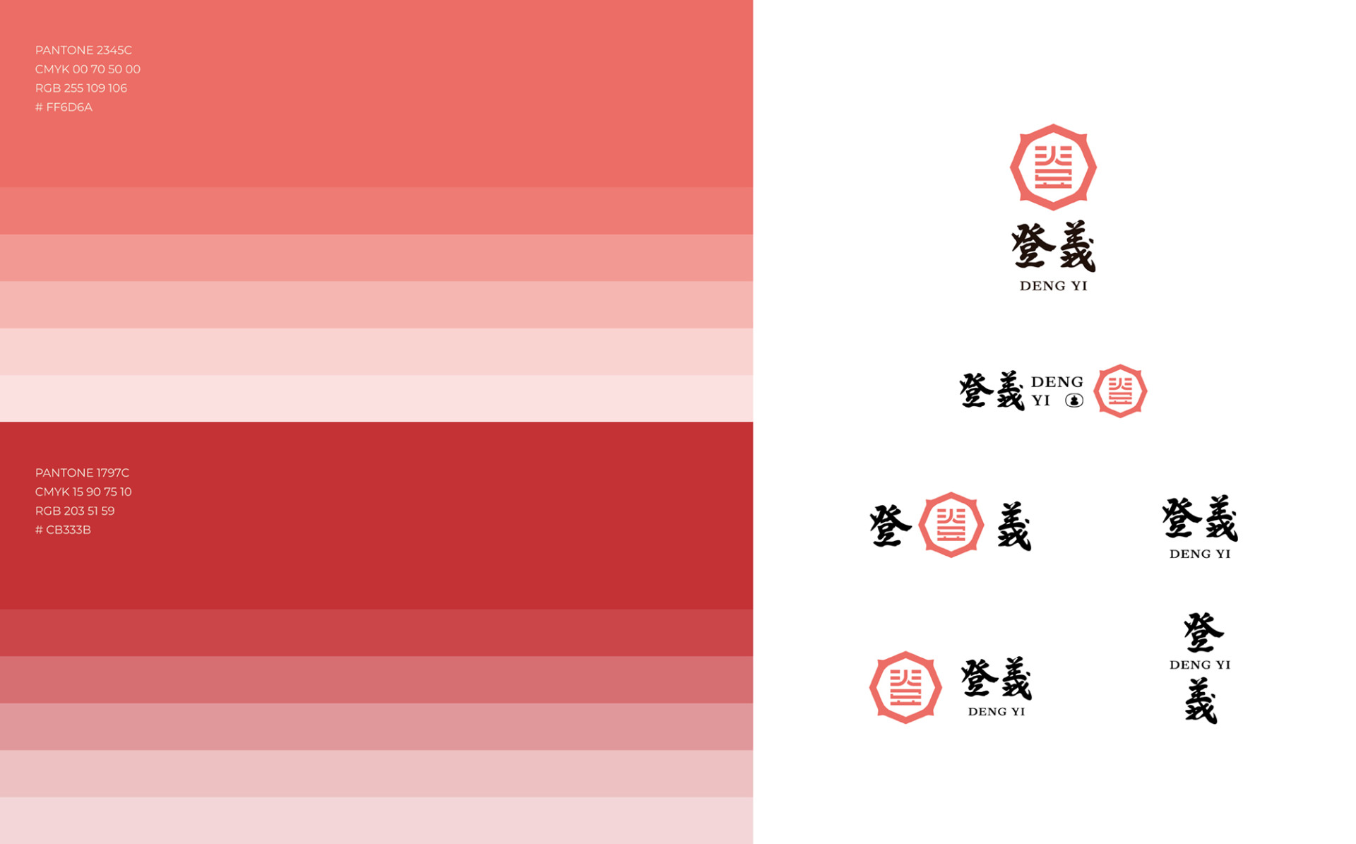
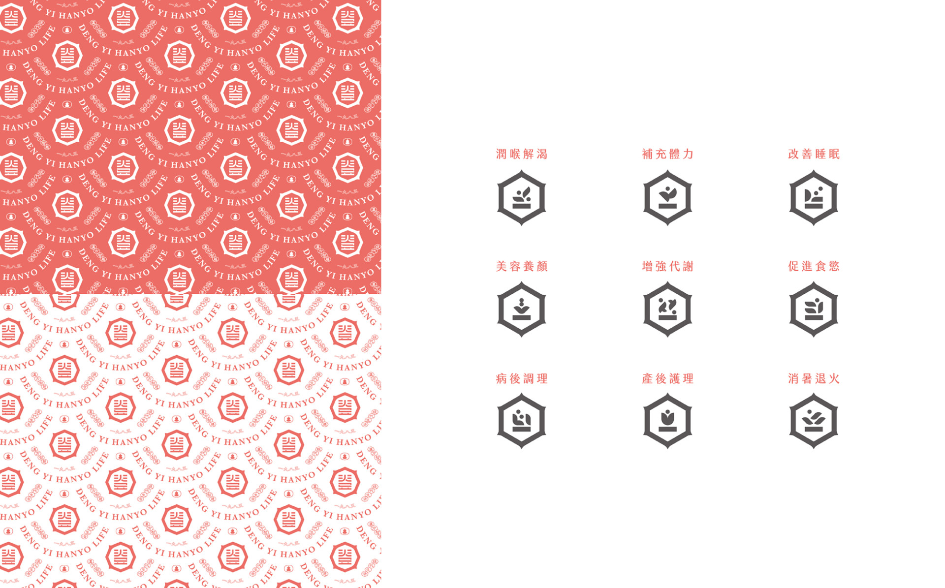
在識別設計上,美可特以「登」字為核心發展品牌標識,並參考《易經》「地天卦」的意象,象徵通達、否極泰來之意;同時將品牌所重視的「四時八節」融入其中,呼應漢方順應自然、依循時節調養的生活智慧,讓識別成為品牌精神與漢方哲學的視覺轉譯。
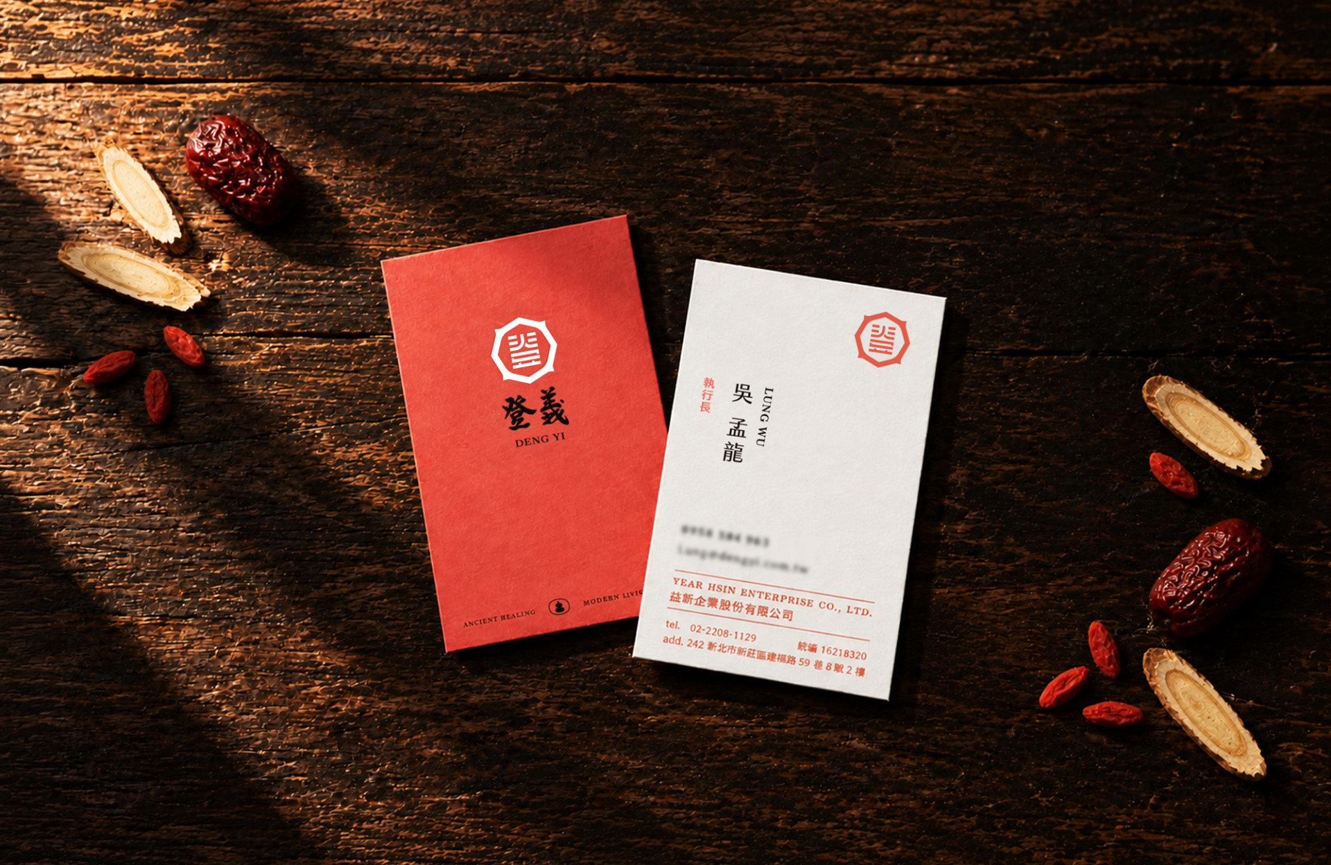
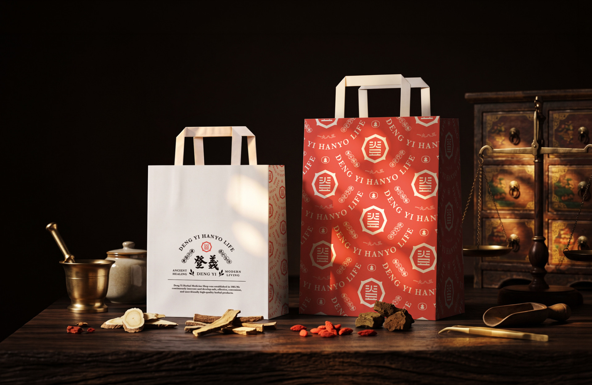
文字部分則延續原有書法字形,透過細節微調保留原有筆意與精神,在傳統與當代之間取得平衡。品牌色彩選用溫潤的珊瑚紅作為代表色,以柔和且富有生命力的色調,讓品牌更具親和力,也更貼近日常生活。
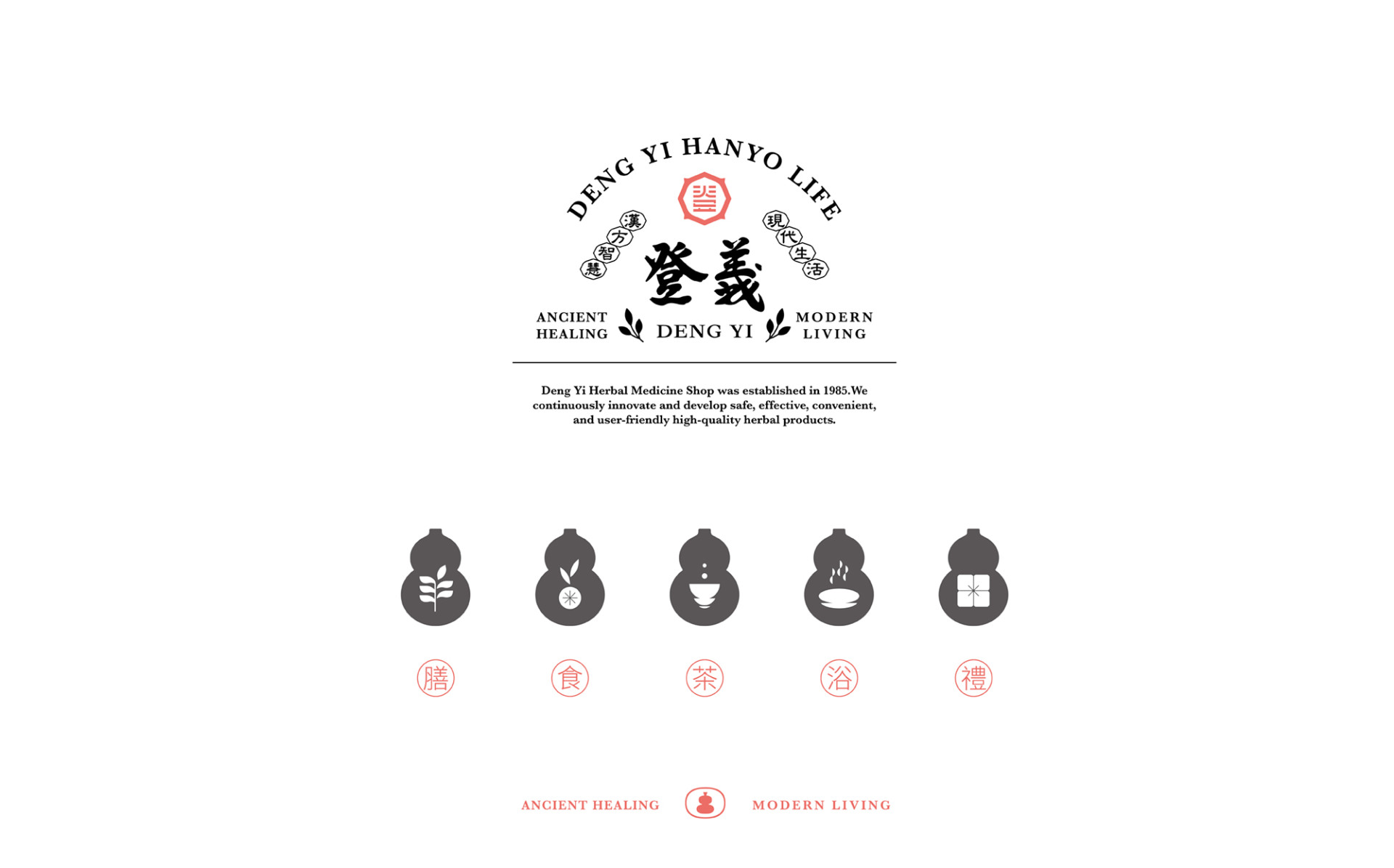
產品則依循不同的生活情境與使用方式,分為「膳、食、茶、浴、禮」五大分類,將漢方智慧延伸至日常生活的不同面向。分類識別以葫蘆作為主要 icon,取其吉祥、興旺與「懸壺濟世」的文化意象,建立產品分類之間的視覺連結,同時強化品牌整體的識別度與記憶點。
#Herbal Wisdom, Modern Living
Deng Yi weaves the wisdom of traditional Chinese herbal medicine into the rhythms of modern life, inviting people to experience the harmony of living alongside nature through everyday practices — from food and tea to lifestyle wellness. Guided by the time-honored wisdom of Chinese herbalism, the brand walks beside and watches over each passing day.
Victor Design unpacked the brand's philosophy through the lens of its name. "登" carries the meaning of ascending to see far, symbolizing continuous forward movement and ongoing exploration, while echoing the brand's direction of bringing traditional Chinese medicinal wisdom into contemporary life. "義" speaks to integrity and righteousness, expressing the brand's unwavering commitment to doing what is right, staying rooted in health, and fulfilling its mission to accompany people in daily life through herbal wisdom. Between "登" and "義," the brand's core spirit takes shape: moving forward, and moving toward people.
Going beyond the name itself, Victor Design carefully unraveled the brand's values, beliefs, and convictions, weaving together the history of the Deng Yi Chinese Medicine Shop with its cultural context. This process established a core brand identity that bridges the old and the new, bringing herbal wellness into the everyday. Deng Yi is defined as "a practitioner of the herbal way of life."
The visual identity centers on the character "登" as the foundation of the brand mark, referencing the hexagram imagery of the I Ching's "Earth over Heaven," which symbolizes openness, flow, and the turning of fortune. The brand's cherished concept of the "four seasons and eight festivals" is woven into the identity, echoing the herbal philosophy of living in alignment with nature and tending to the body according to the rhythm of the seasons. The identity becomes a visual translation of both the brand's spirit and the philosophy of Chinese herbalism.
The calligraphic letterforms of the existing script are preserved and carried forward, refined through careful micro-adjustments that honor the original brushstroke spirit while achieving balance between tradition and the contemporary. The brand color is a warm coral red, a hue that is soft yet full of vitality, bringing the brand closer to everyday life with an approachable, living warmth.
Products are organized into five categories according to different life contexts and methods of use: 膳 Nourish, 食 Eat, 茶 Tea, 浴 Bathe, and 禮 Gift, extending herbal wisdom across the many dimensions of daily living. The gourd serves as the primary icon for category identification, drawing on its cultural associations with good fortune, prosperity, and the spirit of "healing the world with a hanging gourd," creating a visual thread between product categories while strengthening the brand's overall recognition and memorability.
 View more projects
 Next post


